DESIGN PAPER 1 (THEORY) GRADE 12 MEMORANDUM - NSC PAST PAPERS AND MEMOS FEBRUARY/MARCH 2018
Share via Whatsapp Join our WhatsApp Group Join our Telegram GroupDESIGN
PAPER 1 (THEORY)
GRADE 12
NSC PAST PAPERS AND MEMOS
FEBRUARY/MARCH 2018
MEMORANDUM
SECTION A: DESIGN LITERACY
QUESTION 1: 'UNSEEN' EXAMPLES [10 marks]
Candidates answer EITHER QUESTION 1.1 OR QUESTION 1.2
1.1

1.1.1 [Allocate 8 marks in total: a maximum of 2 marks per element/principle]
- Colour scheme:
The surface design makes use of earthy colours which can be found in nature. ? The colours are warm sepia browns, oranges, yellow ochre and umber. This identifies with an African aesthetic. ? This earthy range of harmonious colours relates to the title Animal Tribal. ? The background is a light beige colour tone which imitates a grainy texture. ? - Line:
The surface design uses strong, bold lines that enhance the graphic 2D quality of the design. ? All the patterns are created with thick cloissonistic lines forming diamond-like patterns creating an exotic design. ? The organic lines seem to be inspired by animal patterns, ceremonial masks, tribal artefacts and plants, e.g. leaves and mealies. ? The lines can also refer to ritualistic skin scarring or marking practices performed in some African cultures or societies. ? The compositional structure is divided up into a criss cross grid. ? - Rhythm:
The repetition of colours, shapes, images and bold lines creates curved and zigzag rhythms creating an exotic design. ? The curves are placed in a criss cross grid which is arranged in columns or strips that are repeatedly used throughout the textile design. ? - Positive and negative space:
The surface design uses an all over arrangement of positive and negative spaces with no specific focal point. ? The design makes use of positive and negative space in a clever manner as your eyes are drawn into the images and shapes because of the bold use of colours. ?
Credit any other valid statements.
1.1.2 [Allocate 2 marks]
The title of the surface design already places the work in an African context .? The surface design utilises African images such as animal prints and African plants as its subject matter which gives it an African feel or aesthetic. ? The forms are stylised, simplified, cut down or economised to its basics as is done in traditional African designs like African masks also giving it an African quality and aesthetic. ?
Q1.1 Level | COGNITIVE SKILLS | WEIGHTING | QUESTIONS | MARKS (10) |
Lower order | Remember, Recall, Recognise | 30% | 1.1.1 | 1 |
Understand, Explain, Describe | 1.1.1 | 2 | ||
Middle order | Apply, Implement, Organise | 40% | 1.1.1 | 4 |
Higher order | Analyse, Compare, Interpret | 30% | 1.1.1 | 1 |
Evaluate, Reflect | 1.1.2 | 2 | ||
Synthesise, Justify |
OR
1.2

1.2.1 [Allocate 8 marks in total: a maximum of 2 marks each per element/principle]
- Form: The lamp is created to resemble a realistic image of South Africa's national flower: the protea. ? The conical 3-D form is constructed from wire and a variety of multi-coloured glass beads. ? These beads are cleverly used to hide the bulb of the lamp. The transparent outside leaf forms are left open and create a radial frame around the flower's core. ? The large 3-D form is sculptural and its outstretched leaves seem to be celebrating our national and 'Proudly South African' heritage. ?
- Line: The wire that is used to construct the protea giving it a strong linear quality. ? The bent wire lines imitating the petals of a protea add an organic effect. ? The outside of the protea uses a radiating diagonal line whereas the inside uses lines that point inwards forming a circle of negative space in the centre of the flower. ? The beaded lines create a feeling of intricate delicacy. ?
- Texture: The use of beading lends a tactile/actual texture. ? The variation of petal size creates a bold, tactile texture that contrasts with the core of the Protea which appears more flat and smooth. ?The ends of the white inner core use either silver beads or LED lights adding tactile variation. ?
- Balance: The Protea uses a radial balance as the lines originate from the base of the flower with the outside petals radiating outwards. ? The radial balance is repeated in the core of the protea shown in an opposite direction. ? The hand crafted product creates an asymmetrical balance as not all parts are equal. ?
Credit any other valid statements.
1.2.2 [Allocate 2 marks]
Design should embrace technology in order to improve on existing innovative solutions that improve quality of life solutions. ? Technology plays an enormous part in our society and time. ? A good design is not only aesthetically pleasing but is also functional through the use of technology. ?
Credit any other valid statements.
Q1.2 Level | COGNITIVE SKILLS | WEIGHTING | QUESTIONS | MARKS (10) |
Lower order | Remember, Recall, Recognise | 30% | 1.2.1 | 1 |
Understand, Explain, Describe | 1.2.2 | 2 | ||
Middle order | Apply, Implement, Organise | 40% | 1.2.1 | 4 |
Higher order | Analyse, Compare, Interpret | 30% | 1.2.1 | 1 |
Evaluate, Reflect | ||||
Synthesise, Justify | 1.2.1 | 2 |
QUESTION 2: COMMUNICATION THROUGH DESIGN [10 marks]
2.1
|

2.1.1 [Allocate 2 marks]
- Design activism refers to the moral undertaking that uses design to comment on rectifying societal wrongs. ? Design activism encourages social change through designs that challenge established norms and standards. ?
2.1.2 [Allocate 4 marks]
- The jeans in the above postcard design can symbolise youth/life and longevity because jeans are mostly worn by youngsters. ? Jeans can also symbolise durability because they are tough, lasting and are not easily worn out. ? Alternatively, jeans can also be a fashion item that can give cultural identity. ? The heart is a symbol of life, because the heart pumps blood into one's veins. The combination of the heart and jeans can symbolise good health because jeans are a resilient piece of clothing therefore signifying a resilient heart. ?
2.2 [Allocate 4 marks]
- The character 'Elmo' (stuffed toy) ? symbolises childhood. ?
- The rifle? symbolises war. ? The rifle being bigger than the body of the child symbolises that children are not suitable for adult roles. ?
- The empty background ? symbolise a bleak or empty future and loneliness. ? The thin emaciated body ? of the boy symbolises a lack of adequate nutrition. ?
- The tattered clothing ? of the boy symbolises poverty and lack of adult attention. ?
- The sad pained expression ? on the boy's face symbolises sadness or reluctance. ?
Credit any other valid statements.
Q2 Level | COGNITIVE SKILLS | WEIGHTING | QUESTIONS | MARKS(10) |
Lower order | Remember, Recall, Recognise | 30% | 2.1.2 | 1 |
Understand, Explain, Describe | 2.2 | 2 | ||
Middle order | Apply, Implement, Organise | 40% | 2.1.1 2.1.2 2.2 | 2 1 1 |
Higher order | Analyse, Compare, Interpret | 30% | 2.1.2 | 2 |
Evaluate, Reflect | ||||
Synthesise, Justify | 2.2 | 1 |
QUESTION 3
Candidates answer EITHER QUESTION 3.1 OR QUESTION 3.2.
3.1 [10 marks: a maximum of 2 marks per aspect] 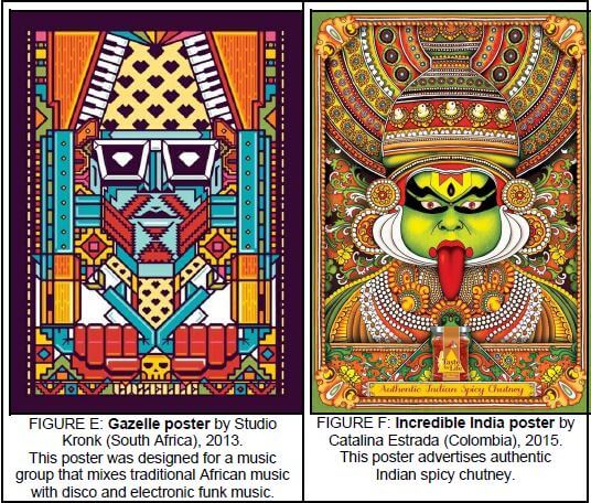
FIGURE E is influenced by the world of electronic games or music forms and inspired by formal, rigid technological patterns while ? FIGURE F shows the influence of traditional Indian patterns and culture. It is inspired by the Indian
dance costumes and the surface patterns of these costumes. ? FIGURE E could also be influenced by the Art Deco/Aztec use of geometric, faceted patterns? whereas FIGURE F, curvilinear patterns could be influenced by organic patterns of nature. ?
FIGURE E targets young, technologically inclined people who, for example, love to play computer games, ? while FIGURE F is targeting people who love Indian cuisine and exotic cultures.?
Both designs are richly patterned.? FIGURE E has a rigid, block-like, machine orientated pattern, whereas the pattern in FIGURE F is more fluent and flowing.? The pattern in FIGURE E creates a zigzag rhythm, whereas the pattern FIGURE F creates a curvilinear, spiralling rhythm.?
FIGURE E uses bright, plastic, pop colours to create a happy fresh feeling, ? whilst FIGURE F is dominated by earthy, warm browns and greens to create a richer surface. ? Both designs make use of strong contrasts which results in dramatic posters. ? FIGURE E uses bright turquoise that contrasts sharply with bright red while in FIGURE F, the lime green contrasts with red.?
The focal point in FIGURE E is from the goggles to the top of the hat because the area uses black and white which is not visible anywhere else.? The shape of the hat is large and dominant.? In FIGURE F the focal point is the face of the deity because it is the large and the only area that does not have pattern on. ? The face is also painted in a bold, garish, neon lime green colour.?
Credit any other valid statements.
NOTE: A maximum of ONLY 3 marks may be allocated for tabular comparison responses. Use the cognitive level grid as a guideline for your marking.
Q3.1 Level | COGNITIVE SKILLS | WEIGHTING | QUESTIONS | MARKS (10) |
Lower order | Remember, Recall, Recognise | 30% | ||
Understand, Explain, Describe | 3.1 | 3 | ||
Middle order | Apply, Implement, Organise | 40% | 3.1 | 4 |
Higher order | Analyse, Compare, Interpret |
30% | 3.1 | 2 |
Evaluate, Reflect | 3.1 | 1 | ||
Synthesise, Justify |
OR
3.2 [10 marks: a maximum of 2 marks per aspect]


A main function of the Colosseum was to hold approximately 50,000 spectators that was used for gladiatorial contests and public spectacles. It was also used for mock sea battles, animal hunts, executions, re-enactments of famous battles, and dramas based on Classical mythology. ? The building ceased to be used for entertainment in the early medieval era. It was later reused for such purposes as housing, workshops, quarters for a religious order, a fortress, a quarry, and a Christian shrine. ?
Although partially ruined, the Colosseum is still an iconic symbol of Imperial Rome. ? It is one of Rome's most popular tourist attractions ?
The Nelson Mandela Stadium functions as a world-class football stadium almost as large as the Colosseum that seats 46 000 spectators. Like the Colosseum it is a multipurpose stadium. ? The stadium also boasts 49 hospitality suites, two business lounges, a gymnasium, and lecture and function rooms. ? There are also two conference rooms situated on the first level, which are able to accommodate 200 people. It was constructed to host 8 games during the 2010 FIFA World Cup which was hosted by South Africa with Port Elizabeth being one of the host cities. ? This was the first time a world-class football stadium has been built in the Eastern Cape province. ?
Both stadiums are monumental, simple, striking structures conveying power. ? The exterior of the Colosseum is very classical in design. ?The surviving part of the outer wall's monumental façade comprises three stories of superimposed arcades surmounted by a podium on which stands a tall attic, both of which are pierced by windows interspersed at regular intervals. The arcades are framed by half-columns of the Doric, Ionic, and Corinthian orders, while the attic is decorated with Corinthian pilasters. ?The outer façade of the Nelson Mandela Stadium by contrast is very contemporary and hi-tech consisting of a unique roof-structure made up of a series of white 'petals' making it look like a flower. ? This billowing roof structure rests on a concrete structure which is geometric and Modernist. ?
Like modern sports stadiums, the Colosseum gave spectators efficient protection from the sun thanks to its innovative roof covering, the Velarium. ? The Velarium was an enormous linen tarpaulin hung by a system of ropes, winches and wooden poles that bound the top of the outer wall. ? It took one hundred sailors to move it. The roof of the Nelson Mandela Soccer Stadium makes use of aluminium cladding alternating with stretched membrane is also designed to protect its crowds from sun and strong wind. ?
The Colosseum's huge crowd capacity made it essential that the venue could be filled or evacuated quickly. ? Its architects adopted solutions very similar to those used by a modern stadium such as the Nelson Mandela stadium to deal with the same problem. ? The Amphitheatre was ringed by eighty entrances at ground level. Each entrance and exit was numbered, as was each staircase. The Nelson Mandela Stadium makes use of 32 turnstiles and colour-coded gates on level 2 for spectators to access their seats and four ramps leading up from level 2 to level 5. ? Built of concrete and sand, the outer wall of the Colosseum was completely covered in splendid travertine stone slabs set without mortar, and held together by tons of irons clamps. ? These building materials reflect the strength and solidity of the Roman Empire. ?
The roof material of the Nelson Mandela stadium consists of a combination of aluminium cladding, combined with a membrane material called polytetraflurethylene (PTFE), which is a coated glass-fibre fabric stretched over a steel superstructure. ?These materials reflect the contemporary, technological age that the stadium forms part of. ?
The arena of the Colosseum had a wooden floor, whereas the arena of the Nelson Mandela Stadium is made up of grass and a drainage system underneath this turf. ?Underneath the arena of the Colosseum were various chambers for holding the wild animals and the gladiators. ?
The Colosseum dominates the city of Rome. ? It was placed both symbolically and precisely at the heart of Rome. ? The Nelson Mandela Bay Stadium is also built in the heart of the city of Port Elizabeth and also dominates its site. ? The Nelson Mandela Bay Stadium is situated on the shores of the North End Lake and overlooks this lake ensuring that it is even more eye-catching. ?
The Colosseum's use of the different classical orders, Doric, Ionic and Corinthian shows the influence of Greek architecture. ? The Nelson Mandela Stadium's use of an oval arena could be influenced by the use of ellipses by Roman stadiums. Its use of innovative, modern materials such steel, glass-fibre, aluminium shows the influence of contemporary, hi-tech architecture. ?
Credit any other valid statements.
NOTE: A maximum of ONLY 3 marks may be allocated for tabular comparison responses. Use the cognitive level grid as a guideline for your marking.
Q3.2 Level | COGNITIVE SKILLS | WEIGHTING | QUESTIONS | MARKS (10) |
Lower order | Remember, Recall, Recognise | 30% | 3.2 | |
Understand, Explain, Describe | 3.2 | 3 | ||
Middle order | Apply, Implement, Organise | 40% | 3.2 | 4 |
Higher order | Analyse, Compare, Interpret | 30% | 3.2 | 2 |
Evaluate, Reflect | 3.2 | 1 | ||
Synthesise, Justify |
TOTAL SECTION A: 30
SECTION B: DESIGN HISTORY [30 marks]
QUESTION 4
4.1 [Allocate 20 marks in total]
[allocate 10 marks for each movement. Note that only 1 mark may be allocated for the name of a designer and product for each movement. Use the cognitive level grid as a guideline for your marking.]
Art Deco (1920 – 1940), design is a shining example of society's response to the political atrocities of World War I which delayed the further development of the style. ? As a result of the turmoil and devastation created by WW1 and the looming possibility of WWII it was definitely all about a hunger for life and a desire for feeling good about self. ? Art Deco established itself with a sense of emotion, enthusiasm, glitz and glamour and playfulness. ? The society was all about prospering. Art Deco's clients during the 20's and 30's were wealthy, fashion conscious art lovers. ? They enjoyed living in luxurious environments, eating out in elegant restaurants and being admired for the couture clothes they wore. ?
Art Deco was changed dramatically by WW2 as the style was seen to be 'too chic' and 'too cheeky' for wartime. ?
Art Deco designers aimed to simplify form and to fit it to suit function. ? Design motifs were reduced to their simplest forms but still maintained their refined sophisticated appearance. ?

The style was applied to all areas of design including architecture, interiors, furniture, fashion, jewellery, painting, graphics, bookbinding, ceramics, costume, glass, silver, metal ware, ceramics and highly ornate head dresses. ?
It borrowed freely from many of the design styles of the past to fashion the future. Some examples are the English Arts and Crafts Movement, the French Art Nouveau and the German Bauhaus Modernists. ? Society's obsession with African sculpture and American jazz encouraged an eclectic interest in international cultures such as Egyptian, Aztec, Oriental art and the Russian ballet. ? The Art Deco style is undoubtedly defined by the skyscraper, the zigzag and imagery evoked by jazz. ?
Furniture was influenced by exotic Oriental veneers, ivory inlays and stylised floral motifs. ? Jaques Ruhlmann's (1879 – 1933) three legged corner cabinet of lacquered rosewood inlaid with ivory, ebony and rare woods was a revolution in the style of the era. ?
Architecture embraced a variety of shapes; from sleek, streamlined curves that were highlighted by painted lines; verticals soaring upward as skyscrapers topped by stepped pyramid shapes. ?

The Orient Express Steam train was the ultimate expression of style and a symbol of mystery and romance. ? The dining car was decorated by the avante garde glassmaker Rene Lalique. Dining on exquisite French cuisine under the watchful eyes of the 'three fates' (goddesses from antiquity) in streamlined form, was very much in fashion. ?
Another example that echoed societies need for travel and speed was the Normandie steam liner launched in 1935. ? The public rooms were decorated in the Baroque style reminiscent of Louis XIV and the court at Versailles. ? Two hundred tables and chairs were set amid a shimmering glass ceiling designed by Rene Lalique. ? Massive pendent ceiling lights were fitted at either end, the walls were veneered in hammered glass and chrome panels that added to the sparkling opulent atmosphere. ? Artificial light emanated from five tiered fountains placed in the centre of its circular banquettes. ?
In America, Art Deco also became highly associated with Hollywood. The costumes, set designs, props for movies, posters, and other Hollywood designs from the 1920s to the 1940s popularised the style but in the end, it was Hollywood's 'Screen Deco' that was responsible for the expiration of the style. ?
Like Art Deco, De Stijl, (which means simply 'the style' in Dutch), was also a response to the politics of World War I. ? De Stijl art was conceived as a universal visual language for the modern era and sought to create a Utopian society to repair the destruction created by World War 1. ? The De Stijl society existed in a new age, an age where machines could streamline human processes to create a new society with balance between individual and universal values. ?
De Stijl aimed to create an abstract style based on geometric forms and primary and neutral colours. ? They focussed on designs where 'form followed function'. ? The movement was against the ornate qualities and envisioned a universal language and a spiritualised world order for the modern society. ?
The reduction of reality to geometric forms, straight lines, squares, and rectangles and primary colours was characteristic of De Stijl art. This was used in a variety of art and design fields for example; architecture, urban planning, industrial design, typography, music, and poetry. ?
A few important concepts influenced De Stijl; the first idea was Neo-Plasticism which refers to the painting style and ideas developed by Piet Mondrian in 1917, and incorporated by De Stijl. Mondrian described Neo-Plasticism as a reductive approach to art making that stripped away traditional elements of art, such as perspective and representation. ?
The second concept was largely inspired by Schoenmaekers's treatise Beginselen der Beeldende Wiskunde (The Principles of Plastic Mathematics), which proposed that reality is composed of a series of opposing forces for example, chaos versus order, male versus female, black versus white and horizontal versus vertical. ?
The third concepts are Elementarism developed by Van Doesburg where not only horizontal and vertical lines were to be used in Neo-Plasticism, but also diagonal lines which created a movement. ?
An example of a De Stijl work that reflects these characteristics is The Scroder House by Gerrit Rietveld, Utrecht, 1924. ? The forms are reduced to simple geometric, flattened forms conveying simplicity and order. ? The colours are reduced to the neutrals, grey, black and white and the textures are smooth. ? These colours and textures also contribute to the overall sense of calmness, balance and control. ?
Credit any other valid statements
Q4.1 Level | COGNITIVE SKILLS | WEIGHTING | QUESTIONS | MARKS (20) |
Lower order | Remember, Recall, Recognise | 30% | 4.1 | 4 |
Understand, Explain, Describe | 2 | |||
Middle order | Apply, Implement, Organise | 40% | 4.1 | 8 |
Higher order | Analyse, Compare, Interpret | 30% | 4.1 | 2 |
Evaluate, Reflect | 2 | |||
Synthesise, Justify | 2 |
4.2 (Allocate 10 marks) 

During the 17th century Baroque era, architect Gian Lorenzo Bernini was commissioned to create a chapel for the Cornaro family. The composition of the interior of the chapel in FIGURE I reflects a typical dramatic, Baroque stage design. ? This is in contrast to the Scandinavian interior design visible in FIGURE J above that focusses on calmness, purity, simplicity and functionality.
Modernist Scandinavian designer Alvar Aalto (1930s – 1970s) saw furniture designs as a natural extension of architectural thinking. His design represents a philosophy that's characterised by functionality, simplicity, clean lines and affordability and this is visible in FIGURE J. ? By contrast to Scandinavian design, when one enters the Baroque Cornaro chapel in FIGURE I the viewer is surrounded by sensual design and illusionary effects. ?
Bernini's careful blending of painting, sculpture, and architecture provides a powerful, spiritual experience for the viewer. ? This is the key characteristic of Baroque interior architecture and the primary artistic goal of the Counter Reformation. One of Bernini's best known sculptures: The Ecstasy of St. Teresa depicts one of the visions of Saint Teresa of Avila. The dramatic Baroque light of this interior is further heightened by the wooden, golden rays of light that radiate from above the pediment, directing the eye towards this sculpture.? Similarly, to the Baroque era the Scandinavian interior designers also consider light to be extremely important. ? In FIGURE J light is not used to create a heightened sense of drama as in the Baroque era (FIGURE I), but is used to create an ambient/soft light using floor, wall or table lamps. ?
The Baroque chapel is filled with a natural light that enters through a concealed window above and behind the sculpture, creating a theatrical atmosphere within a confined space. ? The Scandinavian interior also uses natural light but it is filtered and not so dramatic. ?
The Baroque Cornaro chapel creates an immediate impression of a small, shallow space. ? To maximise the space, Bernini has used ingenious architectural elements; ornate polychromatic, marble columns are accentuated by the broken triangular pediment, with curved edges that push outward, framing the main altar. ? Scandinavian interiors are open plan and left simple and uncluttered. ?
In contrast to Baroques' use of polychromatic marble, ? Scandinavian interior surfaces are characteristically made from woods which were often used on walls, ceilings, cabinetry, and furniture. ? The characteristic earthy muted colours were often combined with white walls and cool blue and grey textiles. In some homes, brighter accents of yellow, orange and turquoise are found, for example with the use of Marimekko fabrics and rugs. ?
Typical of Baroque design is the use of painted stucco figures and clouds on the walls above the pediment in FIGURE I which enhances the height of the ceiling. ? This illusionary technique is characteristic of Baroque interior design and is used to expand the size of the room as well as create a sense of grandiosity. ? In contrast the Scandinavian design in FIGURE J minimises surface decoration and accessories and scales back to create less clutter and fewer visual distractions, promoting the design philosophy 'less is more.' ?
The main purpose of Scandinavian design is to improve daily life. In Scandinavian interiors, there was always a strong relationship between design elements and nature. ? In contrast the main aim of Baroque design was to impress and convey the grandiosity of the Catholic church. ?
Credit any other valid statements.
NOTE: A maximum of ONLY 3 marks may be allocated for tabular comparison responses. Use the cognitive level grid as a guideline for your marking.
Q4.2 Level | COGNITIVE SKILLS | WEIGHTING | QUESTIONS | MARKS (10) |
Lower order | Remember, Recall, Recognise | 30% | 4.2 | 2 |
Understand, Explain, Describe | 4.2 | 1 | ||
Middle order | Apply, Implement, Organise | 40% | 4.2 | 4 |
Higher order | Analyse, Compare, Interpret | 30% | 4.2 | 2 |
Evaluate, Reflect | 4.2 | 1 | ||
Synthesise, Justify |
TOTAL SECTION B: 30
SECTION C: DESIGN IN SOCIO-CULTURAL/ENVIRONMENTAL AND SUSTAINABLE CONTEXT
QUESTION 5 [20 marks]
Answer EITHER QUESTION 5.1 OR QUESTION 5.2
5.1
5.1.1 [Allocate 6 marks]
The mural is painted on a derelict building, brightening and beautifying the drab and broken-down area. The collaborative mural project clearly had as aim the upliftment of an impoverished community and can therefore be called 'socio cultural design'. ? It brings art and design into communities that do not normally have access to it. ? The use of members of the community as partners in the creation of this mural is an acknowledgement of their value and ? supplies an outlet for creative expression. ? This is opportunity instils pride and a sense of identity. ? The message of the image 'Discover the diamond inside you' is very positive and also aims to instil a sense of pride and self-value for the people living in the area. ?
Credit any other valid statements.
5.1.2 [Allocate 14 marks in total]
[Allocate 7 marks per case study - 1 mark for designer and design product]

A local socially responsible design group is Metropolitanrepublic. Their product is The Wimpy Braille Burger. ?
Metropolitanrepublic aim is to do things differently. ? They look at what the business challenge is and come up with business problem solving ideas. ? Their main purpose is to imbue cultural relevance on brands, their products, and their services. They ensure that their designs are culturally relevant and therefore root their ideas in the context in which their audience lives – resulting in advertising that their clients can relate to. ?
Metropolitanrepublic currently has operations in five countries on the continent (incl. SA). ? They think of their employees as citizens of Metropolitanrepublic. ? Unlike agencies that follow a more traditional model, they believe they are in a post-digital era and that all mediums, old and new, have a role to play and are relevant. ?
Metropolitanrepublic started out as an ad agency, a little over three years ago. They don't think of themselves as an ad agency. They create all kind of things, some of which are ads. ?
An analysis of one work explaining how this work addresses social concerns: Metropolitanrepublic created a campaign to include visually impaired in designing braille menus for Wimpy. ? With the help of skilled chefs, sesame seeds were placed on 15 burger buns which in braille described the burger and informed individuals about the availability of the braille menus. ? The braille burgers were delivered to the three biggest blind institutions in South Africa and had an overwhelming emotional impact on the staff at these organisations. ? These descriptions gave these people the ability to 'see' their food before they ate it. ? The look of joy on their faces as they read the message was a clear indication that a little extra attention goes a long way. They couldn't believe that in a world that mostly accommodated sighted people, a restaurant chain would go the extra mile just to make them feel welcome. ? The message was passed on to over 800,000 visually impaired South Africans and the campaign won several awards including a Gold Clio, Gold and Silver Cannes, One Show Gold and a Gold Loerie. ?
The unbelievable word of mouth that was generated from such a small group of people is what makes this advertisement so amazing. Wimpy does an excellent job of reaching a niche market and letting them know that they are appreciated. ? They were able to take advantage of needs that were not currently being met within the sight impaired community and are reaping some serious benefits. ?
CONTEMPORARY INTERNATIONAL: 'Luz nas Vielas,' by Boa Mistura street art collective.
The multidisciplinary art collective Boa Mistura aim to create large scale murals in public spaces with the intention of uplifting and inspiring communities. ? From their studio in Madrid, their projects have taken them as far as South Africa, US, UK, Brazil, Mexico and Algeria.. The main motivation for starting the group was to have fun together, which is reflected in the vibrancy and colour in their work.? Boa Mistura focus largely on graffiti and community building with a mission of giving the world its colour back. ?
The colours that they use are bright and pure. ?The name of the urban art group, which means 'good mixture' in Portuguese, refers to the diversity of perspectives and talents of each of the members which is applied to their work. ? Amongst the team there are architects, engineers, fine artists, graphic designers and advertising specialists. ? Before they embark on a new street art project, Boa Mistura seek the guidance from the most import aspect of a community — the people within it. 'We like to feel the place, talk with the local people, breath the atmosphere and be inspired before start working' Purone said. ?
One work 'Luz nas Vielas,' is in the Sao Paulo favela (shanty town) of Brasilandia. The walls of the town were painted with bright colours, and use a clever visual trick — painted words are used that appear to float when viewed from, a certain angle. ? With words expressing positive emotions like 'Amor' (love) and 'Firmeza' (stability), the project is right in line with the group's mission of uplifting the community. ?
Credit any other valid statements.
Q5.1 Level | COGNITIVE SKILLS | WEIGHTING | QUESTIONS | MARKS (20) |
Lower order | Remember, Recall, Recognise | 30% | 5.1.1 5.1.2 | 1 2 |
Understand, Explain, Describe | 5.1.2 | 3 | ||
Middle order | Apply, Implement, Organise | 40% | 5.1.1 5.1.2 | 3 5 |
Higher order | Analyse, Compare, Interpret | 30% | 5.1.1 | 1 |
Evaluate, Reflect | 5.1.1 | 1 | ||
Synthesise, Justify | 5.1.2 | 4 |
5.2 [20 marks in total]
5.2.1 [Allocate 4 marks]
Yes, I agree with the statement as this laundry basket design is adapted from the isiZulu grain basket, called Isichumo. ? The traditional grain basket is woven with alternating tight and open weave that allows air to circulate so that the grain won't mould, but keeps insects out. ? The same weaving technique is used in this laundry basket as air would circulate to keep it dry. ? The traditional shape of the grain basket has been adapted from a bell shape to an elongated round shape to accommodate laundry. ? This shows how traditional crafts have been adapted for contemporary use, which also makes it relevant in a contemporary world. ?
No, I do not agree with the statement as this causes a loss of traditional items that could communicate negative ideas about a specific community. ? People will forget the original aesthetics, use of natural materials and the original purpose of the isiZulu grain basket. ? This threatens the traditional cultural purposes, identity and preservation of the African continents' rich and diverse history. ? It stays our responsibility to nurture and preserve our indigenous crafts in their original context, purpose, form and aesthetics. ?
5.2.2 [Allocate 6 marks]
Title: ISIZULU INDIGENOUS CRAFT by the Zulu community of South Africa, KZN. The Isichumo-water basket (water tight) ?
This basket, woven by the isiZulu, is a rigid, bottle-shaped basket ? used for carrying and storing liquids (usually water), it has a lid, which fits over the neck like a cap. ? These water baskets are one of the more difficult designs to create, because of the narrow neck and the very tight weaving technique which makes it waterproof. ? Typically, two sizes of this style of basket were created. The baskets are woven with the IIala Palm fronds. ? The early utilitarian baskets were plain in colour. ? A large basket that would be kept in a hut and hold about 30–40 litres of water (typically about two days' worth for a family and its animals). ? A smaller basket (holding about 5–15 litres) that would be used to transport (on top of the women's heads and for up to 8km each way) water from its source to the larger container. ?
5.2.3 [Allocate 10 marks: allocate 1 mark only for the name of the designer and the name of the product] 
Shopping Bag by Binky Newman of Design Afrika. ?
Binky Newman and her team who are highly skilled artisans, founded Design Afrika. Design Afrika combines relevant traditional African and contemporary craft techniques. They aim to nurture the creative and entrepreneurial resourcefulness of rural communities. ? Inspiration for new designs are found by travelling to remote areas across the continent in the hope of finding a basket woven in a style that was previously thought to be extinct. ?
Binky Newman spends a great deal of time in remote villages around Africa, working with marginalised women who have an ancient heritage of weaving baskets. ? For the 2015 collection Binky focuses on the use of geometric patterns, ? hand woven? and organic or manmade materials. ? The shopping bag designed by Design Afrika uses materials like raffia and grass which is not that unusual as it has been used traditionally all over Africa in a variety of forms. ? The shopping bag is a transformed version of the traditional grain baskets. ? Binky has transformed the traditional shape to a more contemporary form. ? By using the traditional African weaving techniques and stitches, Design Afrika successfully created a variety of objects. ?
With this collection, Design Africa has aimed to create a unique and fresh collection. Furthermore, they have blurred the boundaries between; functional and sculptural, ? design and craft ? and high and low craft. ?
Credit any other valid statements.
No marks should be given for repetition of designer/s and their work used in this paper.
Q5.2 Level | COGNITIVE SKILLS | WEIGHTING | QUESTIONS | MARKS (20) |
Lower order | Remember, Recall, Recognise | 30% | 5.2.2 | 1 |
Understand, Explain, Describe | 5.2.2 5.2.3 | 2 3 | ||
Middle order | Apply, Implement, Organise | 40% | 5.2.2 5.2.3 | 3 5 |
Higher order | Analyse, Compare, Interpret | 30% | 5.2.1 | 4 |
Evaluate, Reflect | 5.2.3 | 1 | ||
Synthesise, Justify | 5.2.3 | 1 |
QUESTION 6 [20 marks]
6.1 [Allocate 3 marks]
The term biodegradable in FIGURE M refers to the cardboard frame's capacity to break down or decompose back into natural materials within the natural garden environment ? without leaving any toxins or harmful substances behind. ? In this way the cardboard frame is environmentally beneficial because it breaks down quickly and saves landfill space without harming the environment. ?
Credit any other valid statements
6.2 [Allocate 3 marks]
The economic importance of sustainable design is that it eliminates a negative environmental impact by encouraging recycling through the collection of suitable materials for recycling into design products. ? This practice generates a greater reliance on natural materials that are compatible with the environment. In this regard, designers generate an income from discarded materials left on the landfills. ? At a social level the benefits of sustainable design include knowledge transfer, improved environmental quality and neighbourhood restoration. ?
Credit any other valid statements.
6.3 [Allocate 14 marks]
[Allocate 7 marks per case study – 1 mark for designer and design product]
EXAMPLE OF A SOUTH AFRICAN DESIGNER:

- Name of the designer/design agency or studio and a title of one major project undertaken by the designer. [Allocate 1 mark]
PPC Cement laptop bags by Wren Designs. ? - Brief description and analysis of at least one major project/system undertaken by the design studio.
The PPC Cement laptop bags are made from Pretoria Portland Cement paper bag. ? The layers of the empty PPC paper bag are separated; the top layer is removed and fused with the third layer. These two layers are then bonded together with black cotton to enhance the durability of the bags. ? The paper of the bag is also treated with fusion and coating technologies (nanotechnology liquid glass) to increase the strength of the material. ? The pattern is then drawn, cut and stitched together after the paper has been treated. The bag has two sections and two pockets: one to carry your laptop cables and an iPhone or mouse in the other. A padded divider separates your laptop from any other papers or notes, and the entire inside of the bag is also padded to protect everything that you carry inside it. ? The bags are water resistant, 840g and 39 x 6 x 26.5 cm. The bag closes securely because of the two magnets hidden in the flap, however the strength of these magnets is not strong enough to damage electronic devices. ? - The aims and inspirations with reference to the materials
The origami inspired laptop bag, repurposes empty cement bags, lessening the amount of waste on landfills. ? In this way, minimising the negative environmental impact (carbon footprint). ?
EXAMPLE OF AN INTERNATIONAL DESIGNER 
Name of the designer/design agency or studio and a title of one major project undertaken by the designer [Allocate 1 mark]
Tripty backpack by the Tripty Project. ?
- Brief description and analysis of at least one major project/system undertaken by the design studio
The Tripty backpack is part of The Tripty Project clothing range designed from waste agricultural by-products from pineapples, additionally reclaimed materials from organic small-batch cotton to agricultural material. The Tripty backpack is made from shredded pineapple waste, ? naturally dyed using indigo and natural bark dyes. ? The backpacks come in two colours, a vibrant blue and a pink, both with off-white accents with a canvas-like texture. ? The backpack is both a stylish item and functional product. ? The backpack opens and closes through a front opening. ? - The aims and inspirations with reference to the materials
The Tripty project creates accessories and clothing from reclaimed materials based on an ethical supply chain that is both environmentally and economically sustainable. ? Through their use of renewable resources, they minimise a negative environmental impact by reducing the amount of waste on the landfills. ?
Credit any other valid statements.
Q6 Level | COGNITIVE SKILLS | WEIGHTING | QUESTIONS | MARKS (20) |
Lower order | Remember, Recall, Recognise | 30% | 6.1.1 | 2 |
Understand, Explain, Describe | 6.1.2 6.1.3 | 2 2 | ||
Middle order | Apply, Implement, Organise | 40% | 6.1.1 6.1.2 6.1.3 | 1 1 6 |
Higher order | Analyse, Compare, Interpret | 30% | 6.1.3 | 2 |
Evaluate, Reflect | 6.1.3 | 2 | ||
Synthesise, Justify | 6.1.3 | 2 |
TOTAL SECTION C: 40
GRAND TOTAL: 100