DESIGN PAPER 1 GRADE 12 (THEORY) MEMORANDUM - NSC PAST PAPERS AND MEMOS NOVEMBER 2017
Share via Whatsapp Join our WhatsApp Group Join our Telegram GroupDESIGN PAPER 1 (THEORY)
GRADE 12
MEMORANDUM
NATIONAL SENIOR CERTIFICATE
NOVEMBER 2017
SECTION A: DESIGN LITERACY
QUESTION 1: 'UNSEEN' EXAMPLES
Candidates answer EITHER QUESTION 1.1 OR QUESTION 1.2.
1.1 (10 marks in total)
1.1.1 (Allocate 8 marks: a maximum of 2 marks each per element/ principle)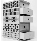
- Rhythm: The use of a variety of repetitive geometric shapes creates a rhythmic optical movement. ✓ The drawers are of equal size and shape, each with holes that acts as handles; these holes create a rhythmic motion or movement. ✓The repeated vertical striped lines also create rhythmic motion.✓ Repeated horizontal rhythmic lines accentuate the elongated appearance of the product. ✓ The repetitions of the drawers create rhythm. ✓
- Texture: The furniture piece is made from a soft, smooth wood, which emphasises a soft, silky effect. ✓ The painted patterns are smooth and flat that create the impression of tactile texture. ✓ The repeated horizontal lines also give an illusion of texture. ✓ The layered plywood of the drawers creates a tactile texture. ✓
- Contrast: The eclectic historical motifs are responsible for the strongest contrast. ✓ The varied Scandinavian inspired Marimekko patterns on the side of the drawers' contrast strongly with the pattern on top or below it. ✓ The varnished wooden draws are unadorned and contrast with the patterned surface designs seen on the sides.✓ The two-dimensional shapes contrast with the box like three dimensional form of the piece of furniture. ✓ Colour contrasts of black and grey are visible in the dominant monochromatic colour scheme. ✓ The warm orange dots, the pink triangles and dots also contrast with the monochromatic colour scheme. ✓
- Shape: The two sides are decorated from top to bottom with two-dimensional shapes. ✓These shapes are flat, stylised and geometric reminiscent of traditional ethnic patterns. ✓ The shapes are repeated to form patterns, which are placed in horizontal bands. These are stacked on top of each other to create a complex and interesting patterned surface. ✓
Credit any other valid statements.
1.1.2 (Allocate 2 marks)
The term totemic refers to stacking or layering. ✓ In the furniture piece of FIGURE A stacked patterns and drawers form the design. ✓ (It is a current Postmodernist trend to create different pluralistic layers of interpretation or references.) The traditional pole is also created from layed of wood that stacked on top of each other. Each layer of wood reflects meaning and symbolic value. ✓
| Q1.1 LEVEL | COGNITIVE SKILLS | WEIGHTING | QUESTIONS | MARKS (10) |
| Lower order | Remember, Recall, Recognise | 30% | 1.1.1 | 1 |
| Understand, Explain, Describe | 1.1.2 | 2 | ||
| Middle order | Apply, Implement, Organise | 40% | 1.1.1 | 4 |
| Higher order | Analyse, Compare, Interpret | 30% | 1.1.1 | 1 |
| Evaluate, Reflect | 1.1.1 | 1 | ||
| Synthesise, Justify | 1.1.1 | 1 |
OR
1.2 (10 marks in total)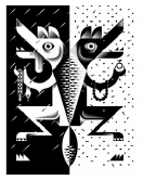
1.2.1 (Allocate 8 marks: a maximum of 2 marks each per bullet)
- Negative space: The illustration makes use of a dramatic balance between negative and positive space by bold use of black and white contrast. ✓ The composition is split in half and the left side is an inversion of the right side to emphasis a duality in the image. ✓ We have to read the negative space of the illustration to fully see the whole image. Some people might read or interpret the use of the negative space as positive or vice versa which makes the experience of the design more interesting and the meaning ambiguous. ✓ Closer inspection reveals the face of a bird/wolf/jackal/dog or crocodile seen within the negative and positive spaces. ✓ Additionally the shield and spear in the negative and positive spaces in the middle are used to highlight the message of the design campaign. ✓
- Movement: Strong diagonal lines, geometric and stylised shapes are utilised throughout the illustration to create movement. ✓ On the left hand side of the background the illustrator makes use of diagonal slashes and on the right he uses dots and squiggles to create dynamic movement. ✓ The middle of the composition creates a strong vertical downward movement. Horizontal lines are emphasised in the centre pattern, and along legs and jaws allowing the eye to move across the picture plane. ✓ Patterns within the shield/spear create an optical movement with the use of repetitive shapes. ✓ The tonal contrast creates an optical illusion. ✓
- Balance: At first glance the illustration is perceived as symmetrically balanced conveying order. ✓ On closer inspection one finds slight differences on either side of the design that could classify the design as asymmetrically balanced. ✓ On the left side the bird's tongue hangs out and in his claws he is holding a dead snake. On the right the bird presenting a diamond ring and a necklace or neckpiece. These differences give the work more energy and support the male/ female symbolic dichotomies (opposites) explored by the work. ✓ The equal weighting of black and white creates a visual balance. ✓ The black and white colour usage also creates a symbolic balance between life and death. ✓
- Line: The illustrator makes use of bold, hard-edged, straight lines ✓ that creates a clean design full of movement, textures and patterns. ✓ An illusion of line is created through contrast that splits the composition vertically in half. ✓ Lines are angular and that enhances the stylistic approach to the design. ✓ The use of curved lines softens the hard-edged motifs. ✓
Credit any other valid statements.
1.2.2 (Allocate 2 marks)
The term 'stylised' means to simplify and flatten reality, reduction of detail or economy of detail.✓ In FIGURE B the illustration is stylised through the use of clean straight line, ✓ geometric, angular shapes ✓ and repeated scalloped patterns to create a striking design with decorative appeal. ✓ Although reality has been simplified the design is complex and has symbolic hidden meanings. ✓
Credit any other valid statements.
| Q1.2 LEVEL | COGNITIVE SKILLS | WEIGHTING | QUESTIONS | MARKS (10) |
| Lower order | Remember, Recall, Recognise | 30% | 1.2.1 | 1 |
| Understand, Explain, Describe | 1.2.2 | 2 | ||
| Middle order | Apply, Implement, Organise | 40% | 1.2.1 | 4 |
| Higher order | Analyse, Compare, Interpret | 30% | 1.2.1 | 1 |
| Evaluate, Reflect | 1.2.1 | 1 | ||
| Synthesise, Justify |
QUESTION 2: COMMUNICATION THROUGH DESIGN
2.1 (10 marks in total)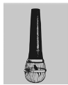
2.1 (Allocate 6 marks: a maximum of 2 marks each per symbol)
The microphone ✓ symbolises an amplified voice, a technological tool used to convey speech in an audible manner. ✓
The upside-down microphone ✓ symbolises a restricted, muted voice or opinion. ✓ A bird in a cage ✓ symbolises imprisonment, building on the metaphor 'as free as a bird'. ✓ The caged bird also represents a speaker whose thoughts are caged. ✓ The cage symbolises the never-ending cycle of containment and the entrapment of the speaker. ✓ The upside-down microphone symbolise the voice of people that are not often heard. ✓
2.2 (Allocate 2 marks)
In order of importance a bold black microphone is placed centrally against a luminous yellow background of the poster, creating a bold contrast that leads the viewer's eyes downwards. ✓ Additionally, the tapered shape of the microphone leads the viewer eye to the focal point of the design. ✓ The cage housing the bird like a prisoner is second in the hierarchy of importance. ✓The image of the bird is the last on the level of importance because it is placed lower on the page and is tiny in size. ✓ Credit must also be given to learners that highlight the cultural hierarchy when answering the question.
2.3 (Allocate 2 marks)
The bright, pure yellow attracts the eye ✓ and ensures that the black microphone is accentuated which emphasises the denial of free speech. ✓ The colour yellow conveys feelings of warmth, life and freedom ✓ whereas black symbolises death of free speech.✓
Credit any other valid statements.
| Q2.1 LEVEL | COGNITIVE SKILLS | WEIGHTING | QUESTIONS | MARKS (10) |
| Lower order | Remember, Recall, Recognise | 30% | ||
| Understand, Explain, Describe | 2.1.1 | 3 | ||
| Middle order | Apply, Implement, Organise | 40% | 2.1.1 2.1.2 | 3 1 |
| Higher order | Analyse, Compare, Interpret | 30% | 2.1.1 | 2 |
| Evaluate, Reflect | ||||
| Synthesise, Justify | 2.1.1 | 1 |
QUESTION 3 (10 marks in total)
Candidates answer EITHER QUESTION 3.1 OR QUESTION 3.2.
3.1 (Allocate 10 marks: a maximum of 2 marks each per aspect)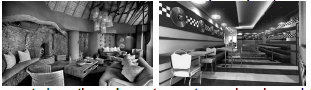
FIGURE D uses muted, earthy colours to create a relaxed mood ✓whilst bright, primary colours to create a youthful, energetic and cheerful scene dominate FIGURE E. ✓ The colours in FIGURE D are natural, such as greys and different browns etc. which is in contrast to the 'funky' colours in FIGURE E that are created by the plastic decorations and the silver chrome of steel.✓
FIGURE D is influenced by the forms and materials of the organic African landscape ✓ while FIGURE E shows the influence of contemporary urban life. ✓ FIGURE D is inspired by the calmness and the quietness of the wilderness ✓ unlike FIGURE E that is inspired by the vibe of a fast cosmopolitan life. ✓ Figure E clearly shows an eclectic style that is influenced by Pop and De Stijl. ✓ Figure D could be influenced the Arts and Craft movement. ✓
FIGURE D targets people who would want to relax, rest, be calm and be part of nature. ✓ FIGURE E in contrast, targets young, urban people who like a vibrant, quick life and fast foods. ✓ FIGURE D also targets tourists who want to explore and experience South African wildlife unlike FIGURE E that targets people who eat fast food. ✓
The environment in FIGURE D functions as accommodation ✓ for wealthy people ✓, especially tourists, who are on vacation, whereas FIGURE E is meant to function as a fast food restaurant for everyone. ✓ Both are used for entertainment and to celebrate special occasions. ✓
Most of the materials used in FIGURE D are organic and natural whilst the material in FIGURE E is mostly artificial, plastic and colourful. ✓ The material used in FIGURE D gives the environment a peaceful feeling as opposed to the material in FIGURE E that looks rigid, hard and angular. ✓FIGURE E relies on artificial lighting materials whereas FIGURE D utlises natural lighting sources. ✓
Credit any other valid statements.
| Q3.1 LEVEL | COGNITIVE SKILLS | WEIGHTING | QUESTIONS | MARKS (10) |
| Lower order | Remember, Recall, Recognise | 30% | 3.1 | 1 |
| Understand, Explain, Describe | 3.1 | 2 | ||
| Middle order | Apply, Implement, Organise | 40% | 3.1 | 4 |
| Higher order | Analyse, Compare, Interpret | 30% | 3.1 | 2 |
| Evaluate, Reflect | ||||
| Synthesise, Justify | 3.1 | 1 |
OR
3.2 (Allocate 10 marks: a maximum of 2 marks each per aspect)
Hadrian's Villa was constructed to function as a retreat from Rome for the Roman Emperor Hadrian. ✓ The Palace of the Lost City can also be seen as a retreat, ✓ a luxury hotel that offers an escape for city people from everyday demands into a make-belief ancient royal residence. ✓ The visitor is transported back in time into an opulent fantasy world of water features and jungle attractions. ✓Hadrian also used Hadrian’s villa later in his reign, to govern his empire. ✓ A large court had to be accommodated there permanently with space for visitors and bureaucrats to be entertained and temporarily housed on site. ✓ The Palace of the Lost City by contrast is only used as a holiday destination. ✓
One of the classical structures in Hadrian's Villa is the so-called 'Maritime theatre' which included a library, heated baths, three suites with heated floors, an art gallery and a large fountain. ✓ In concept this recreational space is very similar to the many recreational spaces offered by the Palace of the Lost City as it also includes spa baths, Jacuzzi's and saunas, restaurants, ballrooms and an auditorium used to entertain to keep the masses occupied. ✓
Hadrian's Villa's layout covers a vast area of land and includes many pools, baths, fountains and classical Greek architecture. ✓ It is set in what would have been a mixture of landscaped gardens, wilderness areas and cultivated farmlands.✓ The Palace of the Lost City also stretches over a vast area of land and also includes many water features such as streams, waterfalls, fountains and pools. It also consists of loose standing classical structures such as a triumphal arch.✓ Whereas the Palace of the Lost City has one large structure that dominates the site, Hadrian's Villa consists of many different structures spread out in a natural layout, making it less imposing to the site it occupies.✓
With regard to materials, both complexes make use of marble in their mosaic floors. ✓ Hadrian's villa's buildings are constructed in travertine, brick, lime, concrete and tufa (a very light stone). ✓ The Palace of the Lost City is largely constructed from modern concrete and steel but on the exterior makes use of a lot of traditional materials such as marble and wood. ✓
Hadrian's Villa was constructed in the picturesque, idyllic landscape around Tibur (modern day Tivoli), a popular site for villas and retreats in that time. The site was chosen due to its abundant waters and readily available aqueducts that passed through Rome. ✓The site of the Palace of the Lost City is far wilder as it is placed in a dense African bushveld setting, away from urban living. ✓
Hadrian's Villa shows the influence of many different architectural styles. The Maritime theatre exhibits a classical Greek Ionic style, whereas the domes of the main building show the influence of Roman architecture. ✓ A sanctuary that Hadrian saw in Egypt influences the elongated canal and imitation of a grotto.✓ The Palace of the Lost City uses mosaics, frescoes, fountains and colonnaded arches which all originate in Roman times. ✓ The many domed towers and roofs are reminiscent of Byzantine or North African mosques or Zulu huts. ✓ Hand carved wooden furniture, elephant tusks, wildlife carvings, a life-size bronze elephant, murals of the African landscape, animals and birds all reflect the influence of Africa. ✓
Credit any other valid statements.
| Q3.2 LEVEL | COGNITIVE SKILLS | WEIGHTING | QUESTIONS | MARKS (10) |
| Lower order | Remember, Recall, Recognise | 30% | 3.2 | 1 |
| Understand, Explain, Describe | 3.2 | 2 | ||
| Middle order | Apply, Implement, Organise | 40% | 3.2 | 4 |
| Higher order | Analyse, Compare, Interpret | 30% | 3.2 | 2 |
| Evaluate, Reflect | ||||
| Synthesise, Justify | 3.2 | 1 |
SECTION B: DESIGN HISTORY
4.1 (Allocate 20 marks)
Modernism
EXAMPLE: VW Beetle by Ferdinand Porsche✓
Modernism was the first movement that aimed to address the turmoil created by the devastation of the war at the beginning of the 20th century and so rebuilt the environments and changed the way people lived. ✓ Design became an important means for countries that had been defeated by the cost of the war to re-establish themselves in the world trade market. Individual countries combined design with industry aimed to create an international style. ✓ A search for a 'style for the age' resulted in a streamlined style that symbolised the present modern day and the future. ✓Modernist designers aimed to solve society's' problems. A good example of one design that influenced people's actions and opinions was the Volkswagen beetle car developed in Germany as means of providing cheap efficient transport for the public. ✓ Designed in the 1930s as a small car that could transport two adults and three children at 100 km/h the Volkswagen beetle became the best-selling vehicle in the USA in the first half of the 20th Century.
America became the design leader of the world because of its advanced attitude to towards industry and the influx of designers from Europe after the war. The good economy in America resulted in a style-conscious wealthy, mass market, eager to buy and consume new products. ✓ New developments in aerodynamics and hydro dynamics, and the modernist phenomenon of fast travel by train, automobile and aeroplane influenced the streamlined shape that resulted from these experiments. The streamlined style became extremely popular and was applied to a variety of products from motor vehicles such as the Volkswagen beetle to toasters. ✓ Large design companies were established that provided employment for many categories of designers, marketing and public relations specialists. This style therefore influenced the way people lived in a fast-paced modern world. ✓
The influence of the analytical approach taken by the Bauhaus resulted in the standardisation and simplification of designs, placing emphasis on mass-produced goods using new technology and new materials. ✓ The development of new materials such as aluminium a range of plastics which included Bakelite improved the quality of design and the mass-production cost. ✓ Chromium was used on the bumpers of the Volkswagen beetle an ideal finish as it was resistant to corrosion. ✓
The designers of the modernist age aimed to appeal to a worldwide mass market that was eager to purchase stylish inexpensive products that functioned well. A wide range of new kinds of products such as plastic stacking chairs and radios and domestic appliances made people's lives easier. ✓ The Volkswagen beetle took America by storm because it was economical and affordable to the masses. Besides the shape, one other revolutionary feature included a rear-mounted air-cooled engine. It was engineered to be mechanically simple which aimed to keep the running costs of the vehicle very low. ✓
The Modernists advocated the characteristic of abstraction and aesthetics thus they often focussed on the essence of the structure. The distinctive characteristic teardrop shape of the Volkswagen Beetle is good example of the curved shapes used in early streamlining that became the ideal shape for transportation design, affording the average working class the opportunity to own their own vehicle. ✓Improved technology had an impact on colour as new chemical dyes became available, all made from man-made components as opposed to the previous animal and vegetable dyes. The VW beetle was available in a wide range of colours and often customised by its owners, most notably the painting of psychedelic patterns during the 1960s. ✓
Art Deco
EXAMPLE: Chrysler Building by William van Alen ✓
The Art Deco movement began as a reaction to the deprivations caused by the 1st World War. The style aimed to address the increased population of the cities as a result of the Industrial Revolution and the increased demand for machine made goods and entertainment. ✓ Machinery was extensively used to meet the day to day needs of city dwellers. The need to escape the depression that surrounded them was a major influence on Art Deco and design provided the answer. Many designers turned to exotic influences taking their inspiration from antiquity, ancient Egypt and Aztec civilizations, Cubism, Fauvism and Modernism. ✓ Design motifs were reduced to their simplest form but maintained their refined sophisticated appearance. This style was applied to architectural, interior, textile and graphic design. ✓ Art Deco created exotic, theatrical environments padded with beautiful, luxurious tiles, materials and wallpapers. This formed the means of escapism for the people of the times which emphasised the way people lived during the era. ✓
The Chrysler Building in New York is a classic example of Art Deco architectures' characteristics and considered by many contemporary architects to be one of the finest buildings in New York City it was designed by architect William van Alen for a project of Walter P Chrysler. When the ground breaking occurred on 19 September 1928, there was an intense competition in New York City to build the world's tallest skyscraper. The style of the building changed the shape of the New York skyline and became a landmark epitomising the new modern era of celebrating humanity. ✓ Walter Chrysler was the chairman of the Chrysler Corporation intended to make the building into Chrysler's motor vehicles' headquarters, meeting the high demand for motor vehicles.✓ The machine age had changed people's lives making travel faster than before. Speed became an obsession and began to influence design. ✓ Various architectural details and especially the building's gothic inspired gargoyles were modelled after Chrysler automobile products like the hood ornaments of the Plymouth which exemplifies the machine age in the 1920s. ✓
The Chrysler Building is considered a leading example of Art Deco architecture. The corners of the 61st floor are graced with eagles; on the 31st floor, the corner ornamentations are replicas of the 1929 Chrysler radiator caps. ✓ It is constructed of masonry, with a steel frame, and metal cladding. The building currently contains a total of 3 862 windows on its facades. Inside, there are four banks of 8 elevators designed by the Otis Elevator Corporation.✓ The building was declared a National Historic Landmark in 1976, and a New York City Landmark in 1978 this shows how design impacts on people's lives changing their opinions actions and the way they live their lives. ✓ The Chrysler Building is also renowned and recognised for its terraced crown, composed of seven radiating terraced arches, inspired by the Egyptian pyramids and sunburst patterns of the Aztecs. ✓ Here the influence of African and Egyptian art is evident in the emphasis on stylised forms which contributed to the direct and simplified approach of the art Deco style. ✓
Van Alen's design of the crown is a cruciform groin vault constructed into seven concentric segments. The stainless-steel cladding is ribbed and riveted in a radiating sunburst pattern with many triangular vaulted windows.✓ The entire crown is clad with silvery 'Enduro KA-2' metal, a stainless steel developed in Germany. ✓
Credit any other valid statements
| Q4.1 LEVEL | COGNITIVE SKILLS | WEIGHTING | QUESTIONS | MARKS (10) |
| Lower order | Remember, Recall, Recognise | 30% | 4.1 | 4 |
| Understand, Explain, Describe | 2 | |||
| Middle order | Apply, Implement, Organise | 40% | 4.1 | 8 |
| Higher order | Analyse, Compare, Interpret | 30% | 4.1 | 2 |
| Evaluate, Reflect | 2 | |||
| Synthesise, Justify | 2 |
4.2 (Allocate 10 marks)
The bed in FIGURE H is inspired by the art and architecture of the Classical age. The Renaissance period in Europe which aimed to represented a change of views, beliefs and mind-sets showed a shift in focus to humanism and the rational mind. ✓ The rise of humanism in the Renaissance period signified a return to reason, individualism, logic thought, science and Classical ideals as seen in FIGURE H. ✓ FIGURE I by contrast, represents the De Stijl movement which was heavily influenced by the Dutch tradition of logic, severity and clarity, ✓ aimed at a style in which content and subject were simplified to the basic building blocks of visual expression developed as can be seen in the geometric shapes and primary colours. ✓
The Classical ideals of harmony are seen in the symmetry, proportion and balance of the bed in FIGURE H.✓ The bed in FIGURE I shows how the De Stijl movement used the fundamentally harmonious principle of geometry with the use of only straight lines, squares, and rectangles, combined with a strong asymmetricality; the predominant use of pure primary colours and black and white. Harmony is also evident in De Stijl's' relationship between positive and negative elements in the arrangement of non-objective forms and lines. ✓
De Stijls' establishment of the use of pure abstraction to achieved universality is evident in FIGURE I through a reduction to the essentials of form and colour. ✓ They simplified their visual compositions to vertical and horizontal only and the use of only black, white and the primary colours. In contrast to this the Renaissances encouragement of observation direct from the natural source, encouraged an accurate reflection of nature in form and colour and an aim to achieve idealism and perfection. ✓On the contrary De Stijl, finds its expression in the abstraction of form and colour in the straight line and the clearly defined primary colour. ✓ De Stijl only allows primary colours and black and white, only squares and rectangles, only straight and horizontal or vertical lines. ✓
The influence of Classical mythology is evident in the Renaissance in the use of decorative motifs on the bed in FIGURE H. ✓ This richly decorated style of the Renaissance known as grotesque, featured a combination of scrolling plants, figures and fantastic creatures, based on ancient Roman frescos that were discovered in Italy in the late 15th century. ✓ A popular feature of this decorative Renaissance style incorporated into furniture design were carved busts of important people or the patrons, mostly in profile and framed by elaborate circles of foliage known as a roundel seen in FIGURE H which is thought to have been an influence from ancient Roman coins. ✓
The De Stjjl bed in FIGURE I gives no recognition to individualism and ignores the particulars of appearance, natural form and colour. ✓ The Renaissance encouraged freethinking and commonly held beliefs that stemmed from medieval times were questioned. The focus shifted to observation and research that encouraged innovation and many new scientific discoveries including perspective, and aerial perspective. ✓ The De Stijl movement was heavily influenced by the theories of the Dutch philosopher Schoenmaekers, who believed that nature could be reduced to binary opposites and basic lines forms and shapes. ✓ The artistic philosophy that formed provided a basis for the De Stijl's work which is known as neoplasticism—the new plastic art.
Credit any other valid statements.
| Q4.2 LEVEL | COGNITIVE SKILLS | WEIGHTING | QUESTIONS | MARKS (10) |
| Lower order | Remember, Recall, Recognise | 30% | 4.2 | 2 |
| Understand, Explain, Describe | 4.2 | 1 | ||
| Middle order | Apply, Implement, Organise | 40% | 4.2 | 4 |
| Higher order | Analyse, Compare, Interpret | 30% | 4.2 | 1 |
| Evaluate, Reflect | 4.2 | 1 | ||
| Synthesise, Justify | 4.2 | 1 |
SECTION C: DESIGN IN SOCIO-CULTURAL/ENVIRONMENTAL AND
SUSTAINABLE CONTEXT
QUESTION 5 (20 marks in total)
Candidates answer EITHER QUESTION 5.1 OR QUESTION 5.2.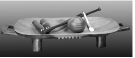
5.1
5.1.1 (Allocate 2 marks)
The design in FIGURE J shows sensitivity to the needs of the visually impaired. ✓ Sesame seeds are placed on the burger to form braille so that the blind person can feel and know what he/she is eating. ✓ It is rare that products are designed to consider the experience of physically challenged people, especially about food. ✓ Wimpy designed a braille menu for this. ✓
5.1.2 (Allocate 2 marks)
In order to qualify as socially responsible designers, one should consider the needs of all people including minorities and physically challenged ✓ that make up our society. This practice of celebrating inclusivity changes mindsets in creating harmony and tolerance among all people. ✓ The target market is made larger through inclusive design practice. ✓In this case blind people are given independence to make their own choices. ✓
5.1.3 (Allocate 2 marks)
Traffic lights that buzz for the blind pedestrians to signal when it is safe to cross the road. ✓ Parking bays that are wider and situated at the entrances of malls and shops for the physical challenged. ✓ Motion sensitive doors pads that will automatically open for the blind and/or the physically challenged. ✓
5.1.4 (Allocate 14 marks; 7 marks per designer: 1 mark for designer and design
product)
Example: A typical Streetwires product is Stack of cows ✓
Streetwires is a local craft business and community development project, established by Patrick Schofield, Winston Rangwana and Anthony Ressel. The business focuses on producing street wire art, a uniquely southern African genre. Its aim was to tackle the problems of unemployment and poverty in our country. ✓
In the beginning only two wire artists were employed on a part-time basis, using a room in Schofield's house as their workspace. The business grew, resulting in two larger premises. The Cape Town studio reveals a business based on quality control. ✓A design team is creating new wire-art designs and once designs have been approved, templates are made and passed on to the wire crafters who work as a collaboration to manufacture the product. ✓To maintain a high standard the team leader ensures that the template design is adhered to exactly and that it is passed through quality control before being released.✓
The company believes that the major hurdle facing our country is unemployment. ✓ Not only is it the leading cause of numerous social ills such as poverty, it also hampers community growth and development. ✓ With this in mind, the aim is to create meaningful long-term employment for as many South Africans as possible to improve the life of South Africans. This provides a workplace, permanent employment, a sense of purpose and access to skills training, development of individual artists and creating outreach initiatives in orphanages, schools and impoverished communities. ✓
Objects produced are both decorative and functional such as beaded promotional items and gifts (e.g. key rings, paperclips with a logo top, business-card holders), working radios, various models of cars in wire or beaded wire and animal, bird and human sculptures. ✓The shapes and forms are highly stylised and simplified, incorporating an element of fantasy and humour. ✓ Bright colours and simple, curvilinear outlines dominate. The technique of wire art dominates, incorporating materials such as beads, cut-up tin cans and bottle caps. ✓
The beaded work reflects simplicity, stylisation, whimsical, quirky, childlike and naïve qualities. ✓ It is made out of wires and beads and recollects and reflects the value of livestock in African cultures. ✓The beads used are monochromatic and ranges from dark coloured cow to a white cow. ✓ The horns are threaded with red beads. ✓
Allocate 7 marks: 1 mark for designer and design product
Jonathan Barnbrook is an International British Graphic designer and typographer who uses his graphic design, fonts/typeface to respond to social, cultural and political events and in that way to benefit the community. ✓
He said in his 'First Things First 2000' manifesto that designers should be conscious of the power that their crafted message can have on mass-media. ✓
The Barnbrook studio is notable for its belief in the ability of graphic design to facilitate social change. ✓ Barnbrook's output is deeply thought provoking, from his corporate identity to his magazine work, his typeface, his industrial designs and CD covers. ✓In one of his projects Friendly Fire he confirmed that graphic design is a social and political tool weapon. ✓On a billboard in Las Vegas, Barnbrook said: 'Stay away from corporations that want you to lie for them'. ✓ He regularly responds to all the unfairness in this world and attempts to expose this to society to 'benefit their lives'. ✓
Some of his well-known fonts include Bastard, Exocet, False Idol, Infidel, Moron, Sarcastic – many reflecting Barnbrook's emotive and provocative style and themes. ✓
Example:
Most of his ideas, compositions and his typeface, designed to agitate the reader, are captured in his first monograph, Barnbrook Bible. Designed to challenge, if not agitate the reader, the book is so deliberately kinetic (movement in the lay-out) and chaotic that it requires time and effort to decipher. ✓Once the reader has deciphered or decoded his lay-outs and style, the design can be appreciated as a personal expression in the service of mass communication, usually containing a social or political agenda. ✓ Barnbrook Bible's political commentary is evident - American foreign policy and global corporatism are his main targets. ✓For example, he has combined Ronald MacDonald and Osama Bin Laden into one single iconic character which is witty but also has a higher purpose that encourages critical thinking. ✓It is easy to dismiss Barnbrook's political work as typographic cartooning but it is underpinned by serious social commentary. ✓
Credit any other valid statements.
| Q5.1 LEVEL | COGNITIVE SKILLS | WEIGHTING | QUESTIONS | MARKS (10) |
| Lower order | Remember, Recall, Recognise | 30% | 5.1.1 5.1.2 5.1.4 | 2 1 2 |
| Understand, Explain, Describe | 5.1.3 | 1 | ||
| Middle order | Apply, Implement, Organise | 40% | 5.1.2 5.1.3 5.1.4 | 1 1 6 |
| Higher order | Analyse, Compare, Interpret | 30% | 5.1.4 | 2 |
| Evaluate, Reflect | 5.1.4 | 2 | ||
| Synthesise, Justify | 5.1.4 | 2 |
5.2 (20 marks in total)
5.2.1 (Allocate 2 marks)
No, the traditional products in FIGURE K will not function with the same ease and precision as modern products do. ✓ Technology has improved the materials that contemporary products are made from in comparison to the materials used for traditional products. Improved robot machines can produce a more accurate, finely honed finish for cutting and grinding products. ✓
Yes, the traditional products in FIGURE K are still useful today for people who wish to remain true to their traditional roots. ✓ Many traditionalists believe that hand-made craft products are far more superior in function and quality of material compared to contemporary products made with cheaper materials and inferior quality. ✓ The product is used for traditional, cultural and ceremonial purposes. ✓The product could be used in a modern context to decorate interiors. ✓ These products are used for the tourist market.✓
Credit any other cultural and symbolic uses.
5.2.2 (Allocate 8 marks)
Wall paintings by the Ndebele community (women). ✓
To begin a wall painting, the craft artists divide the wall into sections and then snap chalk lines diagonally across each section. ✓ The walls are originally whitewashed limestone. ✓ The colours added to make the paintings were mostly natural pigments consisting of browns, blacks, and ochres. ✓ The artists begin painting the black outline of the design for each section. ✓ Painting is done freehand, without a scale design layout done beforehand. ✓ Neither rulers nor squares are used, and yet symmetry, proportion and straight edges are exactly maintained. ✓ A black outline is set around colours, with white spaces offset against painted areas. ✓ After the colour has been applied, the final step is to repaint or touch up the black outlines. ✓The earliest paintings were done with earth pigments, whitewash and laundry bluing. ✓Although commercial paints have replaced the older pigments, the craft artists still use chicken feathers as paintbrushes. ✓
Ndebele painters distinguish styles and origins among different forms of mural decoration. The walls are painted with patterns that are usually repeated throughout their design with only a very slight variation and different colour choice. ✓ The colour white is always used as the background because it makes the bright patterns bold.✓These geometric patterns and shapes are first drawn with the black outline and later filled in with colour. ✓The patterns are grouped together throughout the walls in terms of their basic design structure, creating the space for accuracy and freedom.✓ Most of the patterns were of a V shape and a very simple triangle on a large shape of colour. ✓ There are five main colours represented in the pattern: red, yellow, blue, green, and sometimes pink.
The patterns are one of the most important aspects in their communication through painting. ✓ The colours give an intensified symbolic meaning to the Ndebele.✓ The vibrant symbols and expressions portray communications of general messages.✓
Credit any other valid statements.
5.2.3 (Allocate 10 marks)
Ronel Jordaan. Ndebele tribal Chair✓
The work is a chair that looks like a big, pliable and collapsing grass basket but it is made from felt.✓ It is lying on its side with the lid forming a seat.✓ The lines of the weave technique form concentric circles.✓ The colours are muted greys and blues creating a cool effect.✓ The weaving technique is similar to the grass mat weaving technique used by indigenous cultures.✓ She uses wool, which is dyed, card combed and spun✓ To make the products, the cotton is brushed into thin threads then hand-woven into an assortment of items✓
Ronel Jordaan's materials and work processes are ethical in which she considers the environment and the user. The water she uses is known as waste grey water because it is recycled into organic food gardens ✓ These lush sun drenched gardens grow in containers on the factory grounds situated in a small industrial suburb in Johannesburg South Africa.✓ The vegetables, mainly morogo and spinach are for the women to take home or sell.✓
Ronel uses soap from South Africa that is fully biodegradable.✓ Although the dyes are imported from Germany, they have been specifically chosen because they are lead free and meet European Eco-Standards.✓ The wool Ronel uses does not undergo a process called carbonization.✓The Ronel Jordaan™ label is equally harmonious with nature. The processes implemented in the workshop are all eco-friendly. ✓
Credit any other valid statements.
NO marks should be given for repetition of designer(s) and their work used in this question paper.
| Q5.2 LEVEL | COGNITIVE SKILLS | WEIGHTING | QUESTIONS | MARKS (10) |
| Lower order | Remember, Recall, Recognise | 30% | 5.2.3 | 1 |
| Understand, Explain, Describe | 5.2.1 5.2.2 5.2.3 | 1 2 2 | ||
| Middle order | Apply, Implement, Organise | 40% | 5.2.1 5.2.2 5.2.3 | 1 2 5 |
| Higher order | Analyse, Compare, Interpret | 30% | 5.2.2 | 4 |
| Evaluate, Reflect | 5.2.3 | 1 | ||
| Synthesise, Justify | 5.2.3 | 1 |
QUESTION 6 (20 marks in total)
6.1 (Allocate 6 marks)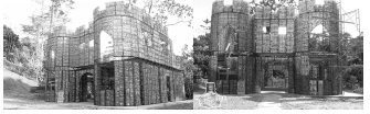
Water conservation is emphasised by building this house using recycled plastic bottles that conserves water, as opposed to traditional building materials like concrete that require more water usage.✓The use of these water bottles to build ensures that they do not find their way into our oceans, rivers and dams. ✓ The use of recycled plastic in FIGURE L enhances the importance of water conservation by highlighting the use of recycled water bottles. ✓
Energy efficiency is maximised by the use of non-traditional building materials like water bottles. ✓ This technique of building minimises the use of electrical tools that will conserve energy. ✓ The use of water bottles insulated the building that will prevent the need for additional heating and cooling.✓
CO² reduction is enhanced by the reduction of the use of machinery and electrical equipment that will pollute the environment. ✓ The building will have minimal impact on the environment, as the materials used in the building process do not impact on air pollution. ✓
Credit any other valid statements.
6.2 (Allocate 2 x 7 = 14 marks) 7 marks per designer: 1 mark for designer and design product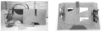
The South African design team The Joinery founded by sisters Natalie and Kim Ellis designed the My Office collection. ✓The Joinery is an ethical Fashion label created to provide an alternative to the traditional and hazardous methods of production.✓ The My Office collection features laptop bags for Mac and PC users made from the luxurious-looking, sustainable fabric shown in a nude brown and pale grey colour.✓ The collection is designed in conjunction with a South African-based industrial plastic recycling plant and polyester fibre manufacturer through the conceptualisation of a lightweight felt-like fabric that is PET (polyethylene terephthalate) chip-derived from discarded plastic bottles collected around Cape Town.✓
The Joinery's general characteristics are defined by form follows function,✓ minimalistic approach ✓that shows clean, craftsmanship approach echoing Scandinavian ideals. ✓ The final products are targeted at a higher income user and most probably business people but also someone who is an avid collector of new and innovative designs.✓
The Joinery focus is on methods of production that contribute to local community growth and partnerships with sewing co-operatives in local townships. ✓ In this regard The Joinery was inspired by the ecological call by the design community to discover and utilise materials for sustainable textile production. ✓ The Joinery's choice of material reduces CO2 emissions by recycling plastic bottles that would have been discarded in landfills. ✓ This initiative by The Joinery has also created numerous job opportunities for local seamstresses and informal plastic collectors✓
International designer, Phillippe Starck and Emeco created the Broom Barstool✓, a chair that is reclaimed, repurposed, biodegradable and durable, ✓ 90% industrial waste, 75% waste polypropylene and 15% reclaimed wood. The material is ground (soil) and compressed into pellets before being mixed with glass fibres and melted so it can be injected into a mould. ✓ The Broom Chair is durable, comfortable, fashionable, colourful and suitable for in-and outdoor use. ✓
The Broom Barstool design considered limited space at a bar in a restaurant or hotel, reducing stool width but maintaining the comfort.✓ The curving shell of the chair has been translated into a seat with softer edges that merge with the legs of the stool. ✓
Starck's general characteristics include the use of waste materials, technology ✓ ensuring excellent quality with a long life, and energy conservation in production and transportation.✓
Credit any other valid statements.
| Q6 LEVEL | COGNITIVE SKILLS | WEIGHTING | QUESTIONS | MARKS (10) |
| Lower order | Remember, Recall, Recognise | 30% | 6.1 | 2 |
| Understand, Explain, Describe | 6.2 | 4 | ||
| Middle order | Apply, Implement, Organise | 40% | 6.1 6.2 | 2 6 |
| Higher order | Analyse, Compare, Interpret | 30% | 6.2 | 2 |
| Evaluate, Reflect | ||||
| Synthesise, Justify | 6.1 6.2 | 2 2 |
TOTAL SECTION C: 40
GRAND TOTAL: 100