DESIGN PAPER 1 GRADE 12 MEMORANDUM - NSC EXAMS PAST PAPERS AND MEMOS NOVEMBER 2020
Share via Whatsapp Join our WhatsApp Group Join our Telegram GroupDESIGN PAPER 1 (THEORY)
GRADE 12
NOVEMBER 2020
MEMORANDUM
NATIONAL SENIOR CERTIFICATE
SECTION A: DESIGN LITERACY
QUESTION 1: 'UNSEEN' EXAMPLES [10 marks]
Candidates answer EITHER QUESTION 1.1 OR QUESTION 1.2.
1.1 (Allocate a maximum of 2 marks for each bullet/aspect)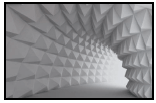
The 2D wallpaper design in FIGURE A creates a 3D illusion of form due to the use of tonal variation and perspectival rendering of the tunnel and in each pyramid. These simulated forms are pure geometric pyramids that create a clean, mechanical feel
The wallpaper design creates the illusion of a tunnel-like space through the changing of the scale of the pyramid forms so that they appear to be receding. Placing the light source on the righthand side of the tunnel also helps to create this sense of space that is emphasized by the tonal gradation.
The repetition of the pyramid forms on the two-dimensional wallpaper creates a zigzag rhythm.The repetition of the sweeping curves along which these pyramids are placed also add curvilinear rhythms to the design.
The monochromatic /achromatic colour scheme consists of a spectrum of whites and greys, creating a clean, calm and quiet atmosphere.Grey and white are neutral colours which also help to convey a modern feel. The light catches the different facets of the pyramid form in such a way that a range of greys are created that brings variety and life to the uniform white colour of the design.
The wallpaper design pattern makes use of an asymmetrical balance as the focal point is formed by the strong white light-source on the far right of the design.The weight or focus on the right is further emphasised by the contrast between the bright circle of light and the dark forms right next to it.
Credit any other valid statements.
| Q1.1 LEVEL | COGNITIVE SKILLS | WEIGHTINGS | QUESTIONS | MARKS (10) |
| Lower order | Remember, Recall, Recognise | 30% | 1.1 | 2 1 |
| Understand, Explain, Describe | ||||
| Middle order | Apply, Implement, Organise | 40% | 1.1 | 4 |
| Higher order | Analyse, Compare, Interpret | 30% | 1.1 | 2 1 |
| Evaluate, Reflect | ||||
| Synthesise, Justify |
OR
1.2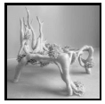
1.2.1 (Allocate 2 marks)
Biomorphic implies that the chair design imitates nature and the form is borrowed from it. FIGURE B is biomorphic as the chair looks like intertwined organic roots of a plant featuring flower-like accents that imitate fungi.
1.2.2 (Allocate 8 marks)
(Allocate a maximum of 2 marks for each bullet/aspect)
FIGURE B uses undulating, curvy and organic lines to define its structure. Thick, uneven lines are prominent on the legs and the backrest of the chair.
The form of FIGURE B is organic, creating flowing movement. The form of the backrest is designed to emulate tree branches/coral. The form is bulky and does not resemble a conventional chair which gives the chair a dream-like, surreal and ghost- like quality. Disc-like forms emulate from the fungi simulated in the chair design.
FIGURE B has a soft white colour that suggests comfort. The cream-yellowish fungus is placed haphazardly to create a sense of an organic structure. This creamy-yellow colour contrasts with the white and the shadows to add some variety.
The backrest of the chair in FIGURE B has repeated vertical branch-like pointy outgrowths and is rendered with a smooth soft/hard textured feel. This contrasts with the rough/knobbly fungus-like pale cream-yellowish textures that create variety and visual interest.
Credit any other valid statements.
| Q1.2 LEVEL | COGNITIVE SKILLS | WEIGHTINGS | QUESTIONS | MARKS (10) |
| Lower order | Remember, Recall, Recognise | 30% | 1.2 | 2 1 |
| Understand, Explain, Describe | ||||
| Middle order | Apply, Implement, Organise | 40% | 1.2 | 4 |
| Higher order | Analyse, Compare, Interpret | 30% | 1.2 | 2 1 |
| Evaluate, Reflect | ||||
| Synthesise, Justify |
QUESTION 2: COMMUNICATION THROUGH DESIGN [10 marks]
2.1.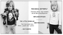
2.1.1 (Allocate 4 marks)
The young boy is wearing a T-shirt featuring the scientist Einstein, this stereotypes boys as intelligent. Alternatively, the image of the man on the boy’s T-shirt with his tongue sticking out is playful and teasing, very typical of boy-like behaviour. The text beside him reading: 'The Little Scholar. Your future starts here,' also stereotypes him as an active scholar with a bright academic future. The use of blue, green and black colours on this clothing are stereotypical colours used to identify boys with that is associated with masculinity.
The silver, glittery kitten ear headband with the accompanying text stating: 'The Social Butterfly: Chambray shirts + logo sweaters are the talk of the playground' tells us that the young girl is stereotyped as being preoccupied by socially accepted fashion trends. She is portrayed/stereotyped as an empty-headed social butterfly. This is emphasised by the glittering kitty princess crown and emphasised by her demure pose against the wall while she flaunts her designer 'logo styles' model outfit. The soft cream and pink colours of her jersey are also stereotypical colours used to identify girls with. The boy’s cheeky pose is active and playful, typical of boys of that age. By contrast the young girl’s pose is passive, stereotypical of society’s views on the way girls should behave.
The advert stereotypes children as being white and having blonde hair.
The boy and the girl come across as androgynous and the stereotype is focussed on the difference between the nerd and the socialite
2.1.2 (Allocate 2 marks)
The advert in FIGURE C can be considered to be irresponsible in that it can be described as 'sexist'. It encourages the social construct that girls should aspire to be social butterflies and boys scholars or academics.This counteracts the current social drive for all girls/women to be afforded equal opportunities in education, to be independent and to be able to make a strong economic contribution in all sectors. The advert only refers to one racial grouping and is therefore not inclusive.
2.2(Allocate 4 marks)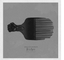
The first symbol is the Afro comb, which symbolises a celebration of black identity and honour. The Afro comb is also symbolic of the Afro hairstyle which in modern day South Africa is a symbol of the return to self-love and a protest against hair straighteners and weaves. The Afro hairstyle can also be seen as symbolising the Black Panther movement in the 70s in America. Any of the above symbols or the clenched fist may represent the #BlackLivesMatter movement.
A second symbol is the colour orange which is associated with the orange clothing worn by prisoners in South Africa. Fela Kuti was at some point jailed for voicing his views on African consciousness and human rights violations through his music.
A third symbol is the clutched fist which is associated with black power in the fight against oppression. It also symbolises unity and black consciousness for the oppressed.
A fourth symbol is the morphed Afro comb with images of the fist and facial images of legendary activist which can symbolise African consciousness and a collective political, historical, social, religious and cultural identity.
Credit any other valid statements.
| Q2 LEVEL | COGNITIVE SKILLS | WEIGHTINGS | QUESTIONS | MARKS (10) |
| Lower order | Remember, Recall, Recognise | 30% | 2.2 2.1.1 | 1 2 |
| Understand, Explain, Describe | ||||
| Middle order | Apply, Implement, Organise | 40% | 2.1.2 2.2 | 2 2 |
| Higher order | Analyse, Compare, Interpret | 30% | 2.2 2.1.1 | 1 2 |
| Evaluate, Reflect | ||||
| Synthesise, Justify |
QUESTION 3 [10 marks]
Answer EITHER QUESTION 3.1 OR QUESTION 3.2.
3.1 [10 marks] (Allocate a maximum of 2 marks for each bullet/aspect)
The materials of the main frame of FIGURE E consist mainly of a soft bendable silver wire that is used to shape and form the structure giving it a strong linear quality. The beads, a traditional African material, are used to imitate the colour of the car. Alternatively, FIGURE F is made of solid cast iron and uses imitation diamanté to imitate the colour which gives it a cheap, bling status.
In FIGURE E the repeated circular wire lines on the wheels create a repetitive, circular pattern. The repeated orange beaded lines create a more rigid, striped pattern. In contrast, the repeated imitation diamanté on FIGURE F creates a solid, dense surface with a tactile pattern.
The form in FIGURE E is quite open due to the linear wire construction method and expresses transparency and lightness,whereas the form of FIGURE F is more solid and heavy. The curved lines on FIGURE F create an aerodynamic form whereas the form of FIGURE E is more block-like.
FIGURE F is kitsch as it is covered in a skin of shiny, cheap imitation diamanté.In comparison FIGURE E stays true to its roots by using authentic traditional bead work and wire. FIGURE E is usually found in museum shops and craft markets aimed for the tourist market, whereas FIGURE F is mass produced and found in department stores for everyone to have access which enhances its kitsch status. Alternatively FIGURE E could be classified as being kitsch as it is seen in most craft markets across South Africa.
FIGURE E is influenced by African wire crafts produced with hand-crafted technologies.FIGURE F, by comparison shows the influence of industrial manufacturing techniques of the western world in the 1970's and onwards.FIGURE E's inspiration came from boys not having toys and a need to create alternative solutions. In contrast FIGURE F is inspired by a consumerist 'bling' life-style where children have access to all kinds of toys. Alternatively FIGURE E could have been influenced by the Arts and Crafts movement because of being hand-crafted and FIGURE F by the Art Deco movement due to the expensive material as well as the adornment used on a fast, aerodynamic car.
Credit any other valid statements.
NOTE: A maximum of ONLY 3 marks may be allocated for tabular comparison responses. Use cognitive levels as guidelines. A maximum of ONLY 6 marks may be allocated for two separate essays.
| Q3.1 LEVEL | COGNITIVE SKILLS | WEIGHTINGS | QUESTIONS | MARKS (10) |
| Lower order | Remember, Recall, Recognise | 30% | 3.1 | 1 2 |
| Understand, Explain, Describe | ||||
| Middle order | Apply, Implement, Organise | 40% | 3.1 | 4 |
| Higher order | Analyse, Compare, Interpret | 30% | 3.1 | 1 2 |
| Evaluate, Reflect | ||||
| Synthesise, Justify |
OR
3.2 [10 marks]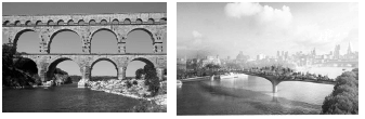
A contemporary transport company, Transport for London invited proposals to improve pedestrian links across the Thames River in 2013. Heatherwick Studio proposed an idea for a new pedestrian 'London Garden Bridge' (FIGURE H) across the River Thames. The aim was for the proposed bridge to connect North and South London with the added bonus of a garden within the city. London is one of the greenest cities of its size in the world; this new terrain aimed to add to London's already rich and diverse horticultural heritage by including many indigenous river edge plant species. A similar, but Classical structure is the Pont du Gard, FIGURE G, a bridge that spans the Gardon River in Remoulins, in southern France. Built in the 1st century CE by the Romans as part of the Nîmes aqueduct its aim was to span the Gardon River and channel water to the city of Nîmes from a spring at Uzés.The entire Nîmes aqueduct is 50 km long; a technologically advanced structure that is estimated to have carried 200 000 cubic meters of water to the fountains, baths and homes of the citizens of Nîmes every day. The Pont du Gard, FIGURE G, is the highest of all Roman aqueduct bridge structures ever built.
A testimony to the advanced technology and construction techniques of the Romans, the Pont du Gard remained in use until the 6th century; a lack of maintenance after the 4th century meant that it became increasingly clogged by mineral deposits and debris that eventually choked off the flow of water. By contrast, despite the ground- breaking technology that was meant to be used for the construction of the contemporary London Garden Bridge, it was never built.
The aim of the contemporary London Garden Bridge, FIGURE H, was to increase and encourage interaction between the South and North Banks and provide new walking routes to and from Covent Garden and Soho. The planned structure of an elevated London garden would have been a safe and easy terrain for London's many commuters and visitors to cross the river; it would also have made areas along its length for pedestrians to stop and enjoy the remarkable river setting and unparalleled views of the city and to serve as a free public space. The terrain that the Classical, Pont du Gard aqueduct spanned was very carefully surveyed by the Roman engineers of the time. Because of the uneven terrain between the origin, the spring in Uzés and the city of Nîmes, the aqueduct followed a long, winding route that was mostly underground but needed a bridge across the gorge of the Gardon River.
The Pont du Gard (FIGURE G) was constructed with three tiers of arches, stands 48.8 m high, and descends a mere 2.5 centimetres – a gradient of only 1 in 18,241 – while the whole aqueduct descends in height by only 12.6 m over its entire length (50km), which is indicative of the great construction precision that Roman designers were able to achieve using the technology of the time.
In order to support the 1,000 cubic metres of earth needed for the garden on The London Garden Bridge, (FIGURE H), Heatherwick planned to construct what appeared to be two enormous metal planters: like upturned hands, which catered for a range of half to two meters deep flower/plant beds, so that plants and trees roots can have sufficient space. The material that was proposed to clad the bridge was cupronickel, a copper- like material, which is highly resistant to corrosion. Typically used for mechanical equipment and ship propellers, cupronickel was to be roll-bonded to the bridge's structural steel a technology whereby an inseparable skin is created.The proposed 367 metre London Bridge was to be coated in the corrosion-resistant copper-nickel alloy material from its feet on the river bed up to the underside of the bridge deck.
By contrast the material used to construct the Classical Pont du Gard (FIGURE G) bridge was quarried stone blocks. These stone blocks could weigh up to 6 tons each. Despite the fact that the Romans were already using concrete, a material invented by them, to reinforce and hold structures together, the blocks were so precisely cut that they fitted together by friction alone. The use of mortar or clamps was eliminated.
Credit must be given to any other valid statements or a comparison of a Classical and contemporary building that the candidate has studied.
NOTE: A maximum of ONLY 3 marks may be allocated for tabular comparison responses. Use cognitive levels as guidelines.
| Q3.2 LEVEL | COGNITIVE SKILLS | WEIGHTINGS | QUESTIONS | MARKS (10) |
| Lower order | Remember, Recall, Recognise | 30% | 3.2 | 1 2 |
| Understand, Explain, Describe | ||||
| Middle order | Apply, Implement, Organise | 40% | 3.2 | 4 |
| Higher order | Analyse, Compare, Interpret | 30% | 3.2 | 1 2 |
| Evaluate, Reflect | ||||
| Synthesise, Justify |
SECTION B: DESIGN HISTORY
QUESTION 4 [30 marks]
4.1 Allocate 20 marks in total.
Allocate 10 marks for each movement. Note that ONLY ONE mark can be allocated for the name of a designer and product of each movement. Use the cognitive levels as guidelines.
This marking guideline supplies an answer for the following two possibilities:
- DE STIJL
- BAROQUE
DE STIJL
The De Stijl movement aimed to reduce their designs to what they considered the essentials of art, i.e. straight vertical and horizontal line, the square and the rectangle, the three primary colours and the neutrals. They believed that designers need to get rid of everything that is not essential. They aimed to create clarity, calm, certainty and order through simplification. They believed that geometric abstraction to attain balance, harmony, order, logic and purity was of utmost importance.
De Stijl design was influenced by the Dutch tradition of logic, clarity, severity and mathematical order.They were also influenced by Cubism where painters broke down form into geometric facets that emphasized the flatness of the picture plane and emphasizes the square and the rectangle. The Cubists also aimed to reduce and simplify form.
De Stijl works are characteristically very simple and totally abstract conveying only the essentials. Straight vertical lines are balanced with straight horizontal lines to create stability.Rectangular and square shapes are carefully arranged to create a perfect balance. The colours are reduced to the primaries, red, blue and yellow and to the neutrals, white, black and grey and exude a sense of purity and clarity. Surfaces are smooth, also conveying calmness.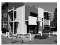
AN EXAMPLE OF DE STIJL DESIGN:
Gerrit Rietveld 'Schröder 1924
This house is clearly simplified to essential geometric planes that form a careful balance of vertical and horizontal lines. Certain components are deliberately detached creating the idea that they are gliding past each other in harmony.
The colour has been reduced to mainly white, grey and black. These neutral colours convey a still feeling.A few accents of blue, red and yellow add contrast and life.
BAROQUE
Instead of deleting detail in order to achieve simplicity and the essential, Baroque design is a celebration of surface decoration and details. The Catholic Church aimed to use Baroque art to get their message across to illiterate people. They wanted to use dramatic imagery and exaggerated motion and decoration to evoke strong religious feelings and in doing so to control their subjects.
The Baroque style is influenced by the Counter-Reformation and the Catholic faith as it glorified both the power and influence of the Catholic Church and the monarchy.
Characteristically Baroque designs are emotional and move away from the Renaissance focus on logic and reason. Their designs are full of theatrical drama, energy, excitement, tension and grandeur.Compositions are dynamic and there is a lot of interplay between light and shadow. Designs make use of strongly contrasting colours and luxurious, expensive materials such as marble, gilding and bronze to excite and overwhelm the viewer.
Interiors are dramatic combinations of architecture, sculpture, silver, silks, rich tapestries and luxurious finishes. Both buildings and furniture show angels, cupids, saints, sculptures, figurines and fountains. Buildings are colossal with dramatic proportions and consist of many colonnades, domes and a bold play of volumes and voids. Large curved and swirling forms, twisted columns, grand stairways as well as complicated and elaborate decorations all contribute to overwhelm the senses.
AN EXAMPLE OF BAROQUE DESIGN:
The Baldacchino of St Peter's Basilica in Rome (1623–1634) by Bernini
This Baldacchino is a very busy, detailed and ornate structure which clearly does not aim to reduce elements to the essentials. It is intended to mark, in a monumental way, the place of Saint Peter's tomb. The fact that it is a very large structure, consisting of various complex elements is typical of Baroque designs, a canopy rests upon four huge twisting columns each of which stands on a high marble plinth. These columns support a cornice which curves inwards in the middle of each side. Above this, four twice life size angels stand at the corners. Behind them four large volutes rise up to a second smaller cornice which in turn supports the gilded cross on a sphere, a symbol of the world redeemed by Christianity. The four helical columns are 20 metres high. Under the canopy is the high altar of the basilica as well as a radiant sun that symbolically shines down on the Pope as he leads the service.The monumentality, grandeur, decorative swirls and rich colour all work together to make this design full of dramatic emotion rather than calm simplicity.
A maximum of ONLY 7 marks per movement may be allocated for responses that do not refer to the statement.
Credit any other valid statements
| Q4.1 LEVEL | COGNITIVE SKILLS | WEIGHTINGS | QUESTIONS | MARKS (10) |
| Lower order | Remember, Recall, Recognise | 30% | 4.1 | 2 4 |
| Understand, Explain, Describe | ||||
| Middle order | Apply, Implement, Organise | 40% | 4.1 | 8 |
| Higher order | Analyse, Compare, Interpret | 30% | 4.1 | 2 4 |
| Evaluate, Reflect | ||||
| Synthesise, Justify |
4.2 [10 marks] (Allocate a maximum of 2 marks for each bullet/aspect.)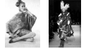
The inspiration of Scandinavian textiles, and its use of stylized, brightly coloured organic shapes can be seen in FIGURE I's simplified floral surface pattern.In contrast to this use of figurative imagery, FIGURE J could have been inspired by the fragmentation and geometric abstraction of movements like Cubism and Constructivism. This emphasis of FIGURE I on child-like imagery also shows the influence of the 1960's Hippie movement.The undermining of the conventions of fashion in FIGURE J show the influence of Dada and Futurism on Deconstructivism. This dress reflects the rebellious attitude of the Grunge movement, whereas the floral motifs of FIGURE I are also reminiscent of the curvilinear floral motifs on Oriental designs. The Hippie movement's emphasis on peace can be seen in the soft colours and shapes of FIGURE I. FIGURE J appears by contrast more chaotic than FIGURE I.
FIGURE I uses a wide range of bright, artificial colours that convey a light-hearted atmosphere. In contrast, FIGURE J uses strong red, black and white to create a harsher, austere effect.The bright, varied, flat colours in FIGURE I reminds one of the psychedelic colour use of the Hippie movement, whereas the harsh colours of FIGURE J seem to relate more to the monochromatic, freely applied colours of Abstract Expressionism.
The outline of the dress in FIGURE I is soft, sensual and flowing, suggesting the curved female body. The outline of the dress in FIGURE J is however, jagged and fragmented and doesn't follow the form of the female. The lines on the floral motifs (FIGURE I) form curvilinear rhythms,whereas the lines in FIGURE J are angular and harsh to create a machine-like feel.
The dress in FIGURE I is made from a soft, smooth and silky textured fabric giving it a luxurious and feminine feel.In contrast the dress in FIGURE J is constructed from hard and stiff plastic making it appear industrial and masculine.The fabric used in FIGURE I appears thin and light, whereas FIGURE J makes use of layering of solid, thick plastic to create a heavy, armour-like shiny textured garment.
The flower motifs in FIGURE I are filled with organic, flowing linear surface patterns. In contrast, the surface pattern on FIGURE J, is formed by abstract splashes of colour reminiscent of the paintings of Jackson Pollock.The repetition of the circular flower shapes creates a rhythmic circular pattern,whereas the repetition of torn, angular pieces of plastic in FIGURE J creates an informal grid pattern.
Credit any other valid statements.
NOTE: A maximum of ONLY 3 marks may be allocated for tabular comparison responses. Use cognitive levels as guidelines. A maximum of ONLY 6 marks may be allocated for two separate essays.
| Q4.2 LEVEL | COGNITIVE SKILLS | WEIGHTINGS | QUESTIONS | MARKS (10) |
| Lower order | Remember, Recall, Recognise | 30% | 4.2 | 2 1 |
| Understand, Explain, Describe | ||||
| Middle order | Apply, Implement, Organise | 40% | 4.2 | 4 |
| Higher order | Analyse, Compare, Interpret | 30% | 4.2 | 2 1 |
| Evaluate, Reflect | ||||
| Synthesise, Justify |
SECTION C: DESIGN IN A SOCIO-CULTURAL/ENVIRONMENTAL AND SUSTAINABLE CONTEXT
QUESTION 5 [20 marks]
Answer EITHER QUESTION 5.1 OR QUESTION 5.2.
5.1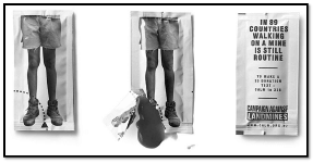
5.1.1 (Allocate 2 marks)
The term 'shock tactics' refers to an advertising/marketing strategy, which uses shocking imagery to grab the viewer's attention in order to promote services or a product. Shock tactics are employed in the design of the tomato sauce sachet in such a way that it shocks and surprises the consumer when the sachet is torn open, giving the impression of a severed bleeding limb. This leaves a lasting impression on the consumer. These consumers will inform others about the campaign against landmines and therefore more people will hear of the campaign than initially anticipated.
5.1.2 (Allocate 4 marks)
Drunk driving is a prevalent problem in society. Not only do those who drink and drive endanger their lives, they also endanger the lives of other users of the road. I would make use of pictures taken at the aftermath of an accident caused by drunk driving, with scattered bodies and injured individuals to shock the viewer. In this way creating an awareness of the dangers of drunk driving and promoting safe practices on the road. Placing the billboard in high traffic areas will lead to more people seeing the billboard with the hope of educating more people not to drink and drive.
Izinyokanyoka (electric cable thieves), electric cable theft is a problem most prevalent in society. Electric cables are stolen to be sold at scrapyards as raw copper for a handsome monetary compensation. In my digital billboard I would use a video clip of an individual illegally disconnecting and stealing electric cables and subsequently being electrocuted, capturing the few moments after the electrocution whereby evidence of smoke and burned flesh is apparent. Screams of agony to create awareness of the dangers of the practice can be added to the video.
Credit may be given to learners who describe by using visuals or an illustration. This must be accompanied by annotations.
Credit any other valid statements.
5.1.3 Allocate 14 marks in total, 7 marks per case study.
Allocate 1 mark for the name of the designer and the name of design product.
ONE CONTEMPORARY SOUTH AFRICAN DESIGNER/DESIGN GROUP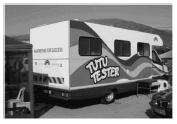
- Name of a designer/design group/design company and one design product:
Tutu Tester by Anna van Esch - The social issue that is addressed:
The Tutu tester is a mobile clinic that delivers healthcare services in remote poverty stricken rural and township areas.Around a fifth of South Africans between the ages of 15-49 have HIV. Communities most vulnerable to HIV and TB are remote and densely populated. According to the 2016 annual survey, about 16% of women aged 15-19 have begun childbearing. Some of these girls have to drop out of school, the Tutu tester is essential to lowering this number and giving women the power of choice over their bodies. The communities residing in these remote areas often cannot afford the transportation fares to access primary health services often housed in normal government day clinics. - An analysis of the design and an explanation of how it addresses the social issue:
The Tutu Tester is a colourful medically equipped truck with a bright signature rainbow banner. Since its inception in 2008 the Tutu Tester has seen an excess of 35 000 patients. The mobile clinic focuses on making healthcare accessible to township communities while at the same time addressing lifestyle diseases. The truck is fitted with care diagnostics, enabling its trained staff to conduct immediate HIV and Tuberculosis (TB) testing as well as diabetes and high blood pressure testing for free. The mobile clinic also advises patients about their Body Mass Index (BMI) and conducts breast and testicular cancer examination. Tutu tester also provides family planning services empowering women on their choices regarding childbearing. The Tutu Tester operates in the areas from Masiphumelele in Noordhoek through to Khayelitsha nearby schools or malls in the Western Cape where healthcare services are inadequate.
ONE INTERNATIONAL DESIGNER/DESIGN GROUP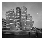
- Name of a designer/design group/design company and one design product: Heatherwick Studio and the Nanyang Technological University (NTU) in Singapore, 2015.
- The social issue that is addressed:
In the information age, the most important commodity on a campus is the creation of social spaces to meet and bump into and learn from each other.
Since the advent of the internet and low-cost computers, there has been a distinct shift in how students approach educational facilities. The digital revolution, the most important function of this new university building is to nurture togetherness and sociability, so that students can meet entrepreneurs, scientists or colleagues in a space that encourages collaboration. The outcome is a structure that interweaves both social and learning spaces to create a dynamic environment. Another inspiration for the New Learning Hub was a wish to break down the traditional square forward-facing classrooms with a clear front and hierarchy, and move to a corner-less space, where teachers and students mix on an equal basis. Each of these tutorial rooms faces the large shared central space, allowing students to continually feel connected to all the other activities going on in the building.
The rooms open into the shared circulation space around the atrium, interspersed with informal garden terraces, allowing students to be visually connected while also leaving space to 'hang out'. The new Learning Hub provides an exciting mix of learning, community and recreational spaces for all inhabitants of the building to interact. Bringing people and their ideas together, NTU can spark future innovations and new dialogues that increasingly happen when disciplines collaborate. - An analysis of the design and an explanation of how it addresses the social issue:
Instead of the traditional educational building with kilometres of corridors the university asked for a unique design that is better suited to contemporary ways of learning. The hub's form is dictated by its function, and the lack of corridors unifies the 56 tutorial rooms.Students can enter from 360 degrees around into a large central space which links all the separate towers together.Twelve tapering towers create a large public central atrium to provide space for fifty-six tutorial rooms. Each tower is made up of a stack of classrooms which build up gradually, with gardens on selected floors. The new-generation smart classrooms promote more interactive small group teaching and active learning. The flexible format of the rooms allows lecturers to better engage with their students,and for students to easily collaborate with each other. With soaring Singapore temperatures it was important to maintain the students' comfort whilst achieving a sustainable energy usage. The building's open and accessible atrium is naturally ventilated, maximising air circulation around the towers of tutorial rooms and allowing students to feel cool.
The primary challenge was to make the choice of concrete feel beautiful. This resulted on the concrete stair and elevator cores being embedded with 700 specially commissioned drawings, three-dimensionally cast into the concrete, referencing everything from science to art and literature. Overlapping images, specially commissioned from illustrator Sara Fanelli, are deliberately ambiguous thought triggers, designed to leave space for the imagination. The curved facade panels are cast with a unique horizontal pattern. The building's various raw treatments of concrete have been handmade from wet clay.
Credit any other valid statements.
| Q5.1 LEVEL | COGNITIVE SKILLS | WEIGHTINGS | QUESTIONS | MARKS (10) |
| Lower order | Remember, Recall, Recognise | 30% | 5.1.1 | 2 4 |
| Understand, Explain, Describe | ||||
| Middle order | Apply, Implement, Organise | 40% | 5.1.1 | 2 6 |
| Higher order | Analyse, Compare, Interpret | 30% | 5.1.1 | 2 2 2 |
| Evaluate, Reflect | ||||
| Synthesise, Justify |
5.2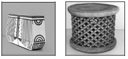
5.2.1 (Allocate 4 marks)
The Dokter and Misses furniture piece (FIGURE L) is a contemporary interpretation of traditional African furniture (FIGURE M). This can be seen in its use of geometric pattern and bright colours and its block-like form. Whilst these patterns are painted on the wood, traditional African furniture makes use of high and low relief carvings to form pattern. Traditional furniture (FIGURE M) is mostly carved from a single piece of wood, whereas contemporary furniture is manufactured from several pieces of wood.In this case processed supa wood is used to give FIGURE L a smooth, clean and trendy look, whereas the carving used to create traditional furniture (FIGURE M) creates a more personal and hand-made feel. Contemporary interpretations of traditional crafts often use synthetic paint for the patterns and the surface is varnished with lacquer to create a shiny, machine-like, smooth surface.Traditional crafts such as the stool in FIGURE M use raw wood, which is burnished and polished with animal fats to create a more organic feel.
5.2.2 (Allocate 6 marks)
- History/Origins
The traditional beehive huts are known as iQukwane. Traditional isiZulu hut craft forms part of the hut/rondavel indigenous knowledge and historically forms part of the traditional isiZulu Beehive Huts monument buildings and precincts. - Materials and Techniques
The role of isiZulu men in the society is to collect the outer sticks and place them in a circle on the ground.The women then bind and thatch the structure using braided split reeds and grass.A central sapling tree trunk acts as a support and the door is made low so that one has to stoop before entering. After the frame is complete, it is thatched with grass. Cow-dung and termite clay is mixed to a thick consistency and spread to form the floor which sets rock hard and may be polished to a mirror-like finish using a polishing stone. The same material is used to form a raised hearth near the central pole. The materials and the process make the hut stable, warm in winter and cool in summer.Smoke from the fire escapes out the door or through the thatch that has the effect of constantly fumigating the hut of insects.
- Functions
The huts are hierarchically arranged in a circular kraal formation. The isiZulu term is umuzi and consists of two concentric fences of thorn trunks.The huts are located inside the outer fence and the cattle in the inner circle with a smaller enclosure there for the calves.
The cattle are kept in the middle protected from wild predators. The isiZulu society lives as a close- knit community with a central hearth where all cooking is done by the women.
The kraal is usually built on a slight slope with the main entrance at the lower end. This enables rainwater to clean the cattle kraal, the ground dries quickly and any foe has to fight uphill.
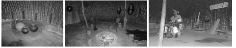
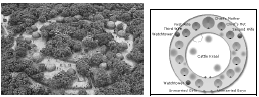
Small huts on poles act as storage huts or watchtowers. The largest hut, opposite the entrance, is that of the chief's mother. The chief's hut is to the right, the first wife is to the right of the chief's mother, and the second wife is to the left of the chief's hut, the third wife to the right of the first wife and so on The unmarried girls live on the left of the entrance, the unmarried boys, to the right. The two elder sons inspect visitors and guard the entrance around the clock. Visitors are either rejected, expected to wait for an appropriate time or welcome in immediately depending on their relation to the family. Those that are allowed in experience the siyakuleka ikhaya display where the gatekeeper sings the praises of the chief. The function of gatekeeper is also very useful in another way in that he will assume the role of chief on his father's death and will be familiar with all those who visited his father and their treatment. White flags over a kraal mean that an engagement is imminent whilst red/white flags over a bridegroom's kraal indicate that he has to go through tears and longing (red) to reach the love of his sweetheart.
Credit any other valid statements.
5.2.3 (Allocate 10 marks)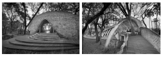
- Name the designer/design group and ONE design product:
Nicholas Plewman Architects in association with Michaelis Boyd Associates, Sandibe Okavango Safari Lodge, Okavanga Delta, Botswana, 2015. - Aims of the designer/design group
One main aim of the architects was that the lodge had to be wholly built of ultimately bio-degradable materials and 70 % of the lodge had to be of sustainable origin. They strived to have minimal to zero physical impact of any sort on the site, fauna and flora.They also aimed for the final building to appear to have grown organically from its site.
Influences on the designer/design group
The natural, organically shaped lodge is influenced by the biomorphic forms of animals that use their shell as part of their shelter or birds that weave shelters from the organic materials in their environment.The architects chose the pangolin – Africa's armadillo –as a specific motif because of its shy, elusive, and completely harmless nature and its ability to curl up.The curved exposed beams of the lodge also imitates the ribcage of animal carcasses. Another possible reference for the exposed beams could be elephant tusks and the domed form of the grass roof that resembles a tortoise shell. - Analysis of the design, explaining how it is an adaptation and continuation of the indigenous craft technique.
The lodge structure is unique and modern, but its structure incorporates various local craft knowledge techniques found in and around Botswana. The lodge is
built almost entirely of wood. Laminated pine beams create curvilinear forms that seem to have taken their inspiration from the inverted boat layers of butt jointed pine planks, but also from the skeletal frame of a basket and of traditional huts.External screen walls and balustrades are fashioned from an interlocking mat of eucalyptus laths woven onto stiff wire. Reference here could be traditional basket weaving techniques.The entrance of the dome is reminiscent of traditional Zulu hut architecture.These traditional craft techniques form part of the structure of the building that unifies the building with local heritage and ensures the continuation of this knowledge.
Credit any other valid statements.
NO marks should be given for repetition of designer(s) and their work used in this question paper.
| Q5.2 LEVEL | COGNITIVE SKILLS | WEIGHTINGS | QUESTIONS | MARKS (10) |
| Lower order | Remember, Recall, Recognise | 30% | 5.2.1 5.2.2 + 5.2.3 | 2 2 + 2 |
| Understand, Explain, Describe | ||||
| Middle order | Apply, Implement, Organise | 40% | 5.2.1 5.2.2 + 5.2.3 | 2 3 + 3 |
| Higher order | Analyse, Compare, Interpret | 30% | 5.2.2 + 5.2.3 5.2.2 + 5.2.3 | 2 + 2 1 + 1 |
| Evaluate, Reflect | ||||
| Synthesise, Justify |
QUESTION 6 [20 marks]
6.1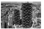
6.1.1 (Allocate 3 marks)
Vertical forests simulated through this building increase biodiversity. They help to set up an urban ecosystem where a different kind of vegetation creates a vertical environment which can also be colonised by birds and insects, and therefore becomes both a magnet for and a symbol of the spontaneous re-colonisation of the city by vegetation and by animal life
Vertical forests help to build a micro-climate and to filter dust particles which are present in the urban environment.The diversity of the plants helps to create humidity and absorbs CO2 and dust. It produces oxygen, protects people and houses from harmful sunrays and from acoustic pollution.
Vertical forests are an anti-sprawl measure which aims to control and reduce urban expansion. If we think of them in terms of urban densification, each tower of the vertical forest is equivalent to an area of urban sprawl of family houses and buildings of up to 50,000 square metres.
Credit any other valid statement/s that refers to how the building promote/s a healthy environment.
6.1.2 (Allocate 3 marks)
Effective Recycling
Inventive methods need to be developed that will transform how we take care of our waste. One method is to reward homeowners for recycling with weighable recyclables, in which sanitation workers weigh the recycle bin and provide compensation based on weight to incentivise energy efficient ways of removing waste.
Invest in renewable energy
Solar, wind, geothermal, low-impact hydro and biofuels are sources of renewable energy. A policy of granting energy tax credits to companies who buy 'green power' would incentivise buildings to choose sustainable sources of energy.
Install ventilation system
Installing a ventilation system can reduce the need for air conditioning, which can keep your carbon footprint and electricity bill low. Replace your windows with fibre glass and wood frames, add improved insulation and high thermal mass ceilings to circulate the air. These small details add up to improve the quality of your workplace, buildings and cities.
Green Lifestyle
The use of energy efficient LED light bulbs. LED lights do not emit as much heat as incandescent or fluorescent light bulbs which gives them a longer life span, consequently cutting maintenance costs.These bulbs can also be used for street lights and traffic lights.
Credit any other valid statements
6.2 Allocate 14 marks in total, 7 marks per case study.
Allocate 1 mark for the name of the designer and the name of design product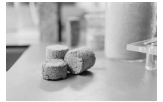
ONE CONTEMPORARY SOUTH AFRICAN DESIGNER/DESIGN GROUP
- Name of the designer and design
Suzanne Lambert, Vukheta Mukhari and Han Beushausen designed the Bio-brick. - The environmental issues that have been addressed
The urine brick is an innovative solution to waste recovery and upcycling.The urine brick is significant because it will provide an alternative form of calcium phosphate, a key ingredient in fertilisers used for commercial farming worldwide.Commercial farming is pivotal to the economy and food supply in the country.The development is also good news for the environment and global warming as bio-bricks are made in moulds at room temperature.Regular bricks are kiln-fired at temperatures around 1400°C and produce vast quantities of carbon dioxide. - An analysis of the design and an explanation of how it addresses the environmental issue.
Chemically speaking, urine is liquid gold. It contains nitrogen, phosphorus and potassium. Some 97% of the phosphorus present in the urine can be converted into calcium-phosphate, the key ingredient in fertilisers that underpin commercial farming worldwide.This is significant because the world's natural phosphate reserves are running dry.Additionally, the bio-brick has the potential to be 40 per cent stronger than a traditional limestone brick. The longer the bacteria is allowed to make the cement the stronger the brick becomes.
First, urine is collected in novel fertiliser-producing urinals and used to make a solid fertiliser.The remaining liquid is then used in the biological process to grow the bio-brick.The bio-bricks go through a natural chemical process, a procedure called microbial carbonate precipitation.Loose sand is colonised with bacteria that produce urea, which is an enzyme.Through a complex chemical reaction, urea breaks down to form urine and produce calcium carbonate.
This cements the sand into any form, whether it is a solid column, or now, for the first time a rectangular building brick. The remaining liquid product from the bio-brick process is used to make a second fertiliser that results in zero waste.
ONE INTERNATIONAL DESIGNER/DESIGN GROUP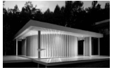
- Name of designer/design group/company and ONE design product:
'Papel' (paper Chapel house) by Shigeru Ban (New Zealand), 2013. - Environmental issues that have been addressed:
The Japanese architect Shigeru Ban and his team, have developed temporary mobile structures after the disaster in Japan. Similar internal paper partition system have recently been proposed.Planned in 2004, these mobile structures have been presented again after the earthquake disaster in Japan in 2011. Shigeru Ban's studio offered a solution to distress from the lack of privacy and high density, in creating a personal space in emergency situations: gyms, stations and so on. Ban's space allows for physical well-being and has aesthetic and functional features.Most of his cardboard projects are developed in response to the requirements needed by earthquake victims. - An analysis of the design and an explanation of how it addresses the environmental issue.
Shigeru Ban's Paper Chapel House is a paper structure built with hollow (but sturdy) cardboard tubes.This approach points to the revival of traditional Japanese elements that involve 'tatami'. 'Tatami' refer to the light weight mat – a rush-covered straw mat forming a traditional Japanese floor surface.'Papel' (paper Chapel house) makes use of huge cardboard columns that are coated in polyurethane/varnish and flame-retardants to keep away mould and fire, and are designed to last decades. 'Papel' (paper Chapel house) is sustainable and in this way well suited for emergency housing at crisis sites because it is inexpensive to install and easily recycled when the building is eventually dismantled.
Credit any other valid statements.
| Q6 LEVEL | COGNITIVE SKILLS | WEIGHTINGS | QUESTIONS | MARKS (10) |
| Lower order | Remember, Recall, Recognise | 30% | 6.1.1 6.1.2 + 6.2 | 1 1 + 4 |
| Understand, Explain, Describe | ||||
| Middle order | Apply, Implement, Organise | 40% | 6.1.1 6.1.2 + 6.2 | 1 1 + 6 |
| Higher order | Analyse, Compare, Interpret | 30% | 6.1.1 + 6.1.2 6.2 6.2 | 1 + 1 2 2 |
| Evaluate, Reflect | ||||
| Synthesise, Justify |
TOTAL SECTION C: 40
GRAND TOTAL: 100
NB: Markers must take note that colour printing varies in the provinces.