DESIGN PAPER 1 GRADE 12 MEMORANDUM - NSC PAST PAPERS AND MEMOS NOVEMBER 2019
Share via Whatsapp Join our WhatsApp Group Join our Telegram GroupDESIGN PAPER 1 (THEORY)
GRADE 12
NOVEMBER 2019
MEMORANDUM
NATIONAL SENIOR CERTIFICATE
SECTION A: DESIGN LITERACY
QUESTION 1: 'UNSEEN' EXAMPLES [10 marks]
Candidates answer EITHER QUESTION 1.1 OR QUESTION 1.2.
1.1 (Allocate a maximum of 2 marks for each bullet/aspect)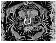
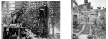
Black is used as a background colour to emphasise the foreground motifs. The motifs used in FIGURE A are bright and pure in colour which makes them eye-catching.✓ These colours work together to create a very vibrant, exciting textile design in enhancing its South African identity.✓The browns and greens are symbolic of the South African nature and the reds and greens are complementary creating a striking energetic effect. ✓
The actual tactile texture of the cushion is smooth because the pattern is printed on a cotton fabric.✓ This smoothness gives a luxurious feeling.✓ The actual texture of most of the animals and plants is represented with stylised pattern simulating visual texture.✓ This activates the surface adding to the lively effect already created by the bright colour.✓
The elephant in the centre is surrounded by motifs that are placed like a mirror image to create a symmetrical balance.✓This symmetrical balance stabilises the movement to draw the viewer's eye to the focal point.✓ The symmetrical balance is slightly disturbed by the placement of two different animals, a zebra and a leopard, on either side of the centre.✓
The black background contrasts strongly with the light and bright foreground creating a very dramatic scene.✓ There is also a contrast created between the visually implied smooth surfaces of the green leaves and the patterned surfaces of the animals and reptiles.✓ The elephant is shown in a full frontal view while the other animals are shown in profile. ✓ Contrast is also created by varying proportions as is seen with the different sizes of the elephants.✓
The black background unifies the design as a positive space.✓ The repetition of green, purple and orange also serves to unify the design.✓The vegetation on the sides of the image acts as a frame that encapsulates the whole to unify the design.✓ The repetition of the similar/indigenous animals and plants that are all commonly found in Africa creates a unity of design motive. ✓
Credit any other valid statements.
| Q1.1 LEVEL | COGNITIVE SKILLS | WEIGHTINGS | QUESTIONS | MARKS (10) |
| Lower order | Remember, Recall, Recognise | 30% | 1.1 | 2 1 |
| Understand, Explain, Describe | ||||
| Middle order | Apply, Implement, Organise | 40% | 1.1 | 4 |
| Higher order | Analyse, Compare, Interpret | 30% | 1.1 | 2 1 |
| Evaluate, Reflect | ||||
| Synthesise, Justify |
1.2 (Allocate a maximum of 2 marks for each bullet/aspect)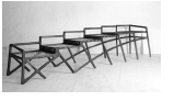
The functionality of this unique bench goes against the norm in various ways. Firstly, it seats six people instead of two to four.✓ Secondly, it allows seating for people of different heights to accommodate adults and children in terms of hierarchy.✓ This results in people not sitting right next to each other but having a specific personal space.✓Alternatively, the last two 'seats' are high enough to function as tables or as a platform to rest against as they may not function as 'seats'. ✓
The back rest creates a clearly defined straight, geometric, stepped line which conveys a zigzag movement upwards.✓ The legs form crisscrossing diagonal lines which create dynamic movement.✓ Two of these diagonals form long, sweeping, clean curved lines which pull the eye strongly across the bench up to the highest chair. ✓
The backrests form rectangular negative spaces which creates a machine-like feel.✓ The negative spaces formed in between the legs are also more varied where triangles and irregular diamond shapes are formed which result in a busy and dynamic effect.✓
The bench is made from dark, hardwood and stretched 'riempies' (strips of leather stretched across the seat in a woven-like fashion). This bench is influenced by traditional early Cape Dutch furniture techniques and uses them in a new, unconventional manner.✓ This unique design is handcrafted reminding one of Arts and Crafts furniture.✓ The zigzag lines and the dynamic movement of diagonal lines are influenced by the Art Deco movement.✓ The unconventional design also shows the possible influence of Deconstructivism.✓ The bench resembles a centipede showing the influence of nature.✓
The repetition of the stepped backrest, the block-like seat and the diagonal legs all contribute to unifying the design.✓The repetition of the stitched 'riempie' rigid line around the border of each seat contrasts with the irregular lines of the legs.✓ The repetition of the stepped shapes creates a dynamic rhythm resulting in a unique design. ✓ The repetition creates a progressive rhythm that grows from a low seat to a high seat. ✓
Credit any other valid statements.
| Q1.2 LEVEL | COGNITIVE SKILLS | WEIGHTINGS | QUESTIONS | MARKS (10) |
| Lower order | Remember, Recall, Recognise | 30% | 1.2 | 2 1 |
| Understand, Explain, Describe | ||||
| Middle order | Apply, Implement, Organise | 40% | 1.2 | 4 |
| Higher order | Analyse, Compare, Interpret | 30% | 1.2 | 2 1 |
| Evaluate, Reflect | ||||
| Synthesise, Justify |
QUESTION 2: COMMUNICATION THROUGH DESIGN [10 marks]
2.1 (Allocate 6 marks)
The blue men represent giant robotic computers that now control mankind who are dwarf-like in comparison.✓ These 'computer men' are geometric and angular that makes them look harsh and strong.✓ The dwarf-like humans look weak and helpless.✓ Their helplessness is further emphasised by the fact that some of them are falling out of buildings that are being overturned by the computer men.✓ The message of this poster, that mankind is being overpowered by the computer world and losing their control, is emphasised by the use of disproportionate scale and stylised imagery.✓ Stereotypes are evident through the use of male IT giants that assume that men dominate the technological world.✓ The lack of older people being represented enhances the stereotypical belief that only young people use technology.✓ The corporate clothing also reflects a social class division.✓ It is a stereotypical assumption that computer aided technology can perform better than humans. ✓
2.2 (Allocate 4 marks)
The claws✓ remind one of cruel, relentless birds of prey or roosters that suggest that the corporate world (the world of business) operates like this.✓
The big, expensive leather armchair✓ is typical of businessmen chairs and symbolises wealthy, powerful businesses that are largely responsible for corporate corruption.✓
The notes of money✓ symbolises capitalism, consumerism and power that enhance the power of corruption in the corporate world.✓
Credit any other valid statements.
| Q2 LEVEL | COGNITIVE SKILLS | WEIGHTINGS | QUESTIONS | MARKS (10) |
| Lower order | Remember, Recall, Recognise | 30% | 2.1 2.2 | 2 1 |
| Understand, Explain, Describe | ||||
| Middle order | Apply, Implement, Organise | 40% | 2.1 2.2 | 3 1 |
| Higher order | Analyse, Compare, Interpret | 30% | 2.1 2.2 2.2 | 1 1 1 |
| Evaluate, Reflect | ||||
| Synthesise, Justify |
QUESTION 3 [10 marks]
Answer EITHER QUESTION 3.1 OR QUESTION 3.2.
3.1 [10 marks] (Allocate a maximum of 2 marks for each bullet/aspect)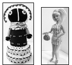
FIGURE E has a cylindrical form with no curvilinear features whereas FIGURE F emphasises feminine body curves.✓ The doll's form in FIGURE E appears big and heavy whereas FIGURE F's form appears slim and light.✓ The face and hands of FIGURE E are stylized, whereas FIGURE F's face, hands and shoes appear very life-like.✓
FIGURE E's use of stylized forms and different beads and patterns shows the influence of the indigenous Ndebele culture and gives the doll an African design identity. ✓ FIGURE F, on the other hand, clearly reflects a Western design identity as it represents the stereotypical western ideal of a perfect woman with a perfect figure, flawless complexion, blond hair and blue eyes.✓
FIGURE E is handmade using rolled black cotton material as a solid foundation for the beaded adornment, whereas FIGURE F is machine made and hollow because it is made from a plastic mould.✓ The apparel in FIGURE E uses hand stitching techniques to create a doll that resembles a Ndebele woman dressed in traditional attire, whereas the apparel of FIGURE F is factory made with popular and new synthetic materials of the era.✓The handmade quality of FIGURE E gives it a more personal and individual quality whilst the machine made quality of FIGURE F makes it appear artificial and impersonal✓
FIGURE E functions as a fertility doll given to new brides that symbolises good fortune in bearing children and growing their families✓ FIGURE F, functions as a toy for girls that serves as the epitome of western beauty and perfection.✓ In contemporary times FIGURE E has also been used for decorative purposes FIGURE F has become a collector's item.✓
Both FIGURE E and FIGURE F use colour to communicate the look or style.✓ The repetition of black and white in the head and bottom of the skirt of FIGURE E is striking and unifies this doll.✓ The repetition of pink in the handbag, shoes and dress of FIGURE F is unified with the pink/pale skin tone of the doll.✓ The colours in FIGURE E are bright and strong, whereas the colours in FIGURE F are pastel like and soft.✓The colours used for Figure E are representative of African women whereas the colours used for Barbie FIGURE F of light skin and bleached blonde hair is stereotypical of western women. ✓
Credit any other valid statements.
NOTE: A maximum of ONLY 3 marks may be allocated for tabular comparison responses. Use cognitive levels as guidelines.
| Q3.1 LEVEL | COGNITIVE SKILLS | WEIGHTINGS | QUESTIONS | MARKS (10) |
| Lower order | Remember, Recall, Recognise | 30% | 3.1 | 1 2 |
| Understand, Explain, Describe | ||||
| Middle order | Apply, Implement, Organise | 40% | 3.1 | 4 |
| Higher order | Analyse, Compare, Interpret | 30% | 3.1 | 1 2 |
| Evaluate, Reflect | ||||
| Synthesise, Justify |
OR
3.2 [10 marks] (Allocate a maximum of 2 marks for each bullet/aspect)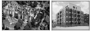
The structure of the House of Algae (FIGURE H) is multi-storeyed, block-like and geometric giving it a very modernist exterior devoid of decorative elements. In contrast to this contemporary building, the Baths of Caracalla's (FIGURE G) structure is clearly Classical as its layout is single storeyed and horizontally spread. The Caracalla bath complex is interspersed with curved archways and decorative columns.✓
The House of Algae apartment block (FIGURE H) is the first building in the world to supply its own energy, becoming fully operational when the glass façade is filled with liquid biomass that is a contemporary innovative material. While these technologically innovative panels produce energy, they will also regulate light and provide shade for the interior living areas.✓The combination of these innovative materials and technologies i.e. energy-saving algae, geothermal and solar energy, will generate more energy than the residents of the house could possibly consume. ✓ The Classical Baths of Caracalla (FIGURE G) also made use of innovative materials for that time, such as large glass windows to trap the heat.✓ This structure was called a heliocaminus; i.e. a solar furnace.✓ The heliocaminus was also used in Roman homes and could be covered with various materials such as glass or thin sheets of mica or selenite✓ In the days of Augustus, first century CE, solar architecture was so important that it provoked Roman cover disputes over sun rights. The Romans deserve high praise for their innovative technological use of solar energy.
By the 3rd century CE Roman engineering skills had developed to the extent that they were able to design fully integrated complexes.✓ The layout of water supply and drainage systems of baths was complex; the engineers had to ensure an adequate flow to and from the numerous hot and cold baths.✓ The water needed for the Caracalla Baths (FIGURE G) flowed over 90 km along the Aqua Marcia aqueduct.✓ The complex layout guided the water into a huge cistern✓ from which it went by gravity flow through pipes underneath the gardens to the main building.✓ Inside the main building the water was then distributed to the cold pools or to boilers over wood fires where it was heated for the warm and hot baths, when the solar heating was not sufficient.✓ Waste water was removed from each basin via drains, to the municipal drain in the valley.✓ Both distribution and drainage pipes were accessible through tunnels for inspection and maintenance.✓ A third network of tunnels was used to store the enormous amounts of wood required to fuel the furnaces (praefurnia). The furnaces were used to heat the water and also to heat the rooms by a hot air system beneath the floor (hypocausta).✓
Hamburg aims are to make the district of Wilhelmsburg, function as a sustainable climate-friendly district.✓The House of Algae apartment block (FIGURE H) is part of a town energy project layout that aims to make the most of Hamburg a climate-
friendly carbon-neutral district.✓ This innovative approach of sustainable urban living is an important signal for building construction in times of climate change. The five story BIQ (FIGURE H) intelligent quotient-building functions as a residential apartment block.✓ Originally built as a part of the International Building Exhibition IBE, the BIQ apartment block is the world's first building to include the innovative technology of a bioreactor facade.✓The algae foliage facade also serves the more conventional function of insulating the building from street noise, heat and cold, and provides shade for the interior.✓ The building consists of 15 apartments which gives residents a new approach to life through innovative materials and technologies. Individually controlled rooms make it possible to switch functions and components on and off on demand.✓
The Caracalla bath complex (FIGURE G) functioned as a place where after a morning's work; most Romans could enjoy spending the afternoon at the thermal or a public bath complex.✓ The baths also functioned as a social meeting place.✓ The BIQ Algae House, (FIGURE H), functions as an apartment block.✓ The facade of the contemporary building, a five-story building, is purely functional and non-decorative as the rectangular glass panels are filled with algae suspended in water. The algae are used to produce energy thus turning the building into a Plus Energy House.✓ In comparison to the modern BIQ House of Algae apartment block (FIGURE H) the facade of the Baths of Caracalla (FIGURE G) was adorned with non-functional, decorative Classical elements such relief carvings, pilasters, columns and recesses.✓ This creates a far more decorative exterior than that of the BIQ House of Algae (FIGURE H) whose smooth glass panels form a simple machine-like grid of silver and green.✓
When learners refer to their own examples they must refer to the questions bullets.
Credit must be given to any other valid statements or a comparison of a Classical and contemporary building that the candidate has studied.
NOTE: A maximum of ONLY 3 marks may be allocated for tabular comparison responses. Use cognitive levels as guidelines.
| Q1.2 LEVEL | COGNITIVE SKILLS | WEIGHTINGS | QUESTIONS | MARKS (10) |
| Lower order | Remember, Recall, Recognise | 30% | 3.2 | 1 2 |
| Understand, Explain, Describe | ||||
| Middle order | Apply, Implement, Organise | 40% | 3.2 | 4 |
| Higher order | Analyse, Compare, Interpret | 30% | 3.2 | 1 2 |
| Evaluate, Reflect | ||||
| Synthesise, Justify |
SECTION B: DESIGN HISTORY
QUESTION 4 [30 marks]
4.1 Allocate 20 marks in total.
Allocate 10 marks for each movement. Note that ONLY ONE mark can be allocated for the name of a designer and product of each movement. Use the cognitive levels as guidelines.
This marking guideline supplies an answer for the following two possibilities:
- Postmodernism
- Pop design
The Postmodern Design movement aimed to move away from the Modernist's world of technology. They found Modernism to be sterile, boring and repetitive.✓ They wanted to create designs that recognised the world of people and human purpose. Their designs were humane and clearly aimed to address the needs of people.✓ Whilst Modernism focussed on creating a universal style celebrating geometric abstraction, uniformity and modernity, the Postmodernists focussed on individual needs and solutions.✓ The Modernists' designs rejected all past styles and traditions in favour of a rigid, technology-inspired style. The Postmodernists, on the other hand, referred to past styles and traditions in order to connect people with their past.✓
Postmodern designers were influenced by Classical building elements such as the column, the pediment, the portico and the arch.✓ These elements are visible in designs such as the 'AT & T building' by Johnson and Burgee where a high-rise building ends in a pediment which has been cut open.✓ They also reintroduced traditional building materials such as stone, wood and brick to bring back nature and warmth to the cold, technological, machine-like designs of the Modernists.✓ Postmodern designers did not want to reject Modernism completely. They still 'have their feet' in the Modernist's developments in technology and use their technological inventions such as glass curtain walls, the steel frame structure and reinforced concrete in their buildings to create eclectic designs which combine the past and the present.✓
Postmodern designs are concerned with human needs in other ways too, for example characteristically they bring back colour and decoration in order to make their designs fun and visually appealing.✓ In contrast to the Modernists' belief in 'Less is More' the Postmodernists believe in 'Less is Bore'.✓ They move away from the serious mood of Modernist designs and bring humour and quirkiness into their designs – for example using classical elements in a non-functional way, for example a cut-out flat column is used as decoration and a reference to the past in Venturi's 'Vanna House'.✓ In contrast to the Modernists' emphasis on functionalism they play with ambiguity where the function is not immediately obvious✓ Designs become multi-layered and full of references that make viewing more human-centred, interactive and exciting.✓
A good example of Postmodernist design is Portland building by Michael Graves✓
The facades of the Portland building have a human purpose as they are designed to entertain and amuse. They are decorative and colourful, displaying the Postmodernists belief that people are tired of the Modernists' adherence to 'Truth to Materials', their standardised geometric structures and belief in uniformity.✓ These decorations refer to history, for example keystones and pilasters are used with the purpose of reconnecting humans to the past.✓ The building depends on the Modernist use of the steel frame and reinforced concrete technology to achieve its large, multi-storied size.✓
Pop design is inspired by the everyday, urban life of the 1960s and one of their aims was to connect with the human need for escapist entertainment, the transient and the world of glamour.✓ Their designs are a reaction against abstract, serious, intellectual design.✓ They aim to use the world of people as their subject matter. This can be seen in their use of understandable everyday culture as their subject matter.✓ Images that were once considered to be superficial and mundane are now used in designs, for example junk food, film stars, electronic equipment, tinned food, etc.✓ People are connected in a very direct and simple way with their interests.✓
Pop designs are often kitsch, appealing to people's love for bright, happy colours, and easy to understand, sentimental imagery such as hearts and red lips are used. ✓The influence of Op Art and Kinetic Art can be seen in Pop designer's use of simple, bold, eye-catching patterns.✓ Another influence on Pop design is the Anti-Design movement where conventional norms are questioned and unexpected forms, materials and images result in humorous, quirky designs.✓ Exaggerated visual distortions disorientate and amuse the spectator.✓ Pop design very clearly has its feet in the world of new materials and technologies. Many Pop designers enjoy experimenting with the possibilities that plastic gives to them. The new technique of injection molded plastic results in sculptural products with very fluid lines.✓ The Verner Panton 'Cantilever Chair' is a good example of this technique.
Another new technology explored by Pop designers was moulded plywood, which also allowed for new sculptural, lightweight forms that could be mass-produced cost-effectively serving the world of human needs.✓
A good example of Pop Design is the Studio 65 Leonardo, sofa, 1969✓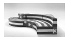
This design clearly illustrated Pop designers' use of the world of people as their subject matter. Popular, recognisable, everyday imagery (in this case the American
flag) is used as the inspiration for the forms and the patterns on products.✓ The simple, striking bold stripe pattern and stars are typical of Pop design.✓ Using a flag design to inspire a bench is an example of Pop design's rejection of traditional ideas regarding design and their use of surprising, unconventional subject matter.✓
Credit any other valid statements
| Q4.1 LEVEL | COGNITIVE SKILLS | WEIGHTINGS | QUESTIONS | MARKS (10) |
| Lower order | Remember, Recall, Recognise | 30% | 4.1 | 4 2 |
| Understand, Explain, Describe | ||||
| Middle order | Apply, Implement, Organise | 40% | 4.1 | 8 |
| Higher order | Analyse, Compare, Interpret | 30% | 4.1 | 2 2 2 |
| Evaluate, Reflect | ||||
| Synthesise, Justify |
4.2 [10 marks] (Allocate a maximum of 2 marks for each bullet/aspect.)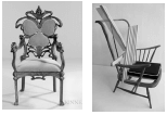
The Art Nouveau chair's (FIGURE I) use of flowing, organic line clearly shows the influence of the Arts and Crafts' interest in curvilinear line and curving stems.✓The influence of nature is also visible in the use of organic lines seen in the Art Nouveau chair.✓ In contrast, the geometric faceting of the Deconstructivist chair (FIGURE J) reflects the influence of Cubism/De Stijl/Bauhaus.✓ The Anti-Design movement's aims to undermine traditional design structures can also be seen in this chair's use of unconventional, non-functional forms✓
The Art Nouveau chair (FIGURE I) has a comfortable, padded seat and backrest that enhances the ergonomics of the design product.✓ The Deconstructivist chair (FIGURE J) has a forward-leaning backrest which will make leaning backwards impossible.✓This chair does not consider the comfort or the posture of the body.✓
Vertically the Art Nouveau chair (FIGURE I) reflects a symmetrical balance as the one side is a mirror image of the other side.✓ This use of symmetry lends a formal, ordered and balanced quality to the chair.✓ The Deconstructivist chair (FIGURE J) is asymmetrically balanced as lines and shapes on the left hand side are not reflected on the right hand side. ✓ This results in a much more informal and dynamic effect.✓
The Art Nouveau chair (FIGURE I) clearly reflects their love for the undulating, organic, whiplash line which creates very energetic linear rhythms.✓On the other hand, the Deconstructivist chair (FIGURE J) consists mostly of straight and angled lines which give it a dominantly rigid and strong look.✓This strength is softened by the contrasting curving line of the non-functional backrest and seat.✓
The bulky Art Nouveau chair's (FIGURE I) form is traditional with a typical backrest, chair seat, arm rests and cabriole legs.✓The Deconstructivist chair (FIGURE J) defies these norms by inserting an angular grouping of slatted lines in the place of a comfortable backrest.✓This renders the chair non-functional.✓ The organic and curvy forms of the Art Nouveau chair suggest femininity,✓ whereas the Deconstructivist form is more geometric and masculine.✓
Credit any other valid statements.
NOTE: A maximum of ONLY 3 marks may be allocated for tabular comparison responses. Use cognitive levels as guidelines.
| Q4.2 LEVEL | COGNITIVE SKILLS | WEIGHTINGS | QUESTIONS | MARKS (10) |
| Lower order | Remember, Recall, Recognise | 30% | 4.2 | 2 1 |
| Understand, Explain, Describe | ||||
| Middle order | Apply, Implement, Organise | 40% | 4.2 | 4 |
| Higher order | Analyse, Compare, Interpret | 30% | 4.2 | 1 1 1 |
| Evaluate, Reflect | ||||
| Synthesise, Justify |
SECTION C: DESIGN IN A SOCIO-CULTURAL/ENVIRONMENTAL AND SUSTAINABLE CONTEXT
QUESTION 5 [20 marks]
Answer EITHER QUESTION 5.1 OR QUESTION 5.2.
5.1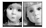
5.1.1 (Allocate 6 marks)
The posters make use of a close-up, cropped view of the dolls' faces as the lay-out. This cropping ensures that the eyes become the focal point. ✓These large, vulnerable and pleading eyes seem to be directly aimed at the viewer.✓ They engage with the viewer's gaze and this direct eye contact forms an emotional 'link' between the viewer and the poster.✓ The black outline gives the appearance that it is a photograph.✓
The poster uses dolls to suggest young children are more likely not to 'speak out' about abuse. The dolls are inanimate and lifeless but have real looking children's eyes which make the dolls look lifelike.✓ Dolls are synonymous with children and the connection is emphasised by making the dolls look more lifelike. To make the images more powerful, the designer gave each doll a little tear, which runs down from its eyes.✓ The tears tell a tragic story of children silently crying in pain. The tears also make these dolls feel real as dolls cannot cry.✓ The blurred or erased mouths alert the audience to the fact that something is wrong✓ Abused children often do not speak of their abuse to anyone. They are afraid that their abuser will find out or that no one would believe them.✓ Removing their mouths shows the viewer that their “voices” have been removed. ✓ The faces without mouths create a surreal effect which enhances the disturbing and dark message of the poster.✓
The words “SPEAK OUT” are in a bold, black, sans serif text which totally replaces the mouths and conveys the seriousness of the message.✓ This also draws the viewer's attention towards this main message of the campaign.✓ Yet, at the same time, the words “SPEAK OUT” are smaller in proportion to the rest of the other facial features. This design technique brings attention to children that need to speak out.✓ The words 'when you can't talk about abuse, talk to us' at the bottom of each poster is also in a sans serif text, helping to show the seriousness of the message.✓ The white letters stand out clearly against the black background ensuring that this important message is legible.✓
5.1.2 Allocate 14 marks in total, 7 marks per case study.
Allocate 1 mark for the name of the designer and the name of design product.
ONE CONTEMPORARY SOUTH AFRICAN DESIGNER/DESIGN GROUP
- Name of a designer/design group/design company and one design product
Victoria Yards by the developer Brian Green from Group 44.
(Allocate 3 or 4 marks) - A brief discussion of the general characteristics of the design
The previously derelict cluster of industrial buildings in Johannesburg, CBD, has been revived into an urban oasis and named Victoria Yards by Group 44's Brian Green✓
Built as a laundry in the early 1900s, the property serviced the mining and cotton nappy business.✓ After the cotton nappy industry declined in value, together with the area losing its allure, the property turned into a centre for chop shops (scrapyards) and illegal businesses, falling into disrepair.✓ Victoria Yards is an 'urban generation' project and offers a mix of studios, workshops and galleries that covers about 30,0000m2 and includes the Jukskei River.✓
Every month the studios and workshops open their doors, performers offer theatre productions and a variety of food is offered by street food vendors.✓ An open industrial space houses a large market which offers artisanal cheeses, kombucha, deli foods, spices and fresh vegetables from the property and surrounding producers.✓
(Allocate 2 or 3 marks) - Explain how the designer's work reflects social consciousness
This project is socially responsible in various ways. The heritage buildings are minimally changed, leaving their architectural honesty and character bare. ✓ Built in 1924 as a series of workshops and factories, the gabled façade and saw-tooth structures remain with some raw, industrial elements added. ✓ The project has a brownfield status; a term used in urban planning to describe any previously developed land that is not currently in use. The social upliftment of the area through urban regeneration that supports sustainability and regeneration is addressed as a social concern.✓
There is a focus on collaborations and skills development for makers living in the area.✓ Locals are offered free stall space to sell produce at the weekly market.✓ Some of the tenants, like Stitch (a social enterprise for abused women that create embroidered textiles) are fully subsidised. It is also home for some of the country's top artists and artisans.✓ Artists like Benon Luutya, Ayanda Mabulu, Blessing Ngobeni and Roger Ballen all create their work to exhibit and sell. Highly sought-after artisans like David Krynauw have also taken up residence alongside other makers, designers, metalworkers and producers, forming a symbiotic community.✓
ONE INTERNATIONAL DESIGNER/DESIGN GROUP
Name of a designer/design group/design company and one design product
Babocush, designed by Kerri Nevins.✓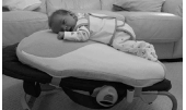
(Allocate 3 or 4 marks)
- A brief discussion of the general characteristics of the design
This design solution allows for your baby to be strapped on the Babocush immediately after a feed for instant relief from wind/gas pains. The cushion holds your baby in a very natural position✓ as it allows the baby's airway to relax and stay open as opposed to sitting slumped over in a bouncer, rocker or car seat. ✓ The incline of the Babocush is adjustable, ensuring your baby is in the correct position to prevent acid reflux.✓ The Babocush gently vibrates and sways from side to side encouraging the baby to relax.✓
(Allocate 3 or 2 marks) - Explain how the designer's work reflects social consciousness.
Limited social support, the inability to afford childcare and single parenthood can make it very challenging for parents to cope with the physical and psychological demands of caring for a new born baby.✓ The frustration linked with feeling overwhelmed after childbirth is a contributing factor in postpartum depression. ✓ Exhaustion affects a woman's ability to be able to breastfeed her child and a frustrated mom leads to a frustrated baby.✓ The Babocush is a cushion that aims to give parents much needed help with reduced crying from colic and reflux, tummy time, winding and calming of the baby.✓ Babocush helps prevent colic by holding the baby securely and has the extra comfort of a gentle vibration and heartbeat sound.✓ The Babocush provides essential recommended tummy time. New-born babies' skulls are so soft that flattening of the head will occur if not enough tummy time is provided.✓
Credit any other valid statements.
| Q5.1 LEVEL | COGNITIVE SKILLS | WEIGHTINGS | QUESTIONS | MARKS (10) |
| Lower order | Remember, Recall, Recognise | 30% | 5.1.2 | 2 4 |
| Understand, Explain, Describe | ||||
| Middle order | Apply, Implement, Organise | 40% | 5.1.1 5.1.2 | 4 4 |
| Higher order | Analyse, Compare, Interpret | 30% | 5.1.1 5.1.2 | 2 4 |
| Evaluate, Reflect | ||||
| Synthesise, Justify |
5.2
5.2.1 (Allocate 2 marks)
By using South African traditional beadwork on well-known brands these brands are connected to our heritage and culture.✓ These super-sized renderings (similar to the Pop Art style) of popular 'proudly South African' products encourage pride in our traditional bead craft and the need to buy local.✓ Women from these poor communities are provided the employment opportunity to apply their beaded craft and to develop a personal style whilst applying it to a contemporary marketable product.✓
Credit any other valid statements.
5.2.2 (Allocate 8 marks)
- Refer to the statement (allocate 1 mark)
- Materials, methods and processes used in making the craft product (allocate 2 or 3 marks)
The Ndebele people created large colourful wall murals on their houses using brushes that were hand-made with chicken feathers or they painted with their fingers.✓ The original paint on the hut was a limestone whitewash.✓ The colours used to make the paintings were mostly natural pigments consisting of browns, blacks, and a range of ochre. Today commercial PVA paints are used in place of traditional natural pigments.✓
Most of the patterns were of a V-shape and a simple triangle on a large shape of colour applied with thick black lines in patterns that echo Ndebele beadwork.✓ The women of the Ndebele are often the tradition carriers and the main developer of the wall art of their home.✓The tradition and style of house painting is passed down from generation to generation by the mothers.✓ This traditional craft celebrates the cultural heritage practices of the Ndebele people as part of one culture of the collective South African diverse culture.
This enhances national pride through which other countries are able to identify with our South African heritage.✓ The repeated geometric patterns and shapes are first drawn with a black cloissonistic outline.✓ The patterns are then filled-in with tints and tones of the colours. The patterns are grouped on the walls in terms of their basic design structure.✓
Since the later part of the 1960s, a new style became evident, the outlines and colours have significantly changed; contemporary imagery such as cell phones and aeroplanes are now incorporated into the design to reflect modern society.✓The murals were used as a form of protest or resistance design against the imposed oppression.✓ - The possible functions of the craft products (allocate 2 or 3 marks)
Originally, patterns were painted on the houses as part of a ritual of Ndebele people to announce events like a birth, death, wedding, or when a boy went off to the initiation school. ✓ These expressive symbols were a form of communication between sub-groups of the Ndebele people; they stood for their continuity and cultural resistance to their circumstances.✓ These wall paintings created by the women were their secret code to their people, undecipherable to anyone but the Ndebele. ✓ The vibrant symbols and expressions portray communications of personal prayers, self-identification, values, emotions, and marriage. Sometimes the male initiation, known as the 'wela', was a reason for repainting their houses. ✓ - Possible symbolic meaning of patterns and/or of the craft products (allocate 2 or 3 marks)
There are five main colours represented: red and dark red, yellow to gold, a sky blue, green, and sometimes pink. The colours have a symbolic meaning to the Ndebele as they can refer to the status or power of the homeowners, offer prayer, announce a marriage in the home, or can represent a current protest.✓
Credit any other valid statements.
5.2.3 (Allocate 10 marks)
- Name of a designer/design group/design company and one design product (allocate 1 mark)
Pinda and Nandini Stacked Side Tables designed by Siyanda Mbele ✓ - A detailed description and analysis of the above product (allocate 5 or 6 marks)
Siyanda Mbele produces functional products reflecting the colourful, geometric patterns of the Ndebele and gives it a refreshing, and contemporary update. ✓ The patterns have provided the inspiration for an innovative range of furniture titled, 'Nandini'. The collection comprises of compact, multi-functional side tables that can also be stacked to form shelving units. ✓ These colourful tables are stackable and reflect Scandinavian ideals of space saving. ✓ Each table is individually hand painted, designed, and manufactured under the label Pinda. This allowed him to create 'bespoke designs'. ✓ - Explain how it reflects the influence of indigenous knowledge systems (allocate 3 or 4 marks)
Siyanda Mbele is inspired by the diverse cultures of South Africa, in that he references patterns of the Ndebele, Venda and Zulu amongst others in his work✓ His explorations of simplifying and playing with shapes are a defining hallmark of his designs. He uses traditional African aesthetics to inspire the surface patterns and product shapes, e.g. the structure of the legs. ✓ Siyanda Mbele successfully transforms the African aesthetic inspired coffee table that is adorned with the Ndebele patterns into a contemporary design. ✓The stepped pyramid design, a key focus in this range, is inspired by work of the internationally acclaimed Ndebele artist, Esther Mahlangu. ✓ Her 'istegetsane' zigzag style is evident in the boldly styled, colourful coffee table. ✓The applied geometric, Ndebele patterns are transformed into a three-dimensional design which can be stacked with a high quality African aesthetic. ✓
Credit any other valid statements.
NO marks should be given for repetition of designer(s) and their work used in this question paper.
| Q5.2 LEVEL | COGNITIVE SKILLS | WEIGHTINGS | QUESTIONS | MARKS (10) |
| Lower order | Remember, Recall, Recognise | 30% | 5.2.2 5.2.3 | 4 2 |
| Understand, Explain, Describe | ||||
| Middle order | Apply, Implement, Organise | 40% | 5.2.1 5.2.2 5.2.3 | 2 2 4 |
| Higher order | Analyse, Compare, Interpret | 30% | 5.2.2 5.2.3 | 2 2 2 |
| Evaluate, Reflect | ||||
| Synthesise, Justify |
QUESTION 6 [20 marks]
6.1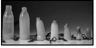
6.1.1 (Allocate 2 marks)
Biodegradable materials refer to materials that can decompose completely and not leave any traces of toxins in our earth or water. ✓ The bottle in FIGURE M is made from seaweed, a biodegradable, natural material that will decompose quickly and will not harm the earth. ✓
6.1.2 (Allocate 4 marks)
Plastic straws✓ are single-use products that are made from plastic which is non-biodegradable and contributes to large scale ocean, river and land pollution. ✓ Fast food packaging ✓ made from polystyrene is discarded after use and can take hundreds of years to decompose. ✓ These waste materials contribute to landfills and are often consumed by animals resulting in poisoning and death. ✓ Note: materials may also be referred to.
Credit any other valid statements.
6.2 Allocate 14 marks in total, 7 marks per case study.
Allocate 1 mark for the name of the designer and the name of the design product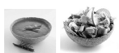
ONE CONTEMPORARY SOUTH AFRICAN DESIGNER/DESIGN GROUP
- Name of designer/design group/company and ONE design product Munch Bowls by Georgina de Kock. ✓
- Refer to the statement (allocate 1 mark)
- Environmental challenges that have been addressed (allocate 2 or 3 marks)
- The Munch Bowls by Georgina de Kock were inspired by a growing concern to preserve the environment.✓ The edible Munch Bowls are an eco-friendly, green alternative to toxic, and wasteful plastic and polystyrene food containers.✓ These Munch Bowls reduce our carbon footprint as they utilise material that does not impact negatively on the environment.✓
- The appropriate use of materials, processes and technologies used during the research and production phases (allocate 2 or 3 marks)
Munch Bowls aim to create more innovative, practical and wholesome edible eco-friendly products in the future.✓ The edible Munch Bowl is derived from the idea of edible biscuit ice cream cones.✓ The plant-based container is biodegradable and an ideal serving bowl for meals at festivals and other outdoor events.✓
ONE INTERNATIONAL DESIGNER/DESIGN GROUP
- Name of designer/design group/company and ONE design product Edible water pods called the "Ooho!" by Skipping Rocks Lab ✓
- Environmental challenges that have been addressed (allocate 2 or 3 marks)
Ooho edible water pods challenge the greatest contributor to landfills, i.e. plastic bottles. In addition to this, the pollution caused during the production of plastic bottles is also addressed.✓ This edible pod, filled with water, could answer the world's plastic pollution problem by reducing the use of plastic and other harmful materials.✓ - The appropriate use of materials, processes and technologies used during the research and production phases (allocate 2 or 3 marks)
The transparent membrane of these Ooho pods is made from a fully biodegradable, seaweed extract.✓ A group of three to ten Ooho pods can be encapsulated in a peelable skin, just like an orange. ✓ The material is transparent but can be coloured to differentiate the peel from the core.✓ Seaweed is readily available and can be produced in all countries. ✓ Seaweed is a sustainable plant source. ✓ It is a material that is so renewable that it makes one wonder why toxic materials are being used when nature provides materials that are so renewable. ✓
Credit any other valid statements.
| Q6 LEVEL | COGNITIVE SKILLS | WEIGHTINGS | QUESTIONS | MARKS (10) |
| Lower order | Remember, Recall, Recognise | 30% | 6.1.1 + 6.2 | 2 + 2 2 |
| Understand, Explain, Describe | ||||
| Middle order | Apply, Implement, Organise | 40% | 6.1.2 6.2 | 2 6 |
| Higher order | Analyse, Compare, Interpret | 30% | 6.2 | 2 4 |
| Evaluate, Reflect | ||||
| Synthesise, Justify |
TOTAL SECTION C: 40
GRAND TOTAL: 100