DATA HANDLING GRADE 12 NOTES - MATHEMATICAL LITERACY STUDY GUIDE
Share via Whatsapp Join our WhatsApp Group Join our Telegram Group- Developing research questions
- Collecting data
- Classifying and organising data
- Activity 1: Working with frequency tables
- Summarising data
- Measures of central tendency and measures of spread
- Activity 2: Measures of central tendency
- Measures of spread
- Activity 3: Measures of spread
- Activity 4: Working with a percentile graph
- Representing, interpreting and analysing data
- Line graphs
- Bar graphs
- Activity 5: Working with bar graphs
- Histograms
- Activity 6: Working with histograms
- Pie charts
- Activity 7: Working with pie charts
- Scatter plot
- Box and whisker plots
- Activity 8: Box and whisker plots
- Misleading data
- Activity 9: Revision exercise
Data handling
Data is a collection of numerical figures and information used in research.
Data handling involves the following processes: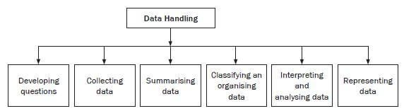
6.1 Developing research questions
Before we start the research process, we need to make sure that we state the aim of the research clearly, in a way that can be measured. The aim of the research is then written as a research question. This will guide us to formulate the tool to be used to collect the data. Data may be collected from a population. Open-ended and closed questions may be used.
In an open-ended question, the answer is usually the opinion of the respondent and the respondent can answer in their own words. In this way you can gain insightful data and avoid receiving answers that are biased. A disadvantage of this type of question is that respondents might leave it out if it takes too long to answer.
Closed questions could give options for the respondent to choose from, which is convenient because they can simply tick the right box. A disadvantage of this type is that, when an option provided does not accommodate all respondents, this may lead to a situation where some of the questions are not answered.
The aim of the research influences the choice of the sample and the method of collecting data. The population is a group that the data is collected from, e.g. Gauteng Matric learners. If the population is large, a sample may be used. A sample is a portion chosen to represent the population e.g. learners from 10 schools in Gauteng to represent the matriculants of Gauteng.
The choice of sample can have an effect on the reliability of the data and could even lead to sample bias. Sample bias occurs when the sample is not representative of that population, e.g. if the selected learners are from city schools only, then the sample will be biased because they might not share similar characteristics with learners from townships and farms schools. Random sampling is used to minimise sample bias. However it might still lead to sample bias, if the random sample is composed of learners from township schools only.
So demographic factors, race, gender, age, etc. should be controlled when sampling.
The method of collecting data will help us to identify the most appropriate tool to be used when collecting the data.
There are three methods of collecting data:
- Observation: This is the method of collecting data by watching and recording the The advantage of this method is that you don’t interact with people to get the response.
- Questionnaire: This is a list of questions used to collect data from the respondents. Participants do not have to identify themselves. The advantage of using this method is that you get the information directly from the
- Interview: The interviewer asks the interviewee questions and records the The advantage of this method is that the interviewer may ask further questions if the response is vague.
6.3 Classifying and organising data
- Organising data is taking information and arranging it into some kind of order (such as ascending or descending order).
- Classifying data means organising it in groups or classes, based on some common
Data can be organised by using tally marks. These are a way of counting how many of each group there are. They are used when the data is discreet.
e.g. Worked example 1
An Audi sales person has ordered cars from their plant in Germany. The table below shows the number of cars they received.
Colour | Red | White | Silver | Black |
Model | ||||
A3 | 2 | 5 | 4 | 3 |
A4 | 3 | 2 | 3 | 6 |
S3 | 4 | 3 | 5 | 5 |
Q7 | 1 | 4 | 4 | 3 |
R8 | 2 | 3 | 1 | 4 |
Use the information provided above to construct a tally table for A3 cars.
Solution
Use vertical lines (tally marks) to represent the specific colour; the fifth tally mark should be drawn the across the 4 tally marks.
Colour | Frequency | Tally |
Red | 2 | |
White | 5 | |
Silver | 4 | |
Black | 3 | |
e.g. Worked example 2
This grouped frequency table shows the heights of seedlings (young plants) in different categories.
Height of seedling (mm) | Frequency |
10–14 | 3 |
15–19 | 6 |
20–24 | 7 |
25–29 | 5 |
30–34 | 4 |
- How many plants were measured altogether?
- How many plants are less than 20 mm high?
- How many plants are more than 24 mm high?
- What percentage of seedlings are below 25 mm?
- How many plants are at least 25 mm high?
Solutions
- 3 + 6 + 7 + 5 + 4 = 25 plants were measured
- 3 + 6 = 9 plants are less than 20 mm
- 5 + 4 = 9 plants are more than 24 mm
- 16 ÷ 25 × 100% = 64%
- There are nine plants that fall into the intervals of 25 mm or longer.
Activity 1: Working with frequency tables
The Geography examination marks, expressed as a percentage, of 52 learners were recorded as follows:
54 | 67 | 83 | 34 | 49 | 56 | 78 | 89 | 90 | 79 | 20 | 49 | 50 |
70 | 89 | 57 | 27 | 48 | 56 | 65 | 70 | 22 | 98 | 89 | 29 | 56 |
47 | 95 | 49 | 67 | 89 | 48 | 46 | 89 | 63 | 75 | 45 | 50 | 58 |
73 | 67 | 45 | 76 | 70 | 38 | 46 | 37 | 47 | 36 | 38 | 99 | 100 |
In the exam you are required to show results in terms of seven performance levels rather than percentages. As a result, the subject internal moderator who is analysing the results needs to work out the number of learners per performance level. Complete the frequency table below to work out the number of learners per performance level. [14]
FREQUENCY TABLE : LEARNER PERFORMANCE IN GEOGRAPHY | |||
PERFORMANCE LEVEL | PERCENTAGE RANGE | TALLY | FREQUENCY |
1 | 0 to 29 | ||
2 | 30 to 39 | ||
3 | 40 to 49 | ||
4 | 50 to 59 | ||
5 | 60 to 69 | ||
6 | 70 to 79 | ||
7 | 80 to 100 | ||
Solutions | |||
Frequency table : learner performance in geography | |||
Performance Level | Percentage Range | Tally | Frequency |
1 | 0 to 29 | III ✓ | 4 ✓ |
2 | 30 to 39 | IIII✓ | 5 ✓ |
3 | 40 to 49 | IIII IIII I ✓ | 11 ✓ |
4 | 50 to 59 | IIII III ✓ | 8 ✓ |
5 | 60 to 69 | IIII ✓ | 5 ✓ |
6 | 70 to 79 | IIII III ✓ | 8 ✓ |
7 | 80 to 100 | IIII IIII I ✓ | 11 ✓ |
[14] | |||
After data has been collected, classified and organised it is not always possible to mention every piece of data in a report. Instead we summarise data by describing the whole data set using just a few numbers. Summarising data also makes it easier to analyse the data later. Data can be summarised by using measures of central tendency or measures of spread.
6.4.1 Measures of central tendency and measures of spread
A measure of central tendency is a single value that attempts to show a central position of a set of data. There are three types of measures of central tendency: mean, mode and median.
Mean
The mean is the most common measure of central tendency that is used, but it can be easily influenced by high or low numbers in the data set. It is also known as the average. It is calculated by adding all the values together and dividing by the number of values in the data set.
Median
The median is the middle number in the data set. To determine the median, you have to write all the numbers in the data set from the smallest to the highest and the number in the middle will be your median. If there is more than one number in the middle (i.e. if the data contains an even number of data values) add the two numbers in the middle and divide the answer by 2.
Mode
The mode is the data value that appears most often in a set of data. No calculation is needed to find the mode. You just find the value that appears most frequently. If no number appears more than the other numbers, then there is no mode.
e.g. Worked example 3 |
The principal of Hills Primary School compiled data of the number of learners who receive social social grants in each class. 0 0 1 1 1 2 2 2 3 3 3 3 4 4 5 5 6 6 6 7 7 |
- How many different classes are there at Hills Primary School?
- Determine:
- the mode
- the median
- the mean
Solutions
- 21 (Count how many numbers are in the data set)
- (i) Mode = 3 (the number that appears most in the data set)
(ii) Median = 3 (the middle number in the data set)
(iii) Mean = 0+0+1+1+1+2+2+2+3+3+3+3+4+4+5+5+6+6+6+7+7
21
= 71
21
= 3,38
(Add all the numbers in the data set and divide by the total number of the data set.)
e.g. Worked example 4 |
Thembeka compared the monthly salaries of the employees at two call centres, one in Greytown and the other in Johannesburg. Greytown |
Solutions
|
When answering questions on data handling where two or more data sets are given, it is advisable to underline keywords (e.g. in order to choose the correct data set for the question, underline the town for the data set that you have to use).
Activity 2: Measures of central tendency
1. Information for question 1
Thandeka has a shop with a scrapbooking department and a toy department. She kept a record of the ages of the customers who visited the two departments on a particular day.
Scrapbooking is a hobby which involves cutting and pasting photos, pictures and other decorative items into a book.
Ages of customers who visited the scrapbooking department
35 | 60 | 46 | 57 | 54 |
34 | 60 | 54 | 56 | 46 |
47 | 67 | 65 | 54 | 45 |
Ages of customers who visited the toy department
5 | 15 | 25 | 7 | 36 | 21 | 70 | |
20 | 17 | 6 | 15 | 65 | 9 | 15 | |
1. | a) | Arrange the ages of the customers who visited the toy department in ascending order. | (1) | ||||
b) | Determine the mode of the ages of customers who visited the scrapbooking department. | (1) | |||||
c) | Calculate the mean age of the customers who visited the scrapbooking department. | (3) | |||||
d) | Determine the median age of customers who visited the toy department. | (4) | |||||
e) | How many customers visited the toy department? | (1) | |||||
f) | Calculate the percentage of customers older than 50 years who visited the scrapbooking department. | (1) | |||||
2.) The table below shows the results of the games played by 16 teams who are playing against each other to win the league.
Absa Premiership
Pos | Team | Pld | W | D | L | GF | GA | Pts |
1 | Kaizer Chiefs | 19 | 13 | 4 | 2 | 31 | 12 | 43 |
2 | Mamelodi Sundowns | 19 | 10 | 4 | 5 | 33 | 21 | 34 |
3 | Bidvest Wits | 18 | 10 | 4 | 4 | 23 | 13 | 34 |
4 | SuperSport United | 20 | 9 | 5 | 6 | 28 | 22 | 32 |
5 | Orlando Pirates | 17 | 9 | 3 | 5 | 21 | 13 | 30 |
6 | AmaZulu | 21 | 7 | 7 | 7 | 20 | 27 | 28 |
7 | Platinum Stars | 18 | 7 | 6 | 5 | 19 | 18 | 27 |
8 | Bloem Celtic | 19 | 6 | 8 | 5 | 25 | 24 | 26 |
9 | Ajax Cape Town | 20 | 7 | 5 | 8 | 20 | 22 | 26 |
10 | Moroka Swallows | 18 | 6 | 5 | 7 | 22 | 22 | 23 |
11 | University of Pretoria | 20 | 7 | 2 | 11 | 19 | 21 | 23 |
12 | Black Aces | 18 | 6 | 5 | 7 | 16 | 20 | 23 |
13 | Maritzburg Utd | 19 | 5 | 5 | 9 | 19 | 25 | 20 |
14 | Polokwane City | 19 | 5 | 4 | 10 | 21 | 26 | 19 |
15 | Free State Stars | 18 | 4 | 4 | 10 | 14 | 26 | 16 |
16 | Golden Arrows | 19 | 4 | 1 | 14 | 16 | 35 | 13 |
Key: Pld(games played) W(games won) D(games drawn) L(lost games) GF(goal for) GA(goals against) Pts(points)
2).
- How many teams do we have on the Absa Premiership league? (1)
- How many points does the last team on the league have? (1)
- How many games did the first team on the league play (Pld)? (1)
- Which team(s) played the least number of games? (1)
- Calculate the mean for the number of games played.Give your answer to the nearest whole (4)
- Determine the median of the “goal against” data set (GA). (3)
- Write down the mode for the points scored (Pts). (1) [12]
Note: The reason that we have all three measures: mean, median and mode, is because they can give us different information.
Solutions
- a) 5 6 7 9 15 15 15 17 20 21 25 36 65 70 ✓
b) Mode = 54 ✓
c) Mean = 35+34+47+60+60+67+46+54+65+57+56+54+54+46+45
15
= 780
15
= 52
d) 5 6 7 9 15 15 15 17 20 21 25 36 65 70 ✓
Median = 15 + 17
2
= 32
2
= 16
e) 14 ✓
f) 9 × 100 = 60% ✓
15 - a) 16 teams ✓ (1)
b) 13 points ✓ (1)
c) 19 games ✓ (1)
d) Orlando Pirates ✓
e). Mean = 19+19+18+20+17+21+18+19+20+18+20+18+19+19+18+19 ✓
16
= 302
16
= 18,88 ✓ ✓
≈ 19 ✓ (4)
f) Median (first arrange the numbers in an ascending order)
12 13 13 18 20 21 21 22 22 22 24 25 26 26 27 35 ✓
(22 + 22) ÷ 2 ✓
= 44 ÷ 2
= 22 ✓
g) Mode = 23 ✓
e.g. Worked example 5
The department of trade and industry has funded 1 internship student from Gauteng to study engineering at the University of Toronto in Canada. Mr Kasmal, the project co-ordinator has decided to use the learner’s marks in the table below, to choose the best learner.
Help Mr Kasmal to choose the best learner by calculating the mean, median and mode of the 2 learners’ results.
Subject | Internship student A | Internship student B |
Mathematics | 95 | 95 |
Physical Science | 93 | 93 |
Life Sciences | 69 | 72 |
Life Orientation | 87 | 87 |
English | 90 | 90 |
Home Language | 92 | 89 |
Geography | 90 | 90 |
Solution
Internship student A | Internship student B |
Mean = 95+93+69+87+90+92+90 | Mean = 95+93+72+87+90+89+90 |
69 87 90 90 92 93 95 | 72 87 89 90 90 93 95 |
Mode is 90 | Mode is 90 |
The measures of central tendency are the same for the two learners. In this case, these cannot be used to determine the best candidate.
The measures of spread can then be used to make the choice by analysing the spread of marks, as discussed on the next page.
Range
The range is the difference between the largest (highest) and the smallest (lowest) values.
The range is a measure of spread because it tells you how spread out the data values are.
A small range suggests that the values are grouped closer to the median, while a bigger range suggests that the values are more spread out.
Range = highest data value – lowest data value
e.g. Worked example 6
Find the range of the number of death fatalities that occurred over 6 months on the N4 highway: 3; 7; 8; 5; 4; 10.
Solution
The lowest value is 3, and the highest is 10, so the range = 10 – 3 = 7.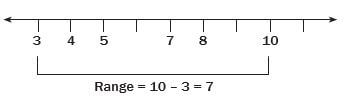
Measures of spread are used to determine how spread out the data is. We have the following measures of spread: range, quartiles and percentiles. These are used together with measures of central tendency to analyse and interpret data.
The range only indicates the spread between the lowest and highest values. This might be misleading if only the minimum and the maximum values are spread apart and the other values are grouped together.
e.g. Worked example 7
In the data: 2, 75, 79, 83, 86, 86, 89, 99, the range will be: 99 – 2 = 97, which might give the wrong interpretation that the data is spread apart. To overcome outlier values, quartiles may be used to analyse the data.
(An outlier is an extremely low or extremely high value.)
Quartiles
This is the division of data into 4 equal parts. The data is divided into four portions of 25% each.
To determine the quartiles, first divide the information into 2 equal parts to determine the median (Q2), then divide the lower half into 2 equal parts, so that the median of the first half is the lower quartile (Q1). Then divide the upper half into 2 equal parts, so that the median of the second half is the upper quartile (Q3).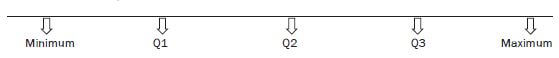
Data can be summarised using 5 values, called the five number summary,
i.e. the minimum value, lower quartile, median, upper quartile, and maximum value.
Interquartile range
This is the difference between the upper quartile and the lower quartile.
It indicates the spread between the lower part of the data and the upper part of the data
e.g. Worked example 8
The following data has been released by Statistics South Africa on fatal crashes for November and December 2011.
MONTH | GP | KZN | WC | EC | FS | MP | NW | LIM | NC |
NOV | 200 | 156 | 77 | 112 | 73 | 75 | 57 | 81 | 21 |
DEC | 182 | 227 | 107 | 135 | 90 | 109 | 78 | 120 | 32 |
Use the given table to determine the five number summary and the interquartile range for each month.
First arrange the data for each month in ascending order.
Determine the minimum and the maximum values.
Determine the median (quartile 2).
Then determine quartile 1 and quartile 3.
Solutions
November:
21 57 73 75 77 81 112 156 200
- Minimum : 21
- Maximum : 200
- Median (quartile 2 ) : 77, divides the data into 2 equal halves
- Quartile 1 divides the lower half of the data into 2 equal parts
Quartile 1 = 57+73 = 65
2 - Quartile 3 divides the upper half of the data into 2 equal parts
Quartile 3 = 112+156 = 134
2 - Interquatile = Q3 - Q1
= 134 - 65
= 69
December:
32 78 90 107 109 120 135 182 227
- Minimum : 32
- Maximum : 227
- Median (quartile 2 ) : 109, divides the data into 2 equal halves
- Quartile 1 divides the lower half of the data into 2 equal parts
Quartile 1 = 78+ 90 = 84
2 - Quartile 3 divides the upper half of the data into 2 equal parts
Quartile 3 = 135 +182 = 158,5
2 - Interquatile = Q3 - Q1
= 158,5 - 84
= 74,5
This can be summarised in the following table:
Month | Minimum | Q1 | Q2 | Q3 | Maximum | IQR |
November | 21 | 65 | 77 | 134 | 200 | 69 |
December | 32 | 84 | 109 | 158,5 | 227 | 74,5 |
The summary can be used to analyse which month had more fatalities by representing the data on box and whisker plots (in Section 7.5).
Activity 3: Measures of spread
The South African Weather Service recorded the temperatures for ten towns and cities in South Africa on 2009-05-13
TABLE 5: Temperatures recorded on 2009-05-13 for ten South African towns and cities
Temperature in °C | Bloemfontein (Bfn) | Cape Town (Ctn) | Durban (Dbn) | Johannesburg (Jhb) | Kimberley (Kmb) | Mafikeng (Mfk) | Musina (Msn) | Nelspruit (Nls) | Pretoria (Pta) | Polokwane (Pol.) |
Minimum | 5 | 13 | 15 | 6 | 10 | 8 | 20 | 9 | 7 | 3 |
Maximum | 23 | 22 | A | 21 | 24 | 23 | 40 | 22 | 22 | 22 |
Mean (average) maximum temperature = 25,6°C
Use the information in the above table to answer the following questions.
- The upper quartile for the minimum temperature is 13°C.
Identify the towns or cities in which the minimum temperatures were less than the upper quartile. (7) - Calculate:
- The maximum temperature, A for (2)
- The median of the maximum (3)
- The percentage of the towns and cities that had a maximum temperature greater than the (1)
- Would the maximum temperatures best be represented by the median or the mean?
Justify your answer. (3) - Determine the interquartile range for the maximum temperatures. (6) [22]
Solutions
- Bloemfontein, ✓ Johannesburg, ✓ Mafikeng, ✓ Kimberly, ✓ Nelspruit, ✓ Pretoria ✓ and Polokwane ✓ (7)
-
- 25,6 = 23+22+A+21+24+23+40+22+22+22 ✓
10
25,6 = A + 219
10
A = 37 - 21 22 22 22 22 23 23 24 37 40 ✓
Median = 22+23 ✓
2
= 22,5 - 2.3 50% of the cities and towns had a maximum temperature greater than the median. ✓ (1)
- 25,6 = 23+22+A+21+24+23+40+22+22+22 ✓
- The mean is affected by the 2 high temperatures ✓ (Durban 37°C and Musina 40°C). Eight of the 10 towns have maximum temperatures ✓ less than the mean The median is therefore a better representation. ✓ (3)
- 21 22 22 22 22 23 23 24 37 40 ✓✓
Q1 = 22 + 22
2
= 22
Q3 = 24 + 37
2
= 30,5
IQR = Q3 - Q1
= 30,5 - 22
= 8,5
Percentiles
This is the division of data into 100 equal groups. This is used to analyse the spread of large sets of data. Percentiles can be represented as follows: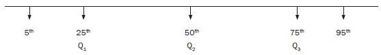
5% of values lie below the 5th percentile and 95% of the values lie above.
25% of values lie below the 25th percentile and 75% of the values lie above.
50% of the values lie below the 50th percentile and 50% of the values lie above.
95% of values lie below the 95th percentile and 5% of the values lie above.
Percentiles are used to determine the percentage of the data grouped in categories.
The concept of percentiles is used in growth charts. The curves on the growth chart below represent the percentile values of the data collected from different age groups. The growth chart is used to compare the BMI (body mass index) of a child to others in his age group. This is also used to determine the health status of the baby.
e.g. Worked example 9
A South African couple has relocated to USA .The growth chart below has been used to monitor the growth of their female children.
Use the chart to answer the questions.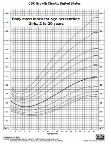
- What is the BMI of a 4 year old girl at the 95th percentile?
Solution
Draw a vertical line upwards from 4 years to the 95th percentile. Draw a horizontal line across to find the relevant BMI.
The BMI is 18 kg/m2. - The couple’s 10 year old child has a BMI of 16 kg/m2. Between which percentile curves does her BMI lie?
Solution
Draw a vertical line upwards from 10 years. Draw a horizontal lie across from 16 kg/m2. Locate the percentile, where the two lines meet. Between the 25th and 50th percentiles. - The BMI of their youngest child who is 2 years old lies at the 45th What does this mean?
Solution
The BMI of 45% of the girls of her age group is less than hers and the BMI of 55% of the girls in her age group is above hers. - Use the table below to determine the health status of their 16 year old girl with the BMI of 20 kg/m2
SolutionBMI for age percentile range
Weight status
<5th percentile
Underweight
5th percentile to < 85th percentile
Healthy
85th percentile to < 95th percentile
Risk of overweight
≥ 95th percentile
Overweight
Draw a vertical line upwards from 16 years.
Draw the horizontal line across from 20 kg/m2.
Determine the percentile and use it to determine the health status: it is just below the 50th percentile, therefore the child is healthy.
Activity 4: Working with a percentile graph
Study the growth chart below and answer questions that follow.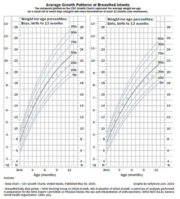
Mrs Michael, the visiting American ambassador has brought her twins, a boy and a girl who are 9 months old. She is also looking after her late sister’s daughter who is 1 year old. Use the table below.
BMI for age percentile range | Weight status |
<5th percentile | Underweight |
5th percentile to < 85th percentile | Healthy |
85th percentile to < 95th percentile | Risk of overweight |
≥ 95th percentile | Overweight |
- What is the weight of her daughter at the 75th percentile? (1)
- Give a range of percentile curves for her son who weighs 10,5 (1)
- Calculate the BMI of her niece whose height is 60 cm and whose weight at the 25th Give your answer in kg/m2.
Use the formula : BMI = mass . (3)
height2 - Do you think she must be worried about her niece’s health status? Explain. (1)
- What does it mean if the weight of a child is at the 68thpercentile? (2) [8]
Solutions
- 9 kg ✓
- 90th to 75th percentile ✓
- Her weight is 9 kg ✓
60 cm = 0,6 m
BMI = mass .
height2
= 9/0.62
= 25 kg/m2 ✓ - No, because she is healthy according to the BMI table. ✓
- The weight of 68% of the children of her age group is less than hers, and the weight of 32% of the children in her age group is above hers. ✓✓ (2) [8]
6.5 Representing, interpreting and analysing data
Purposes of graphs:
- a way of exploring the relationships in data
- a way of displaying and reporting data
- making it easier to report patterns and relationships, shapes of distributions and trends.
Any graph used to report findings should show:
- the significant features and findings of the investigation in a fair and easy-to-read way
- the underlying structure of an investigation in terms of the relationships between and within the variables
- the dependent variable on the horizontal (x) axis and the independent variable on the vertical (y)
Types of graphs
We have the following types of graphs:
- Line graph
- Bar graph
- Histogram
- Scatter plot
- Pie chart
- Box and whisker
In data handling we use line graphs to show the relationship between two quantities. A line graph is formed by using straight lines to join data points which have been mapped on a grid. It is used to show the change of information over time.
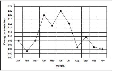
e.g. Worked example 10 | |||||||||||
Month | Jan | Feb | Mar | Apr | May | Jun | Jul | Aug | Sep | Oct | Nov |
Daily TV viewing time (min) | 108 | 103 | 108 | 120 | 115 | 122 | 116 | 105 | 110 | 105 | 104 |
| |||||||||||
Solution for example 1
- The points are plotted and connected with line segments

- You can see that Jabu’s viewing time increases in April, again in June and slightly in September (perhaps due to school holidays). We also see decreases in his viewing time during February, May, August, October and These could be times when he was preparing for tests and exams.
- Yes, it would be possible to represent this data on a bar graph; the number of minutes would be plotted as a bar for each
- A line graph helps us to see trends because we can easily see the increasing or decreasing slope of each line segment in the graph
A bar graph is used to represent data that is sorted into categories. Display data is compared in categories. Each bar shows the number of items in that category and there are spaces between the bars.
A bar graph can be a:
- single graph
- double or multiple graph
- compound or stacked
Worked example 11
The school tuck shop keeps track of how many hot dogs, sandwiches, salads and burgers they sell at one break time. They have the data given in the table below. Draw a bar graph to represent this data.
Item | Frequency |
Hot dogs | 15 |
Sandwiches | 35 |
Salads | 10 |
Burgers | 12 |
Solution for example 2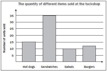
e.g. Worked example 12
A survey of 1 000 households was undertaken during 2001 to determine how many households used various electronic appliances. A survey of the same number of households was repeated during 2007.
The graph below shows the results of the two surveys.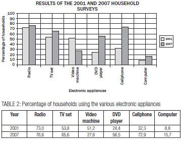
- What was the percentage increase in usage of TV sets between 2001 and 2007?
- Which appliance was used most in households during both 2001 and 2007?
- Which appliance showed a decreased usage in 2007 compared to 2001?
- How many of the 1 000 households surveyed used cellphones during 2007?
- Calculate the difference in percentage usage during 2001 between TV sets and DVD players.
Solution for example 3
- 65,6% – 53,8% = 11,8%
- Radio
- Video machine
- 72,9% × 1 000 households
= 0,729 × 1 000
= 729 households - Difference in percentage = 53,8% – 24,4%
= 29,4%
Activity 5: Working with bar graphs
The compound bar graph below shows the percentage of South African children for age seven to thirteen enrolled in primary schools during 1996 and 2007.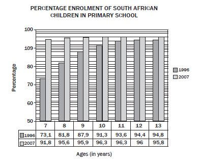
[Source: www.businessreport.co.za. 8 November 2007]
Use the graph above to answer the following questions.
- What percentage of 10 year olds was enrolled during 1996? (1)
- Calculate the increase in the percentage enrolment of 11 year olds from 1996 to 2007. (1)
- Which age group had
- the largest percentage enrolment in 1996? (1)
- the smallest percentage enrolment in 2007? (1)
- the greatest increase in percentage enrolment between 1996 and 2007? (1)
- If there were 240 000 ten year old children in South Africa in 1996, calculate the number of 10 year olds enrolled in primary schools in 1996. (2) [7]
Solutions
- 91,3% ✓
- Increase = 96,3% - 93,6% ✓
= 2,7% (1) -
- 13 year olds ✓ (1)
- 7 year olds ✓ (1)
- 7 year olds ✓ (1)
- d. 91,3% of 240 000
91,3 ÷ 100 × 240 000 ✓
= 219 120 ✓ (2) [7]
Histograms are different from bar graphs in that they represent continuous data. Data that is displayed on a histogram is also grouped. There are no spaces between the bars.
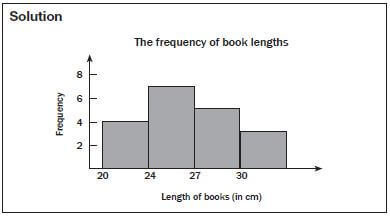
e.g. Worked example 13
Lwanda measures the lengths of his school books (in cm) and draws up the frequency table below. Draw a histogram to represent this data.
Length of book | Frequency |
20 – 23,9 cm | 4 |
24 – 26,9 cm | 7 |
27 – 29,9 cm | 5 |
Longer than 30 cm | 3 |
Activity 6: Working with histograms
Mr Smith, an investor from Australia, has just opened the branch of Raetsiza Company in Pretoria central. The graph below represents the salary categories of the employees versus the number of employees per category. Study the graph and answer questions that follow.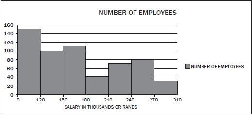
- How many people were employed by the Raetsiza Company? (2)
- How many employees are earning the lowest salary? (1)
- Why do fewer employees earn the highest salary? (1)
- Give possible reasons why there are fewer employees in the category of R180 000 to R210 000. (1)
- If the salary increases by 6%, what will be the new maximum amount for employees in the category R150 000 – R180 000? (2) [7]
Solutions
- 150 + 100 + 110 + 40 + 70+ 80 ✓ + 30 = 580 ✓ (2)
- 150 earn less than R120 000 ✓ (1)
- They are senior employees. ✓ (1)
- They have got special skills. ✓ (1)
- 106% of R180
= 1,06 × R180 000 ✓
= R190 800 ✓ (2) [7]
Pie charts are circular graphs, divided into sectors. They are used to show the parts that make up a whole. They can be useful for comparing the size of relative parts. They do not give quantities of the categories, only the relative (compared) amounts. They do not show the actual amounts. The information is often presented as percentages that must add up to 100%. They are often used in media to show clear and important differences, but they cannot show shape and spread of data.
Note: Learners are not expected to draw pie charts.
e.g. Worked example 14
The pie chart below shows a survey of the different types of the favourite fruit juice flavours that are normally bought by a group of 120 learners from Ndukwenhle High school during their lunch time.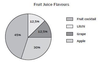
- Calculate how many learners chose each type of juice
- In what way does the pie chart work better than a bar graph to represent this data?
- What information would a bar graph give you that this pie chart does not?
Solutions
- 45% of 120 learners
= 54 learners who chose fruit cocktail.
30% of 120
= 36 learners who chose apple.
12,5% of 120 learners
= 15 learners who chose grape.
12,5% of 120
= 15 learners who chose litchi. - The pie chart is a simple, visual representation that works well for representing A pie chart allows us to see at a glance the relative proportions of the learners who prefer each flavour.
- The number of learners who prefer each
Activity 7: Working with pie charts
A recent survey looked at households in two income groups. The study determined what percentage of monthly income was spent on food, housing and other requirements. The pie charts below represent the findings of the study.
- What were the average monthly incomes of the groups considered? (2)
- What percentage of Group 1’s earnings was spent on housing? (1)
- How much was spent on housing by a household in Group 2? (2)
- Which group spent the larger amount of money on food? Justify your answer by calculations. (5) [10]
Solutions
- R3 000 and R20 000 ✓✓ (2)
- 100% – 75% = 25% (1)
- (40 ÷ 100) × 20 000
= R8 000 ✓ ✓ (2) - 1. (55 ÷ 100) × 3 000
= R1 650 ✓
2. (14 ÷ 100) × 20 000
= R2 800 (2 spent more) ✓✓ (5) [10]
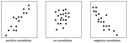
A scatter plot is the most useful graph for studying the relationship (correlation) between two variables. It shows one of the variables on the horizontal axis and the other variable on the vertical axis. The resulting scatter plot of points will show at a glance whether a relationship exists. You cannot have more than two sets of data on a scatter plot.
A scatter plot can show:
- positive correlation
- negative correlation
- no correlation
- When seeing patterns remember that the tighter together the points are clustered, the stronger the correlation between the variables you have plotted
- If you find a pattern that slopes from the lower left to the upper right, this tells you that as x increases, y also increases. This means there is a “positive” correlation between the two variables
- If you find a pattern that slopes from the upper left to the lower right, this tells you that as x increases, y This means there is a “negative” correlation between the two variables.
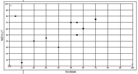
e.g. Worked example 15
After writing controlled tests for term one, Tourism and Mathematical Literacy marks of 10 randomly selected Grade 10 learners were recorded.
Learners are not expected to draw a line of best fit.
TOURISM | 55 | 60 | 20 | 70 | 5 | 40 | 50 | 10 | 30 | 55 | |
MATHS LIT | 70 | 60 | 40 | 75 | 80 | 30 | 70 | 5 | 45 | 50 |
- Draw a scatter plot for the
- Describe the relationship between the
- Is there any point you regard as an outlier? Give a reason for your
- Is there a correlation between the sets of data?
Solutions
- SCATTER PLOT

- There is a positive relationship between the Tourism and Mathematical Literacy
- Yes, point (5; 80). The learner has got the highest mark in Mathematical Literacy and the lowest mark in Perhaps there is a mistake with one of the marks.
- Yes and it is a positive correlation
Box and whisker plots are graphical representation of the five number summary of a set of data.
The five number summary:
- Minimum value
- Lower quartile (Q1)
- Median (Q2)
- Third quartile (Q3)
- Maximum value
Learners are not expected to draw the box and whisker plot.
e.g. Worked example 16
Read from the box and whisker plot the values of the five number summary.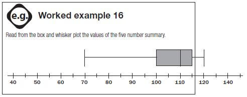
Solution
Minimum | 70 |
Lower quartile (Q1) | 100 |
Median (Q2) | 110 |
Third quartile (Q3) | 115 |
Maximum value | 120 |
Activity 8: Box and whisker plots
(Sunday times 2009 Q & A)
The box and whisker plot below represents the batting averages of 160 cricketers who have batted in T20 matches since 1 January 2009. Answer the questions that are based on the plot.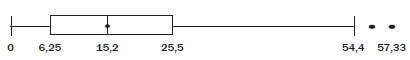
- What is the name given to the two data points with values 57 and 57,33? (1)
- How many players have a batting average less than 6,25? (2)
- What must a batsman’s average be for him to be in the top quartile? (1)
- Jacques Kallis is the South African with the highest batting average. If his average is 48,4, how does he compare with the other batsman? (1) [5]
Solution
- Outliers ✓ (1)
- About 40 players (lower quartile of 160 players) ✓✓ (2)
- >25,5 ✓ (1)
- He is definitely in the top quartile. ✓ He is close to the highest batting averages so he compares favourably with the best batsmen in the world. (1) [5]
(Used http://en.wikipedia.org/wiki/Misleading_graph as a source for graphics – Creative Commons)
Graphs in the media are often drawn to support a particular point of view. We need to be aware that in some situations the graph may give a false impression of the data.
There are numerous ways in which a misleading graph may be constructed.
Biased labelling
The use of biased words in the graph’s title, axis labels, or caption may lead the reader to an incorrect conclusion.
Misleading graphs
Comparing pie charts of different sizes could be misleading as people cannot accurately read the comparative area of circles.
Thin slices which are hard to read may be difficult to interpret.
Making a pie chart 3D or drawing at an angle might make interpretation difficult due to the resulting effect
Misleading pie chart | Regular pie chart | ||||||
| 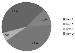 | ||||||
In the misleading pie chart, Item C appears to be at least as large as Item A, whereas it is actually less than Item A. | |||||||
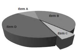
Source: BBC – GCSE: Bitesize misleading graphs
e.g. Worked example 17
The histogram below shows the price increase of houses from 1998 to 1999.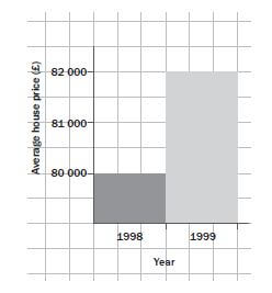
What is misleading about the histogram shown above and how should the information be represented?
Solution
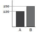
It looks as though house prices have tripled (increased by a factor of 3) in one year, but this is not true. The graph is misleading because the vertical axis does not start at 0.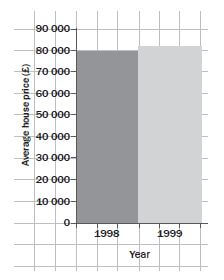
e.g. Worked example 18: Misleading graphs
What can you conclude from the graph given here? How best can this information be presented?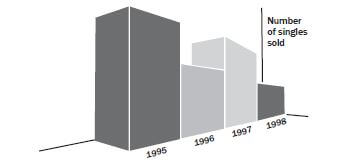
Axis changes
Changing y-axis maximum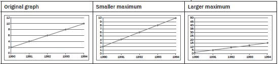
No scale
The scales of a graph are often used to exaggerate or minimise differences.
Misleading bar graph with no scale
Less difference | More difference | |||
 | 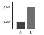 | |||
Note the lack of a starting value for the y-axis, which makes it unclear if the graph is truncated. Additionally,note the lack of tick marks which prevents the reader from determining if the graph bars are properly scaled.Without a scale, the visual difference between the bars can be easily manipulated. | ||||
Solution
It looks from the graph as if the number of singles sold went down from 1995 to 1996 and up from 1996 to 1997 and then down again. The information could be clearer if the 2D bars were used.
Now it is clear that sales for the year 1995 and 1997 are the same.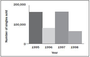
Misleading graphs
- Look at the bar graph below and answer the questions that follow

- Does this graph tell us how many Grade 10 learners there are in total? (3)
- Can we assume that none of the learners who take Accounting take Geography? (2)
- A pie graph of this data would not make Explain why. (3) [8]
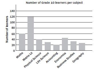
Solutions to 1
- No. It may look like there are 140 learners in total ✓ but learners take more than one subject, ✓ so we can’t use the numbers of learners per subject to determine how many learners there are altogether. ✓
- No, we have no information ✓ about whether learners can take both Accounting and ✓ (2)
- Learners do not only take one subject, ✓ therefore the data cannot be split into discrete percentages ✓ per subject and represented using a pie ✓ (3) [8]
2). The two graphs below show the same data in different forms about the members of Uthando Saving Club from 2004 to 2007. Using the graphs, explain whether each of the statements beneath is true or false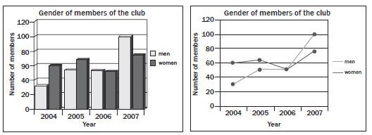
- The number of female members was greater than the number of male members each year. (1)
- In 2006 the numbers of male and female members were equal. (2)
- The number of members who are men has gradually increased over the (2)
- There were more female members in 2007 than there were in (1)
- There were more male members in 2006 than there were in (1)
- The comparison of male and female members has changed over the years. (1) [8]
Solutions to 2
- FALSE – In 2007 there were fewer female members. ✓
- TRUE – In 2006 the bars for men and women are the same height on the bar chart; ✓ on the line graph the lines showing ‘men’ and ‘women’ cross. ✓ (2)
- TRUE – In 2005 and 2006 the number is the same, but over ✓ the four-year period overall, it gradually increases✓ (2)
- TRUE – The line showing the ‘women’ is higher in 2007 than the same line in 2005✓ (1)
- FALSE – There is the same number of men in 2005 and 2006✓ (1)
- TRUE – In 2005 there were more women than men; by 2007 there are more men than women. ✓ (1) [8]
3). Marvin has a gym. In 2012 a total of 1 150 people attended the weight-lifting classes. He kept a record of the number of males, females and different races attended the weight-lifting class from 1 January to 31 December
TABLE: Number of males and females attending the weight-lifting classes
Month | Number of males | Number of females |
January | 60 | 16 |
February | 71 | 19 |
March | 63 | 18 |
April | 82 | 15 |
May | 80 | 19 |
June | 52 | 13 |
July | 96 | A |
August | 79 | 14 |
September | 80 | 15 |
October | 119 | 20 |
November | 76 | 25 |
December | 85 | 18 |
TOTAL | 943 |
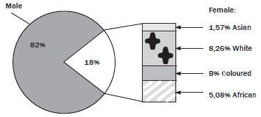
3). Use the pie chart and the table above to answer the following questions
- Give the ratio (in simplest form) of the number of females to males who attended the weight-lifting classes in September 2012. (2)
- Calculate the missing values A and B(5)
- If a weight lifter is chosen at random from the whole year’s weight-lifting class, what is the probability that the weight lifter will be a white female? (5)
- Determine the:
- mean (average) of the number of males in the weight-lifting class (2)
- modal monthly number of females in the weight-lifting class (1)
- median of the number of males in the weight-lifting class (3)
- range of the number of females in the weight-lifting class(2) [20]
Solutions to 3
- 15: 80 ✓
= 3: 16 ✓ - A =1 150 – (943+16+19+18+15+19+13+14+15+20+25+18) ✓
= 1 150 – 1135
= 15 ✓
B = 18%- ✓ (1,57%+8,26%+5,08%) ✓
= 3,09% ✓ - Number of females =1 150 – 943
= 207 ✓
Number of white females = 8,26% of 207 ✓
= 17,0982
≈ 17 ✓
P (white female) = 17 ✓
1 150
= 0,01478 ✓ - (i) Mean = 943 ÷ 12 ✓
= 78,58
≈ 79 ✓
(ii) Mode =15 ✓
(iii) 52;60;63;71;76;79;80;80;82;85;96;119
Median = 79+80 ✓
2
= 79,5
≈ 80 ✓
(iv) Range = 25 – 13 ✓
= 12 ✓