PATTERNS AND GRAPHS GRADE 12 NOTES - MATHEMATICAL LITERACY STUDY GUIDES
Share via Whatsapp Join our WhatsApp Group Join our Telegram Group- Making sense of graphs that tell a story
- Plotting points on a graph grid
- Reading information from a graph
- Touching the axes
- Graphs going up (increasing) and going down (decreasing)
- Continuous and discrete graphs
- Activity 1: Interpret a graph
- More than one line on the same graph
- Activity 2: More than one line on the same graph
- Direct and indirect proportion
- Exponential number patterns and graphs
- How to identify the kind of relationship in a graph
- Reading the scale of a graph
- Activity 3: Reading a graph scale
Patterns and graphs
2.1 Making sense of graphs that tell a story
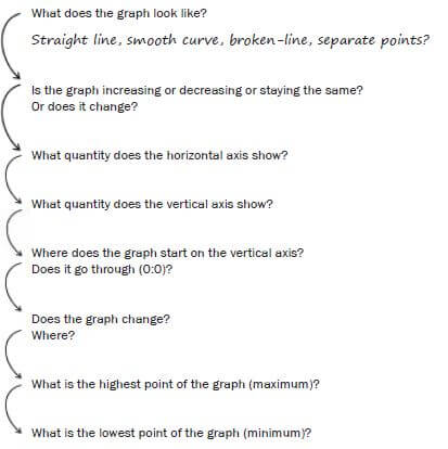
- A graph is a picture of the relationship between two quantities, such as distance and time. The advantage of a graph is that you can see the whole story at one time.
- This section gives you tools to analyse the information in the graph of a relationship. You will consider the following questions.
2.2 Plotting points on a graph grid
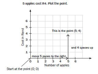
An ordered pair gives us the exact position of a point on a grid. The first number in an ordered pair is the horizontal coordinate and the second number is the vertical coordinate. The order is very important. For example, if 5 apples cost R4, then we could write an ordered pair like this: (5, 4).
‘Plotting points’ means to mark positions on a grid, given ordered pairs. Steps: To plot the point representing the ordered pair (5; 4):
- Start at the zero point on the graph (0; 0).
- Move across the horizontal axis to the right until you reach 5.
- Then, move upwards until you are in line with 4 on the vertical axis.
- Draw a dot or a cross where the grid lines cross. You have plotted the point (5; 4).
Note:
- To plot a point, always move acros then up.
NB
- The line that runs left to right is called the horizontal or x-axis. The line that runs top to bottom is called the vertical or y-axis. The plural of axis is “axes”, pronounced “akseez”.
Ordered pair: Two numbers written in a particular order so that they give the location of a point on a grid.
Coordinate: A number in an ordered pair. The first coordinate shows the position along the horizontal axis, and the second coordinate shows the position up the vertical axis.
The independent variable is not changed by other factors, and we plot it on the horizontal axis.
The dependent variable has values that depend on the independent variable, and we plot it on the vertical axis.
2.3 Reading information from a graph
When you are given a graph, make some notes on it to help you understand it.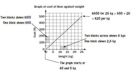
The two quantities are cost and weight of flour.
- The price increases as customers buy more flour.
- The graph starts at R0 for 0 kg and it shows R500 for 25 kg.
- Weight is the independent variable, and cost is the dependent variable.
What does it mean when a graph touches the horizontal axis or the vertical axis?
- If the graph touches the vertical axis, it means that the quantity on the horizontal axis has reached 0.
- If a graph touches the horizontal axis, it means that the quantity on the vertical axis has reached 0.
Worked example 1
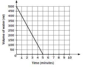
- Tumelo empties his 500 mℓ water bottle at a constant rate.
- Describe what you see in this graph.

Solutions
- As time elapses, the volume of water decreases from 500 mℓ, until the bottle is empty at the end of the 5th minute.
- When t = 0, v = 500. When t = 5, v = 0.
2.5 Graphs going up (increasing) and going down (decreasing)
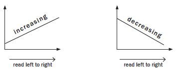
Note:
- If a graph is increasing, the graph goes up from left to right.
- If a graph is decreasing, the graph goes down from left to right.
2.6 Continuous and discrete graphs
Some types of values can only be whole numbers, while others, like length measurements, can have decimal fraction values. This is important when drawing graphs, because whole numbers must be shown by points on a graph, connected by dotted lines. We call these kinds of values, and graphs, discrete. Continuous values, such as length, should be connected by solid lines, to show that the values in between the points are also included.
Continuous or discrete graphs
Look at the graphs below. The first graph shows the number of passengers on a bus for six different trips. The second graph shows the distance that a bus travels for one trip. Explain why the first graph has dotted lines connecting the points while the second has solid lines.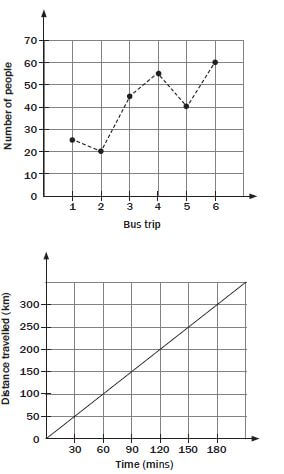
NB
- The number of people are counted in discrete (separate) units (persons), whereas time is continuous (no gaps).
Worked example 2: Interpret a graph
Naledi makes and sells beaded necklaces. Look at the graph below and answer the questions.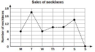
- On which day are the most necklaces sold? How many were sold on this day?
- On which day were there no sales? Give a possible reason for this.
- Between which two days is the biggest increase in sales? Explain.
- Between which two days do the sales stay the same?
- Describe what happens to the sales between Wednesday and Thursday.
- Why is the graph drawn with a dotted line?
Solutions
- On Tuesday, 17 necklaces.
- Sunday. People are not usually shopping on Sundays.
- Between Monday and Tuesday. Difference is 17 - 8 = 9.
- Between Thursday and Friday.
- There is an increase in sales of 2 necklaces.
- This is a discrete graph, because necklaces are sold in whole numbers.
Buhle decides to graph her marks for English First Additional Language and for Mathematical Literacy on the same set of axes, for eight tests, two per school term. Look at the graph below and answer the questions that follow.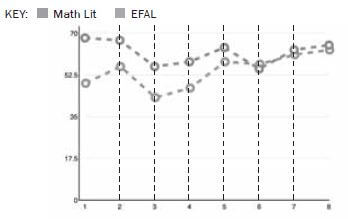
Related Items
- What is Buhle’s highest mark? (1)
- In which subject does Buhle generally score better marks? (1)
- Does the graph show an overall improvement or an overall decline? (1)
- What two interesting things can you tell about the marks? (2)
- What did Buhle score for each subject in test 5? (any two) (2)
- Is this a continuous or discrete graph, and why? (any two) (2)
- Is this graph misleading in any way and why? (any two) (2) [11]
Solutions
- Approximately 68-70 for Mathematical Literacy, in Test 1. ✓
- Mathematical Literacy. ✓
- Overall decline (getting worse). ✓
- The marks correlate, that is, they seem to go up and down at the same rate. ✓
They converge; that is, over time, her marks for the two subjects get more similar. ✓ - 66% (Mathematical Literacy) ✓ and 53% (EFAL) ✓ approximately. (Note to marker: any numbers within 1-2% of these should be marked correct, i.e. 68-64 ✓ and 55-51 ✓ as long as the learner shows that they understand that one is larger than the other by a margin of about 5-6 marks (any two).
- Discrete ✓; because a learner is not constantly being tested ✓; there are only 8 tests so there cannot be items between the tests ✓; the graph is dotted ✓ (Note to marker: any two are correct) (any two).
- Yes, because the axes are not marked evenly in steps or increments of 10 ✓, and the marks are all positioned at the top, ✓ which creates the impression that Buhle is scoring well, whereas her marks are in fact just a bit better than average. ✓ (Any two). (2) [11]
2.7 More than one line on the same graph
A graph can have more than one line. The aim is to compare two or more different situations.
You will often see this in questions about finances.
- We can put two graphs on the same set of axes, if they both compare the same two variables.
- The point where the two graphs meet is sometimes called the break- even point. (The values for the two graphs are the same at this point.)
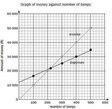
Worked example 3
David’s shop buys solar lamps for R45 each. He marks up the prices and sells them for R100 each. His monthly expenses (fixed costs) are R12 000.
-
- Which expenses change? These are variable costs.
- Which expenses stay the same? These are fixed costs.
- Fill in both blank rows in the table below.
Number of lamps bought and sold
0
100
200
300
400
500
Total expenses
Income
- On the same grid, draw a graph of the total expenses and a graph of his income.
- Read from the graphs the number of lamps David needs to sell to break-even (not to make a profit or loss).
(Assume that the amount is rounded off to the nearest R1 000 at this point).
Solutions
-
- buying the lamps
- R12 000
- Total expenses = R12 000 + (number of lamps × R45)
Number of lamps bought and sold
0
100
200
300
400
500
Total expenses
12 000
16 500
21 000
25 500
30 000
34 500
Income
0
10 000
20 000
30 000
40 000
50 000
- Graph:

- The break-even point is at 220 lamps.
Activity 2: More than one line on the same graph
Pieter wants to start a lift club, and he wants to know how many people he needs to give a lift to in his car in order to break even on petrol costs. People are not willing to contribute more than R 20 per day, and he gains a new passenger each week (starting with one passenger). Answer the questions that follow.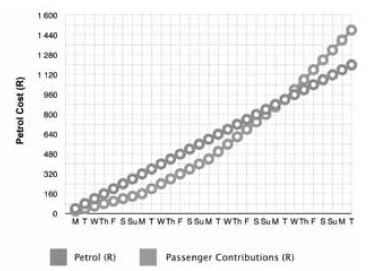
- How many people does he need to give a lift to to break even, if his petrol costs R 1200 per month? Why? (2)
- What value or quantity does the curved line show? (1)
- What day of the month does he break even? Assume that the first Monday is the 1st of the month. (1)
- Why does the curved line overtake the straight line? (1)
- What profit does he make each month? Use the income/expenditure/ profit formula. (3)
- Assuming that Pieter has to service his car every six months at a cost of R 1000, is this still a viable business option for him? Why? (3) [11]
Solutions
- Three. ✓ Because at the end of the week of having transported three people, he starts making a profit. ✓
Marker: bonus mark if they observe that two persons would never get him a profit. ✓ - Cumulative passenger contributions in Rands ✓ OR How much his passengers are paying. ✓ (any 1)
- On day 23 / The 23rd. ✓
- Because he is now making a profit ✓ OR The passenger contributions or fares start to exceed his cumulative petrol cost. ✓ (any 1)
- R 1480 (income) ✓ - R 1200 (expenditure) ✓ = R 280 (profit). ✓
- Since he makes R 280 profit each month, by six months, he would have made R 1680. ✓
Since the service costs R 1000, he will still make a profit of R 680 after 6 months ✓, so it is still a viable business. ✓
2.8 Direct and indirect proportion
Some relationships between quantities give patterns that form direct proportion graphs, or indirect proportion graphs.
- How to recognise a direct proportion relationship
In a direct proportion, when one quantity is multiplied, the other quantity is multiplied by the same number. The resulting graph is a straight line that passes through the point (0; 0). The income graph in the worked example below shows that the income is directly proportional to the number of lamps sold. - How to recognise an indirect proportion relationship
In an indirect (or inverse) proportion, as one quantity decreases, the other increases OR as one quantity increases, the other decreases.
If we multiply the two amounts, they are always the same. Remember that when you multiply two amounts, the result that you get is called the “product”, so, product means “to multiply”.
Worked example 4
A rectangle has a fixed area of 32 square units, but the length ℓ and breadth b can both change. If the length gets smaller, the breadth gets bigger, because the area stays the same.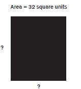
- Complete the following table of possible values for the length and breadth of the rectangle.
length
1
2
4
8
16
32
breadth
32
- Draw a graph to show all the possible values of the length and breadth.
- Is the graph continuous or discrete? Explain.
- Why does the curve not touch the axes?
Solutions
- Table of values:
length
1
2
4
8
16
32
breadth
32
16
8
4
2
1
- Graph of breadth and length values:

- The measurement values are continuous values, so the graph is continuous
- Length and breadth cannot equal zero, so the graph does not touch either of the axes
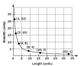
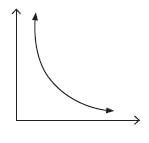
The important things to note about the graph of an inverse proportion are:
- it is a smooth curve with the shape shown below
- the curve never touches the axes
- at any point, the product of the two quantities is always the same.
2.9 Exponential number patterns and graphs
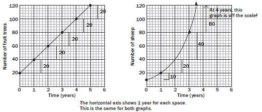
Growth graphs
Some number patterns show exponential growth. This is a situation where the graph first increases slowly and then increases very fast.
You can recognise this in a real-life situation when an amount grows more each time.
This is different from a straight line, which shows a constant rate of growth.
Worked example 5
| Increase in trees | Increase in sheep |
|
|
Number pattern | Number pattern |
This is a constant rate of growth (the rate stays the same). | This is an increasing rate of growth. |
 | |
|
|
| Doubling is only one example of compound growth. A common example of compound growth is when someone saves anDoubling is only one example of compound growth. A common example of compound growth is when someone saves anamount of money and earns compound interest on the savings. | |
Worked example 6
Thembi invests R1 000 at compound interest. The interest is added every year at 10% of the money she has in the account. Fill in the table to show how the money grows.
Year | 0 | 1 | 2 | 3 | 4 | 5 | 6 | 7 | 8 |
Amount of money | 1 000 | 10% of R1 000 +1000 =R1 100 | 1210 | 1331 | 1464,10 | 1610,51 | 1771,56 | 1948,72 | 2143,59 |
NB
- The year that she starts is called year 0, because this is when she puts in the money. No time has passed. This is where the graph starts. Plot the graph on the set of axes below.
Solution
Note: The amount will be multiplied by 110% (or 1,1) each time to get the next number in the pattern. This is a constant ratio pattern, or exponential growth.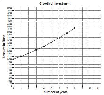
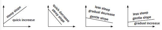
2.10 How to identify the kind of relationship in a graph
You can see what kind of graph it is by looking at the shape of the graph. Here are some tips.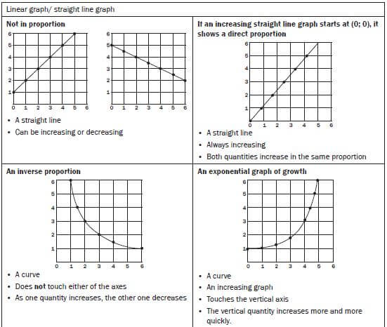
2.11 Reading the scale of a graph
When you are analysing a graph, check the scale on the axes. The scale means the number of things that each space on the graph represents.
Activity 3: Reading a graph scale
Answer the questions below about this graph.
Spend a few minutes looking at the graph before you start. Write the scale on the graph and some other quick notes, to help you understand the graph.
Hint
- Use a ruler and pencil to help you read off the graph grid correctly.
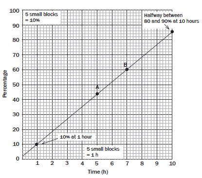
-
- How many blocks represent 10% on the vertical axis? (2)
- How many blocks represent 1% on the vertical axis? Why? (3)
- Describe the scale on the horizontal axis. (2)
- What percentage is reached at 10 hours? (2)
- Where does the line begin? (1)
- Give the values at A and B in percentages and hours. Give your answer in two ordered pairs. (7) [17]
Solutions
-
- 1 large block, which has 5 small blocks, represents 10%.
- One half of a small block represents 1%. This is because one small block represents 10% ÷ 5 = 2%.
- 1 large block represents 1 hour ✓. This means that one small block represents 0,2 h or one fifth of an hour. ✓
- The percentage at 10 hours is halfway between 80% and 90%, so it is 85%. ✓
- The line begins at 0 h and 2%. ✓
- A is at exactly 5 hours. A is between 40% and 50%. It is 2 small squares up from 40. Each small square represents 2%, so the 2 squares show 4%. A is (5; 44)
and B is (7; 60). (7)[17]