STATISTICS GRADE 12 NOTES - MATHEMATICS STUDY GUIDES
Share via Whatsapp Join our WhatsApp Group Join our Telegram Group- Bar graphs and frequency tables
- Measures of central tendency
- Measures of dispersion (or spread)
- Five number summary and box and whisker plot
- Histograms and frequency polygons
- Cumulative frequency tables and graphs (ogives)
- Bivariate data and the scatter plot (scatter graph)
- The linear regression line (or the least squares regression line)
Data handling is the study of statistics, or data. We collect, organise, analyse and interpret data. The data can inform students, researchers, advertising and business.
It can provide us with an understanding of social issues and human trends. Then we can make informed decisions when we plan for the future, or make a new advertisement, or address social issues.
We usually collect data from a fairly small group (called the sample). The sample must be big enough and it must be randomly chosen from the population. This is to make sure that it fairly represents the trends in the larger group of people (called the population).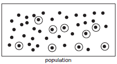
Sample: Some data randomly chosen from population.
13.1 Bar graphs and frequency tables
Data can be represented with a frequency table or with a bar graph. Each bar represents a group of data and the bars can be compared to each other. Bar graphs must be labelled on one axis and show the numbering on the other axis.
e.g.1
In a Geography class, 23 learners completed a test out of 10 marks. Here is a list of their results:
4; 1; 2; 2; 6; 9; 6; 10; 6; 8; 9; 6; 7; 7; 8; 4; 6; 6; 5; 7; 9; 10; 6.
We can use a frequency table to record this data.
Frequency table
| Mark out of 10 | Tally | Number of learners who achieved this mark (frequency) |
| 1 | / | 1 |
| 2 | // | 2 |
| 3 | 0 | |
| 4 | // | 1 |
| 5 | / | 1 |
| 6 | //// // | 7 |
| 7 | /// | 3 |
| 8 | // | 2 |
| 9 | /// | 3 |
| 10 | // | 2 |
We can also make a bar graph to show this data. Use the marks from 1 to 10 on the horizontal axis. Use the number of learners who got that score on the vertical axis. The number of learners is the frequency.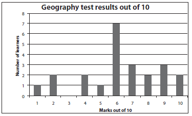
13.2 Measures of central tendency
13.2.1 Ungrouped Data
Measures of central tendency are different measures of finding the ‘middle’ or ‘average’ of a set of data. The three kinds of ‘middle’ of a set of data that we use are the mean, the median and the mode.
It is advisable that we start by arranging the set of data in an ascending order before attempting questions.
- Mean
The mean of the data is the average if you add all the values and divide by the number of values. We use the symbol for the mean.
This formula will be on the information sheet provided in examinations.
e.g.2
In a Mathematics class, 23 learners completed a test out of 25 marks.
Here is a list of their results:
14; 10; 23; 21; 11; 19; 13; 11; 20; 21; 9; 11; 17; 17; 18; 14; 19; 11; 24; 21; 9; 16; 6.
Calculate the mean of this data.
| Solution number of values in set = 14 + 10 + 23 + 21 + 11 + 19 + 13 + 11 + 20 + 21 + 9 + 11 + 17 + 17 + 18 + 14 + 19 + 11 + 24 + 21 + 9 + 16 + 6 23 = 15,4347… 3 (2) |
- Median
The median is the middle number in an ordered data set.
e.g3
In a Mathematics class, 23 learners completed a test out of 25 marks. Here is a list of their results:
14; 10; 23; 21; 11; 19; 13; 13; 20; 21; 9; 13; 17; 17; 18; 14; 19; 13; 24; 21; 9; 16; 6.
Calculate the median of this data.Solution
- First put the data in order, from lowest to highest.
6; 9; 9; 10; 11; 13; 13; 13; 13; 14; 14; 16; 17; 17; 18; 19; 19; 20; 21; 21; 21; 23; 24.
There are 23 numbers, so the middle number is the12th number out of 23 numbers. So 16 is the
median, the number in the middle of the data. - When there is an even number of values in the data set, the median lies halfway between the middle
two values. - We can add these two values and divide by 2. For [Example], what if another learner wrote the test
and her result was 7? We can add this to the ordered data set.
6; 7; 9; 9; 10; 11; 13; 13; 13; 13; 14; 14; 16; 17; 17; 18; 19; 19; 20; 21; 21; 21; 23; 24.
Now there are 24 numbers and the middle two numbers are the 12th and 13th numbers. The middle
two numbers are 14 and 16. Add 14 and 16 to get 30 and divide by 2 to get a median of 15.
14+16 = 15
2
- First put the data in order, from lowest to highest.
- Mode
The mode is the number or value that appears most frequently in the data set.
e.g.4
In a Mathematics class, 23 learners completed a test out of 25 marks.
Here is a list of their results:
14; 10; 23; 21; 11; 19; 13; 13; 20; 21; 9; 13; 17; 17; 18; 14; 19; 13; 24; 21; 9; 16; 6.
Find the mode of this data.Solution
The mode of the results of the test is 133 (13 appears 4 times). (1)
Summary
median: middle score of an ordered list of data
mode: the most frequent score
Activity 1
The table below represents Mathematics test scores and frequency for each score.
| Scores (x) | Frequency (f) |
| 13 | 5 |
| 17 | 6 |
| 20 | 4 |
| 25 | 10 |
- Determine the median (2)
- Determine the mean (2)
[4]
Solutions
|
13.2.2 Grouped data
e.g.5
Fifty shoppers were asked what percentage of their income they spend on groceries.
Six answered that they spend between 10% and 19%, inclusive. The full set of responses is given in the table below.
| PERCENTAGE | FREQUENCY (f) |
| 10 < x < 19 | 6 |
| 20 < x < 29 | 14 |
| 30 < x < 39 | 16 |
| 40 < x < 49 | 11 |
| 50 < x < 59 | 3 |
- Calculate the mean percentage of family income allocated to groceries.
- In which interval does the median lie?
- Determine the mode percentage of income spent on groceries.
Solutions
|
There are 50 scores. median lies between positions 25 and 26
6+14=20
20+16=36
13.3 Measures of dispersion (or spread)
The measures of dispersion give us information about how spread out the data is around the median. The measures of central tendency give us information about the central point of the data, but we still need to know if the data is concentrated in one place, or evenly spread out.
We first look at these measures of dispersion: range and interquartile range.
- Range
The range is the difference between the highest value (or maximum) and the lowest value (or minimum) in a data set.
Range = largest value in the data set – smallest value in the data set
e.g.6
Find the range of the Mathematics test results:
6; 9; 9; 10; 11; 13; 13; 13; 13; 14; 14; 16; 17; 17; 18; 19; 19; 20; 21; 21; 21; 23; 24.Solution
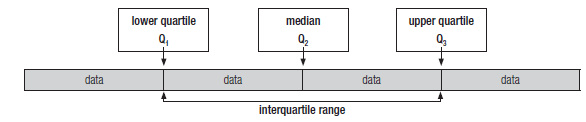
24 – 6 = 18. So the range of the test results is 18. - The interquartile range
- The interquartile range depends on the median. So organise the data first and find the median.
- The data is divided into four parts (quarters, which we call quartiles). First, the median (Q2) divides the data into two halves.
- The lower quartile (Q1) divides the data below the median (Q2) into two equal sets of data.
- The upper quartile (Q3) divides the data above the median into two equal sets of data.
- The difference between the lower and the upper quartile (Q3 – Q1) is called the interquartile range. This tells us how spread out the middle half of the data is around the median.

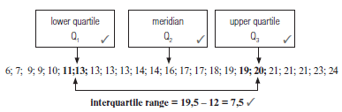
e.g.7
Find the interquartile range of the Mathematics test results:
6; 9; 9; 10; 11; 13; 13; 13; 13; 14; 14; 16; 17; 17; 18; 19; 19; 20; 21; 21; 21; 23; 24.
Solution
N/B Median is not included in the lower half and upper half of the data when calculating Q1 and Q3 |
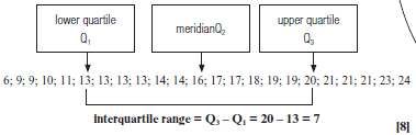
We can also use the ff formulae to calculate the position of Q1, Q2 and Q3. Position of Q2
= (n+1) =(23 + 1) = 12
4 2
Q2 is the value in position 12 which is 16
Position of Q1
= (n + 1) = (23 + 1) = 6
4 4
is the value in position 6 which is 13
Position of Q3
3(n+1) = 3(23+1) = 18
4 4
Q3 is the value in position 18 which is 20
Activity 2
If the test scores in another class are represented by the data below, find the interquartile range of the test results:
6; 7; 9; 9; 10; 11; 13; 13; 13; 13; 14; 14; 16; 17; 17; 18; 19; 19; 20; 21; 21; 21; 23; 24. [8]
Solution
[8] |
13.4 Five number summary and box and whisker plot
- Five number summary
The five number summary is a ‘summary’ description of a data set.
It is made of these five numbers:- the minimum value
- the lower quartile
- the median
- the upper quartile
- the maximum value
e.g.8
What is the five number summary for the set of data we have used so far?
6; 9; 9; 10; 11; 13; 13; 13; 13; 14; 14; 16; 17; 17; 18; 19; 19; 20; 21; 21; 21; 23; 24. - the minimum value: 6
- the lower quartile: 13
- the median: 16
- the upper quartile: 20
- the maximum value: 24
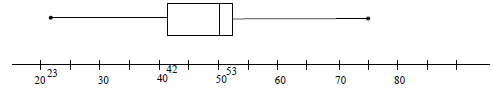
- Box and whisker plot
We can represent the five number summary on a box and whisker plot (or diagram).
The box represents the middle half of the data (the interquartile range)
The line in the box shows the median.
The ‘whiskers’ show the minimum and maximum values. Quartiles divide data into four equal sets of data. The longer whisker and box means that the lower 50% of the scores is more spread out than the upper 50%.
Skewed to the right (Positively skewed) means that the upper half of the data is more spread out than the lower half.
Skewed data
A box and whisker plot can show whether a data set is symmetrical, positively skewed or negatively skewed. This box and whisker plot is not symmetrical because the whiskers are not the same length and the median is not in the centre of the box. The whisker on the left is a bit longer than the whisker on the right, which shows that the data on the left of the box is more spread out. The box is also longer to the right of the median than to the left of the median. We say that the data is negatively skewed. (or skewed to the left). - Identification of outliers
 Quartiles divide data into four equal sets of data. The longer whisker and box means that the lower 50% of the scores is more spread out than the upper 50%.
e.g.9
Determine whether the minimum in the [Example] above is an outlier or not.
| Solution Inter-quartile range = Q3 – Q1 = 20 – 13 = 7 Q1 – 1,5 × IQR = 13 – 1,5 × 7 = 2,5 6 > 2,5 ∴ 6 is not an outlier |
HINT:
To determine outliers:
- Determine the interquartile range
- Determine Q1 – 1,5 × IQR
- If the minimum < the value of Q1 – 1,5 × IQR, then it is an outlier.
- Determine Q3 – 1,5 × IQR
- If the maximum > Q3 – 1,5 × IQR,
Then it is an outlier.
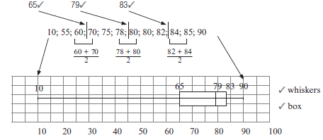
Activity 3
- These are the scores of ten students in a Science test:
90; 85; 10; 75; 70; 60; 78; 80; 82; 80; 55; 84- Draw a box and whisker diagram for the given data. (5)
- Determine the interquartile range. (2)
- State whether the data is skewed or not. (1)
- State whether 10 is an outlier or not. (2)
[10]
Solutions
|
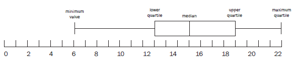
Activity 4
- The five number summary of heights of trees three months after they were planted is (23 ; 42 ; 50 ; 53 ; 75). This information is shown in the box and whisker diagram below.

- Determine the interquartile range. (2)
- What percentage of plants has a height excess of 53 cm? (2)
- Between which quartiles do the heights of the trees have the least variation? Explain. (2)
[6]
Solutions
|
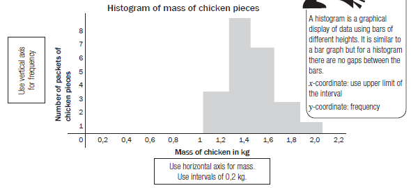
13.5 Histograms and frequency polygons
- Histograms and frequency polygons are graphs used to represent grouped and continuous data. They show the frequency and the distribution (spread) of the data.
- Continuous data is data that is not just measured in whole numbers. For example, length, mass, volume or time are measured in continuous amounts.
- The horizontal axis of a histogram and a frequency polygon have a continuous scale.
- The vertical axis shows the frequency, or number of times the data is listed.
- Grouped data:
Instead of recording every piece of data separately, we can group the data to make it easier to read. Grouped data can be represented on a histogram or a frequency polygon.
e.g.10
A grocer wants to record the mass of each packet of chicken pieces he sells. He groups the masses into intervals of 0,2 kg. He makes a frequency table.Mass of chicken in kg Number 0,8 < mass of chicken ≤ 1,0 0 1,0 < mass of chicken ≤ 1,2 3 1,2 < mass of chicken ≤ 1,4 8 1,4 < mass of chicken ≤ 1,6 6 1,6 < mass of chicken ≤ 1,8 2 1,8 < mass of chicken ≤ 2,0 1 2,0 < mass of chicken ≤ 2,2 0 These 8 packets have any mass between a bit more than 1,2 kg and 1,4 kg.
So 1,2 < mass of chicken < 1,4 Histograms
From the frequency table, he draws up a histogram.
Frequency polygons
We can also make a frequency polygon using this data. A frequency polygon uses lines to join the mid-points of each interval. The polygon must begin and end on the horizontal axis. So we can add an interval at the beginning and the end of the data which both have a frequency of 0.
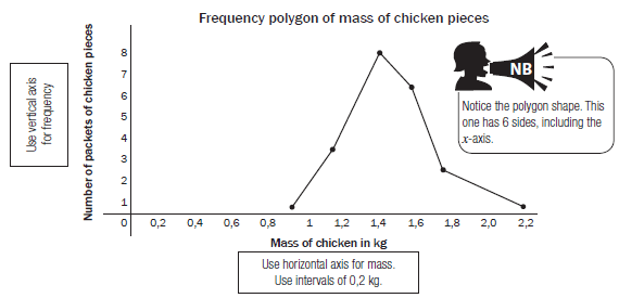
Related Items
The frequency polygon can also be drawn using the midpoints of the bars of the histogram, as shown below.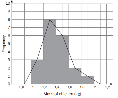
HINT:To plot a frequency polygon:
- Plot midpoints of each interval
- Join the midpoints by straight lines
- Add an interval at the beginning and end of the data, with both frequencies equals to 0.
- Frequency polygon is a closed figure, hence must start and end at the x-axis.
13.6 Cumulative frequency tables and graphs (ogives)
- Cumulative frequency tables
- Cumulative frequency gives us a running total of the frequency. So we keep adding onto the frequency from the first interval to the last interval.
- We can show these results in a cumulative frequency table.
e.g.11
In an English class, 30 learners completed a test out of 20 marks. Here is a list of their results:
14; 10; 11; 19; 15; 11; 13; 11; 9; 11; 12; 17; 10; 14; 13; 17; 7; 14; 17; 13; 13; 9; 12; 16; 6; 9; 11; 11; 13; 20.
With this data set, it would be more useful to group the data.Mark out of 20 Tally Frequency
(number of learners)Cumulative
frequency6 / 1 1 7 / 1 1 + 1 = 2 8 0 2 + 0 = 2 9 /// 3 2 + 3 = 5 10 // 2 5 + 2 = 7 11 //// / 6 13 12 // 2 15 13 //// 5 20 14 /// 3 23 15 / 1 24 16 / 1 25 17 /// 3 28 18 0 28 19 / 1 29 20 / 1 30
Keep adding onto frequency from row before.
For example, 7 + 6 = 13
The last number is the same as total number of learners
We can use intervals of 5 and make a cumulative frequency table for grouped data.Class interval Frequency Cumulative frequency 1 < x < 5 0 0 5 < x < 10 7 7 10 < x < 15 17 24 15 < x < 20 6 30
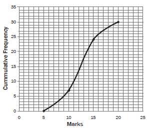
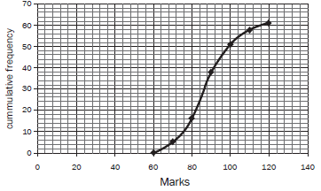
- Cumulative frequency graph (ogive)
- We can represent the cumulative results from a cumulative frequency table with a cumulative frequency graph or ogive.
- This graph always starts on the x-axis and usually forms an S-shaped curve, ending with the cumulative frequency (y-value).
- The endpoint of each interval is plotted against the cumulative frequency.
e.g.12
Represent the data in the cumulative frequency table of grouped data with a cumulative frequency graph. - the x-axis needs the points 5; 10; 15; and 20 to mark the end of each interval.
- the y-axis represents the cumulative frequency from 0 to 30.
- For plotting the points, use the end of each class interval on the x-axis and the cumulative frequency on the y-axis. So you need to plot these points: (5; 0); (10; 7); (15; 24); (20; 30)
- Join the plotted points.

To plot ogive: - x-coordinate - use upper limit of each interval.
- y-coordinate - cumulative frequency
- If the frequency of the first interval is not 0, then include an interval before the given one and make use 0 as its frequency.
Activity 5
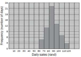
An ice cream vendor has kept a record of sales for October and November 2012. The daily sales in rands is shown in the histogram below.
1.1 Draw up a cumulative frequency table for the sales over October and November. (2)
1.2 Draw an ogive for the sales over October and November. (3)
1.3 Use your ogive to determine the median value for the daily sales. Explain how you obtain your answer. (1)
1.4 Estimate the interval of the upper 25% of the daily sales. (2)
[8]Solutions
1.1 Cumulative frequency table:
1.2Daily sales (in rand) Frequency Cumulative frequency 60 ≤ rand < 70 5 5 70 ≤ rand < 80 11 16 80 ≤ rand < 90 22 38 1st three correct 90 ≤ rand < 100 13 51 100 ≤ rand < 110 7 58 110 ≤ rand < 120 3 61 last three correct 
1.3 There are 61 data points, so the median is the 31st data point.
We can read the data point off the graph at 31. It gives a rand value
of R87. 3 (1)
1.4 The upper 25% lies above 75% of 61 = 45,75. 3
Read from the y-axis across to the graph and down to the x-axis.
The upper 25% of sales lies in the interval: 96 ≤ sales < 120 3(2)
[8]- 1st three points plotted correctly
- last three points plotted correctly
- grounding at 0
We can find the median, the range and the interquartile range from a cumulative frequency graph.
We cannot find the mean from a cumulative frequency graph
13.7 Variance and standard deviation
Sometimes the mean is a more useful measure of central tendency than the median.
The measures of dispersion (spread) around the mean are called the variance and the standard deviation.
1. Standard deviation
The standard deviation is the square root of (the sum of the squared differences between each score and the mean divided by the number of scores). The formula for standard deviation is:
This formula will be on the data sheet. Make sure you can use the formula properly. |
1.1 Calculating the standard deviation using the formula:![]()
- Find the mean of all the numbers in the data set.
- Find each value of
 In other words, work out by how much each of these values differs (or deviates) from the mean.
 - Square each deviation. Find each value of

- Add all the answers together. In other words, find

- Divide this sum by the number of values, n.
- You have now found
 This value is called the variance.
 - Find the square root of the variance to find the standard deviation.

- By working through these steps, you have found the standard deviation using the formula.
e.g.13
Finding the variance and standard deviation
These are the results of a mathematics test for a Grade 11 class of 20 students.
52 44 62 66 60 57 95 78 71 62
100 69 62 72 73 55 32 83 78 80
- Calculate the mean mark for the class. (2)
- Complete the table below and use it to calculate the standard deviation of the marks. (3)
- What percentage of the students scored within one standard deviation of the mean? (2)
Solutions
σ = √4 962,9 = 15, 7526... 3. One standard deviation from the mean lies between |
The squaring of deals with the effect of the negative signs.
At the end, we find the square root of the whole answer to ‘reverse’ the effect of the square.
1.2 Steps for calculating the standard deviation with a scientific calculator:
Using a Casio fx–82 ES PLUS calculator: press Mode then STAT then 1 – VAR
- enter all data one at a time pressing = after each entry.
- press the orange AC button
- press shift STAT then VAR
- in order to calculate the mean press 2:

- once all these steps have been completed, simply press AC shift STAT then VAR
- now press 3: σ to calculate the standard deviation.
If you understand the calculator steps and use them properly, you will come to the same answer of 15,75 as we found before.
Practise these steps so that you can do exam Examples using a calculator.
|
Activity 6
The data below shows the energy levels, in kilocalories per 100 g, of 10 different snack foods.
440 520 480 560 615 550 620 680 545 490
- Calculate the mean energy level of these snack foods. (2)
- Calculate the standard deviation. (2)
- The energy levels, in kilocalories per 100 g, of 10 different breakfast cereals had a mean of 545,7 kilocalories and a standard deviation of 28 kilocalories. Which of the two types of food show greater variation in energy levels?
What do you conclude? (2)
[6]
Solutions
|
2. The normal distributive curve
The data can be plotted on a graph that shows the standard deviations. If the data is distributed symmetrically around the mean, the values form a normal distribution curve: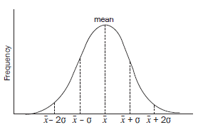
13.8 Bivariate data and the scatter plot (scatter graph)
- A scatter plot is a graph using the x- and y-axes to represent bivariate data.
- Bivariate data means that each point on the graph represents two variables that are independent of each other.
- In a scatter plot, we plot a point for each pair of coordinates and look at the overall pattern or trend in the data.
- The points in the data are compared to see if there is a correlation or some kind of pattern (or trend) in the data.
- When a point does not fit the trend of the other points, it is called an outlier.
- Outliers are easy to identify on a scatter diagram or a box and whisker diagram.
- We can sometimes represent the trend in the data with a line or curve of best fit. The line or curve can be represented by an equation that could be linear, quadratic, exponential, hyperbolic etc.
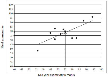
e.g.14
A science teacher compares the marks for the mid-year examination with the marks for final examinations achieved by 11 learners.
| mid-year marks | 80 | 68 | 94 | 72 | 74 | 83 | 56 | 68 | 65 | 75 | 88 |
| final marks | 72 | 71 | 96 | 77 | 82 | 72 | 58 | 83 | 78 | 80 | 92 |
- Draw a scatter graph of this data. (3)
- Describe the curve of best fit. (2)
- Use the scatter plot to estimate the final mark of a learner who had a midyear mark of 75%. (1)
[6]
Solutions
|
Activity 7
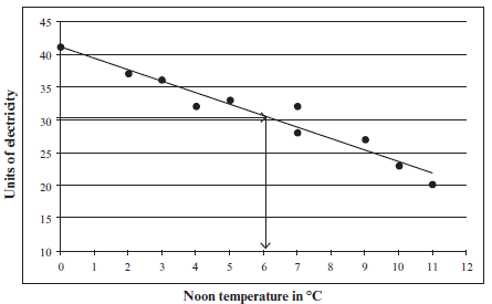
The outdoor temperature (in °C) at noon is measured. It is compared with the number of units of electricity used to heat a house each day.
| Temp in °C | 7 | 11 | 9 | 2 | 4 | 7 | 0 | 10 | 5 | 3 |
| units of electricity used | 32 | 20 | 27 | 37 | 32 | 28 | 41 | 23 | 33 | 36 |
- Draw a scatter graph to represent this data. (3)
- Draw in a line of best fit. (1)
- Use your line of best fit to estimate the noon temperature when 30 units of electricity are used. (1)
[5]
Solutions
|
13.9 The linear regression line (or the least squares regression line)
The line of best fit for a set of bivariate numerical data is the linear regression line. So far, we have seen this trend line on a scatter graph.
Now we use a scientific calculator to determine the equation for this line.
We know the straight line equation: y = mx + c
Statistics (as used on the CASIO x-82ES PLUS calculator) uses y = A + Bx, where B is the gradient and A is the cut on the y-axis of the straight line of best fit.
So the gradient is B instead of m and the y-intercept is A instead of c.
The Regression Coefficient ‘r’
This is a statistical number that measures the strength of the correlation (relationship) between two sets of data.
- This number is calculated from two sets of data using a calculator.
- r always lies between –1 and +1.
- The closer r is to –1, the stronger the negative correlation.
- The closer r is to +1, the stronger the positive correlation.
- If r = 0, there is no correlation between the two sets of data.
The number line shows the r values and the strength of the correlation between bivariate data.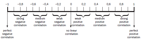 We only study the r value of bivariate data when the line of best fit is a straight line.
A negative correlation means that as x increases, y decreases. The more closely the points are clustered together around the line, the stronger the correlation.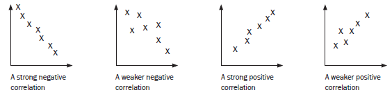
A positive correlation means that as x increases, y also increases A correlation of zero means that there is no relationship between x and y.
e.g.15
A diesel engine turns at a rate of x revolutions per minute. The corresponding horse power of the engine is measured by y in the table below:
| x (revolutions per minute) | 400 | 500 | 600 | 700 | 750 |
| y (horse power) | 580 | 1030 | 1420 | 1880 | 2100 |
- Find the equation of the least squares regression line: y = A + B x (correct to two decimal places).
- Determine the regression coefficient r. Discuss the correlation between x and y.
- Use this regression line to estimate the power output when the engine runs at 800 rev per min.
- About how fast is the engine running when it has an output of 1 200 horse power?
- A strong negative
| Solutions | |
1. Use a calculator
This is the y-intercept of the regression line
Answer: | 2. Keep all the information in the calculator from 1.
There is a strong positive correlation between x and y (r is very close to +1) 3. Substitute x = 800 into line of best fit equation: 4. Let y = 1 200 |
The scatter plot and the line of best fit show the trend in the relationship between the revolutions and the horse power.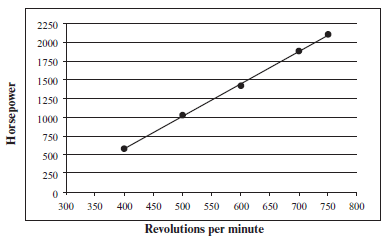 | |
Activity 8
- Pick ’n Pay wants to survey how long in seconds (y) it takes a teller to scan (x) items at the till.
The table shows the results from 9 shoppers.Shoppers A B C D E F G H I x (no of items 5 8 12 15 15 17 20 21 25 y (time in seconds) 3 11 9 6 15 13 25 15 13 - Use your calculator to determine the equation of the line of best fit (the regression line or the least squares regression line) correct to two decimal places. (3)
- Calculate the value of r, the correlation coefficient for the data. What can you say about the correlation between x and y? (3)
- How long would the teller take to scan 21 items at the till? (2)
- How many items could a teller scan in 21,28 seconds? (2)
- A restaurant wants to know the relationship between the number of customers and the number of chicken pies that are ordered.
number of customers (x) 5 10 15 20 25 30 35 40 number of chicken pies (y) 3 5 10 10 15 20 20 24 - Determine the equation of the regression line correct to two decimal places. (3)
- Determine the value of r, the correlation coefficient. Describe the type and strength of the correlation between the number of people and the number of chicken pies ordered. (3)
- Determine how many chicken pies 100 people would order. (2)
- If they only have 12 pies left, how many people can they serve? (2)
[20]Solutions
- A = 2,68
B = 0,62
y = 2,68 + 0,62x (3) - r = 0,62847…. = 0,63
This is a weak positive correlation (3) - y = 2,68 + 0,62(21) = 15,7
(about 16 seconds) (2) - 21,28 = 2,68 + 0,62 x 3
21,28 – 2,68 = 0,62 x
18,6 = x
0.62
30 = x
30 items can be scanned in 21,28 seconds. (2)
- A = 2,68
- A = –0,39285…
B = 0,61190
y = –0,4 + 0,6 x 3 (3) - r = 0,9866…
This is a very strong positive correlation
(r is close to +1) (3) - y = –0,4 + 0,6 x
y = –0,4 + 0,6(100)
y = 59,6
About 60 chicken pies are ordered by 100 3 people. (2) - 12 = –0,4 + 0,6 x 3
12 + 0,4 = 0,6 x
12,4 = x
0.6
20,6… = x
About 21 people will order 12 pies. (2)
[20]
- A = –0,39285…
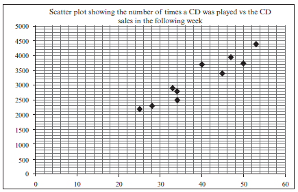
A recording company investigates the relationship between the number of times a CD is played by a national radio station and the national sales of the same CD in the following week. The data below was collected for random sample of CDs. The sales figures are rounded to the nearest 50
Number of times CD is played 47 34 40 34 33 50 28 53 25 45 Weekly sales of
the CD3950 2500 3700 2800 2900 3750 2300 4400 2200 3400 - Identify the independent variable. (1)
- Draw a scatter plot of this data. (3)
- Determine the equation of the least squares regression line. (3)
- Calculate the correlation coefficient. (2)
- Predict, correct to the nearest 50, the weekly sales for a CD that was played 45 times by the station in the previous week. (2)
- Comment on the strength of the relationship between the variables. (1)
[12]Solutions
a) the number of times the CD is played (1)b)

(3)c) a = 264,326
b = 75,21
y = 264,33 + 75,21x 3 (3)d) r = 0,95 (2)
e) y = 264,33 + 75,21x(45) (substitution)
≈ 3 648,78
≈ 3 648
≈ 3 650 (to the nearest 50) (2)f) There is a very strong positive relationship between the number of times that a CD was played and
the sales of that CD in the following week. (1)
[12]
What you need to be able to do:
- Determine mean, median and mode in grouped or ungrouped data
- Draw and analyse the following methods for representing data:
- box-and-whisker plots
- histograms
- frequency polygons
- cumulative frequency curves (ogives)
- Calculate the variance and the standard deviation of a set of ungrouped data.
- Comment on whether a data set is symmetric or skewed, by analysing the representation of the data.
- Identify outliers in a set of data by looking at the box-and-whisker plot or scatterplot.
- Determine the equation of the line of best fit of bivariate data using a calculator. (This line could be called the “least squares regression line”.)
- Determine the regression correlation coefficient “r”.
- Use the line of best fit to draw conclusions.