SKILLS GRADE 12 NOTES - LIFE SCIENCES STUDY GUIDES
Share via Whatsapp Join our WhatsApp Group Join our Telegram GroupSKILLS
LIFE SCIENCES
STUDY GUIDES AND NOTES
GRADE 12
CHAPTER 12:SKILLS
12.1 Drawing graphs
Graphs and charts condense large amounts of information in a format that is easier to understand, showing important points clearly and effectively.
- Line graphs show the relationship between two types of information where the independent variable is continuous. Line graphs are useful in showing trends over time and are often used for biological data.
- Bar graphs show different categories of data and are used when the independent variable is not a set of continuous numbers or continuous groups (discontinuous data). They are best used to compare values across categories.
- Histograms have connected bars displaying continuous data. They are used when the values of the independent variables are continuous but fit into categories or groups that follow on after each other.
- Pie charts are circular charts used to compare parts of the whole. They are divided into sectors that are equal in size to the quantity represented. They are used for discontinuous data.
12.1.1 How to draw a line graph
Step 1
Identify the dependent and the independent variables from the information you are given (usually in table format).
- Dependent: This is the variable or factor that is being measured, i.e. the temperature in degrees Celsius in this example.
- Independent: This is the variable that the investigator can change. The dependent variable changes as the independent variable changes, i.e. the time in hours in this example. (The independent variable is usually given in the first column of the table)
Time(hours) Temperature (°C) 0 16 5 24 9 28 13 26 17 21 20 19 24 17 Table 12.1 Air temperature recorded over a 24 hour period
Step 2
Draw a set of axes and label the X and Y axes. The dependent variable goes on the Y-axis and the independent variable on the X-axis. Include the unit in each label, e.g. temperature in °C and time in hours. Do NOT forget to label the axes.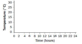
Figure 12.2 Draw the axes and choose a scale
Step 3
Choose a scale for the X and the Y axes.
Make sure that the scale includes the highest numbers in the table for each of the variables. Do not use the values for the Y-axis directly from the table unless they have regular intervals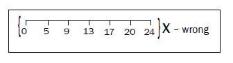
The independent variable must be plotted on the x-axis
Step 4
Place a dot at the point where the two values for each result intersect (meet).
In the example, the point where 5 hours and 24°C intersect on the graph is indicated by the second dot on the graph. Plot all the points using the information in the table.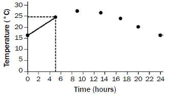
Figure 12.3 Plot the points on the graph and join them
Step 5
Join the dots using a ruler until all the dots have been joined in sequence.
Step 6
Give the graph a heading or caption.
The heading or caption should include both variables. In this case both air temperature and the time period of 24 hours must be mentioned in the heading.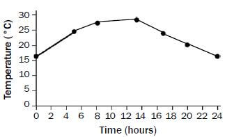
Figure 12.4 Final line graph with heading
12.1.2 How to draw a bar graph
Steps 1 to 3
To draw a bar graph, you follow the same first three steps that you followed to draw a line graph. Use the table to identify the dependent and independent variables. Draw the axes and choose a scale. Note that there will be no units when labelling the X- and the Y-axes in this particular graph.
| Point number | Number of organisms |
| 1 | 10 |
| 2 | 12 |
| 3 | 8 |
| 4 | 8 |
| 5 | 4 |
Table 12.2 Number of organisms found in the water at different points along a river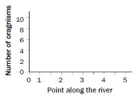
Figure 12.5 Draw the axes and choose a scale
Step 4
Draw a bar to show that 10 organisms were found at point number 1 on the river. Then draw bars to represent the number of organisms found at each of the points along the river.
Since this is a bar graph, the bars should not touch as the points along the river have no direct relationship with each other.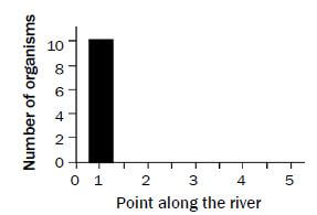
Figure 12.6 Draw the first bar
Step 5
Give the graph a heading or caption. See step 6 under the line graph for instructions how to give your graph a heading or caption.
Bar graph to show the number of organisms at different points along a river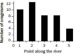
Figure 12.7 Final bar graph with heading
Note the following:
- The spaces between the bars should all be the same width
- The bars themselves should al be the same width.
12.1.3 How to draw a histogram
A histogram is drawn in exactly the same way as a bar graph. The only difference is that a histogram is used when the independent variable is groups of information along a continuous scale. Note that in a histogram, the bars are drawn without any spaces between them. Use the information in Table 12.3 below to draw a histogram. Your graph should look like the one in Figure 12.8 below.
Range (%) | Number of pupils |
0-19 | 0 |
20-39 | 5 |
40-59 | 11 |
60-79 | 16 |
80-100 | 3 |
Table 12.3 Number of learners with a particular percentage (%) score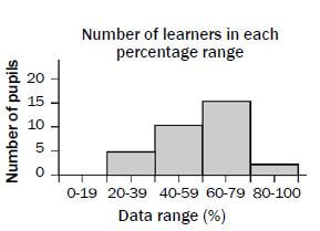
Figure 12.8 Final histogram with heading
NOTE:
When the independent variable is continuous data (an infinite number of values are evenly distributed), we use a line graph or histogram.
When the independent variable is discontinuous data (a fixed number of values that do not form an ordered scale), we use a bar graph or pie chart.
12.1.4 How to draw a pie chart
Step 1
Add all the data in the table together. In this case, you will add all the numbers in the 'Number of women' column to find out how many women took part in the investigation.
34 + 38 + 22 + 30 + 76 = 200
When you do the calculations for the pie chart, then ‘200’ will be the denominator (the number that you divide by).
Related Items
| Contraceptive | Number of women |
| Sterilisation | 34 |
| Pill | 38 |
| Condom | 22 |
| Rhythm method | 30 |
| None | 76 |
Table 12.4 Table of contraceptive use by a sample group of women
Step 2
Convert your data to angles. Divide each number by 200. Then, since there are 360° in a circle, the angles are worked out by multiplying by 360.
- 34/200 × 360 = 61,2° (round down to 61°)
- 38/200 × 360 = 68,4° (round down to 68°)
- 22/200 × 360 = 39,6°(round up to 40°)
- 30/200 × 360 = 54º
- 76/200 × 360 = 136,8 (round up to 137º)
NB: Check that your calculations are correct. All the degrees should add up to 360°. In our example:
61° + 68° + 40° + 54° + 137° = 360°
If the degrees don’t add up to 360°, you have done something wrong. Go back and check your work.
Step 3
Use a mathematical compass to draw a circle.
Step 4
Draw in one radius on the circle. Start at the exact middle of the circle and draw a line to the edge of the circle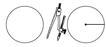
Figure 12.9 Draw a circle and then draw a radius
Step 5
Use a mathematical protractor to measure out the sectors of the pie chart according to the angles you calculated in step 2.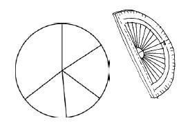
Figure 12.10 Measure out the sectors
Step 6
Label each of the sections of the pie chart with the correct information. In this example, each section should be labelled with the correct contraceptive method used by women (OR provide a key for the different sections).
Step 7
Give the pie chart a heading or caption. Remember that both variables should be included in the heading or caption. In this example the two variables are the type of contraceptive and the number of women.
Pie chart to show contraceptive use among a sample group of women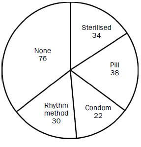
Figure 12.11 Final pie chart with heading
12.2 Answering essay questions
The essay in the final examination is allocated 20 marks. Answering this question requires planning. Let us look at the planning steps using the following essay question, which appeared in the Life Sciences Paper 2 March 2012: Version 1 exam paper, as an example.
- Describe the role of the hypothalamus and the adrenal glands in bringing about changes to the blood vessels of the human skin and explain why these changes take place.
Content (17)
Synthesis (3)
(20)
Step 1
Read the essay question thoroughly to determine the topics that are being covered. Underline the key words in the essay question that provide clues to the different topics:
- Nervous system - since the hypothalamus (a part of the brain) is involved
- Endocrine system - since adrenal glands are involved
- Temperature regulation - since this involves blood vessels of the skin
Step 2
Interpret and analyse the essay question. Identify the aspects or processes that are required from each of the topics identified. You may need to read the question more than once to enable you to do this.
- Hypothalamus - What effect does it have on the blood vessels of the skin?
- Adrenal glands - What effect do they have on the blood vessels of the skin?
If you cover the above in your essay you will only be answering the ‘describe’ part required by the essay question.
Note that the essay also requires an ‘explanation’ of why these changes take place. For the explanation, you need to elaborate on the functions of the hypothalamus and the adrenal gland that involve the blood vessels of the skin as follows:
- Hypothalamus - controls body temperature by stimulating a change in the diameter of the blood vessels of the skin.
- Adrenal glands secrete adrenalin into the bloodstream, which decreases the diameter of the blood vessels of the skin so that more blood (with oxygen and glucose) can be directed to other parts of the body to prepare for an emergency.
Step 3
Write the first draft of your essay in a logical and organised manner, linking each aspect that is discussed. This will help you obtain a high mark from the 3 marks allocated for the synthesis of your essay.
Your plan or draft of the essay may take the form of a flow diagram. But note that you final answer to the essay CANNOT be in the form of a flow diagram.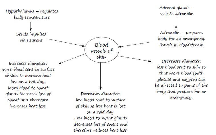
Step 4
Write out the final version of your essay. Put a line across the plan of your essay so that the marker assesses your final answer and not your plan or draft.
Step 5
Now read the question again one more time to check if your answer corresponds to the question.
12.3 Line drawings
In the exam, you may be asked to draw a labelled diagram. Keep these tips in mind if you are asked to draw a labelled diagram:
- Draw in pencil and use neat, strong lines.
- Do not use shading in your diagram.
- Your diagram must not be too small. It must be clear and correctly proportioned.
- The label lines must point directly to the structure that is being labelled.
- The label lines should not have arrow points.
- If possible, label lines should all end at the same point so that the labels are neatly aligned.
- Label lines should never cross. If two label lines cross, neither label will be marked.
- Print the labels neatly in pen.
- Finally, give your diagram a descriptive heading that states exactly what it illustrates.
To enable you to practise your drawing and labelling skills, we have included the diagrams from this guide on the following pages.